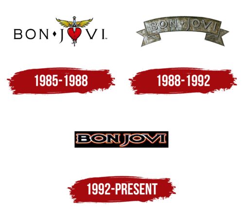
Bon Jovi’s emblem is heartfelt and noble. The emblem tells about the band, which sings about love, romance, and freedom. The sign reflects the spirit of the era in which the band was born and evokes a nostalgic longing for the past.
Bon Jovi: Brand overview
Bon Jovi is an American quintet from New Jersey that has been playing together since 1983. Two members of the original lineup left the band in the first year, and the lineup has remained very constant ever since. The band’s music is not limited to various genres of rock but occasionally includes other styles, such as country. A total of 15 studio albums and two live albums have been recorded and have sold 130 million copies.
Meaning and History
The band is notable for the fact that the first known logo of the musicians appeared after the release of the first album. On the cover of 1984, you can see only a unique rhombus. The idea of a bright and memorable sign appeared later in the performances of Scorpions and Kiss. Interestingly, all rebrandings are different from each other, emphasizing the diversity of the band’s styles and creative themes.
What is Bon Jovi?
A popular American rock band from the late 20th century that continues to delight fans 40 years later. Each member of the legendary band has a bright and creative personality. In addition to group work, the three musicians recorded several solo albums, and Bon Jovi actively starred in movies. Fame engulfed the group after the release of the 3rd album, Slippery When Wet, which was bought by 20 million fans. The artists are now Grammy and BRIT award winners, as well as stars of the U.S. and U.K. Halls of Fame.
1985 – 1988
The band’s first logo consists of the name. The band was named after the founder, which is not usually common for musical groups. However, Jon Bon Jovi was a colorful personality: an actor, singer, and songwriter who played in musical groups from the age of 13 and managed to organize two bands before Bon Jovi. In addition to his work with the band, he recorded two solo albums and was inducted into the Hall of Fame as a music poet in 2009.
Interestingly, fans may have known the band as Johnny Electric. That’s what the quintet was originally proposed to be called if it wasn’t for assistant music manager Doc McGee working with the guys. It was her idea to use the name of the band’s founder as the name. However, the musicians accepted the proposal only two years later.
Between Bon and Jovi, there is a diamond, alluding to the suit of diamonds in cards. This element emphasizes the excitement, risk, and drive present in the band’s music.
The letter “O” in the word Jovi is stylized as a heart pierced by a winged sword. This image is believed to describe the Virgin Mary’s suffering after the death of Christ. The symbol has religious significance, perhaps because John received a Catholic upbringing.
According to another interpretation, the symbol speaks of the agony of love, a feeling that can help one ascend to heaven and create. The most romantic and touching songs are written in moments of separation, loss, and unrequited love.
There is a lot of motivational content about overcoming difficulties in the band’s work. Therefore, the symbol that epitomizes this philosophy is “rising up” despite heartbreak.
This emblem was used by the band at concerts in the 80s. Some elements of the emblem are present on the covers of the second and third albums.
1988 – 1992
A new symbol appeared with Bon Jovi’s fourth album, New Jersey. The metal style was emphasized by a metal heraldic ribbon on which the band’s name was engraved.
The symbol turned out to be romantic and chivalrous, just like the compositions of the compilation. Bon Jovi grew up in the family of a marine, so such concepts as duty, honor, nobility, and loyalty to the law were instilled in him from an early age. There is no vulgarity or offensive language in the band’s songs. But there are dreams and freedom, which unfold on the logo like a flag.
An element of heraldry linked the second symbol to the knightly theme, emphasized in the first symbol by a winged sword.
1992 – today
The emblem first appeared on the fifth Keep The Faith album and has been used continuously. The symbol resembles a neon-lit signboard. Such signs were popular in the 80s when the band was formed.
The symbol looks more modern than the knight symbols of the previous two logos. However, it has less freedom and more stability. The emblem shows a change in the band’s musical style. The transition to a more relaxed pop-rock. It emphasizes the change of image of the musicians, who decided to cut their long, ponytailed hair. This conveys the more serious content of the songs.
However, the innovations did not diminish the love of the fans, and the fourth album achieved double platinum status.
Font and Colors
Black and red are significant colors in the band’s identity. The former indicates the protest and rebellion of rock and its heavy metal notes. It emphasizes the themes of heartbreak and sadness in many of the band’s songs. The red hue symbolizes love, the central note of the composition.
The wide serif symbols indicate a band with a wide soul, full of drive and noble emotions.
Bon Jovi color codes
| Black | Hex color: | #000000 |
|---|---|---|
| RGB: | 0 0 0 | |
| CMYK: | 0 0 0 100 | |
| Pantone: | PMS Process Black C |


