“Ask us. We know everything about rented rooms,” says the Booking.com logo. The emblem indicates a business approach, the ability to find out honest, verified information. Storing a large number of offers in the network space.
Booking.Com: Brand overview
| Founded: | 1996 |
| Founder: | Booking Holdings |
| Headquarters: | Amsterdam, Netherlands |
| Website: | booking.com |
Meaning and History
This travel platform is the result of the merger of several online services. One of them is bookings.nl, opened by Geert-Jan Bruinsma in 1996. The second is Bookings Online, which operated on the .org domain (created by Bas Lemmens, Marijn Muyser, Sicco, and Alec Behrens). Since then, the name, logo, and URL have been changed to Booking.com.
It all started with Bruinsma having to place an ad in one of the local Dutch newspapers, but it was not accepted. The reason is the lack of a phone number because ads linked to websites have not yet been accepted. Then he had the idea of creating his resource, where he could advertise with a tourist orientation.
In 2005, the Internet platform was bought by Priceline Group, which later changed its name to Booking Holdings. She later started a partnership with the European online booking firm ActiveHotels.com. This integration allowed the service to solve financial issues, moving from losses to profits. As a result, Active Hotels became Booking.com, and this purchase was named the best in the world – so profitable was the combination of the two services in the digital tourism market.
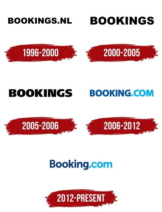
All the while the parent company was connecting and buying competing services, its logo was changing too. But not drastically: the updates took place with minimal intervention because the name remained the same. There were six emblems in total.
What is Booking.com?
Booking.com is an Amsterdam-based online platform where users can find accommodations, rent cars, book flights, or other modes of transportation. It is a full-fledged travel agency offering travelers a vast selection of hostels, villas, hotels, apartments, and resorts in more than 220 countries worldwide. The brand has been in existence since 1996 and is owned by the American company Booking Holdings.
1996 – the 2000s
Since this is an Internet platform related to ads, it also took the corresponding logo – text. It is simple, straightforward, and conveys the name and the web address of the service. The letters in the word “bookings.nl” are bold, wide, dark black, and all in uppercase.
the 2000s – 2005
During this period, the designers removed the designation of the domain zone and left only the inscription “bookings.”
2005 – 2006
In 2005, a different writing style appeared for the first time. The developers removed the inward-curved stroke from the “G,” smoothed out the curves at the “S,” and changed the location of the lower leg of the “K.” The letters were made even more bold and black.
2006 – 2012
With the move to the .com domain, a new logo was approved, without the “S.” It differs in color, which cannot be said about all other versions. The predominant blue palette with gradient transitions. The platform’s web address was highlighted in neon blue.
2012 – today
The main thing that the designers did was to add streamlining to the letters. Therefore, the logo now looks friendlier than before. They also replaced the uppercase characters with lowercase ones, leaving only “B” the same. The developers removed the gradient in the first part of the title and softened the neon color in the second half of the inscription.
Booking.Com: Interesting Facts
Booking.com started in 1996 in Amsterdam as a tiny operation and has become a giant in the online travel industry.
- Dutch Beginnings: Founded by Geert-Jan Bruinsma as Bookings.nl, it initially focused on the Dutch hotel market before going global.
- Growth and Acquisition: After rapid growth, it was bought by Priceline Group (now Booking Holdings Inc.) in 2005, joining other brands like Kayak and Agoda, which helped it expand worldwide.
- Huge Selection: Booking.com lists millions of places to stay, from hotels and apartments to unique spots like treehouses and igloos, appealing to various tastes and budgets.
- Worldwide Availability: It operates in over 40 languages and offers places to stay in more than 220 countries, making it a popular choice for global travelers.
- Tech Focus: The site uses advanced technology, including machine learning and AI, to tailor search results and recommendations to each user.
- Verified Reviews: With hundreds of millions of guest reviews, Booking.com helps travelers make informed choices, ensuring reviews are from people who have genuinely stayed at the listing.
- Eco-Friendly Options: The company promotes sustainable travel, highlighting green accommodations and offering tips for low-impact tourism.
- Activities and Experiences: Beyond stays, Booking.com lets users book various experiences and attractions to enrich their trips.
- Owner Support: It provides tools and support for property owners, helping small and medium accommodations succeed on the platform.
- Constant Updates: Booking.com keeps adding new services, like flight and car rental bookings, to cover all travel needs in one place.
From its humble beginnings to becoming a leader in travel, Booking.com’s rise highlights its commitment to innovation, customer service, and the ever-growing interest in travel and exploration globally.
Font and Colors
The evolution of the Booking.com visual identity mark is a gradual change in the font and color because there are no other elements. Moreover, the logo never had a permanent background – it depended on the environment and was mostly neutral white because the black letters are visible on it.
The typeface at the logo is special – individual, paying tribute to our common home, planet Earth. The thing is that the angles at the beveled places of the letters incline 23.5 degrees, corresponding to the natural inclination of the earth’s axis. The custom font Booking Sans was created by Wieden + Kennedy Amsterdam and symbolized travel, variety of options, the huge reach of goals. It is very similar to Domestos Sans-Black and Conflict. All letters are sans-serif, rounded with miniature cut edges and a 23.5-degree slant in natural curves.
Now the corporate color of the online site is blue sea and sky shades. Previously, exclusively black was used.
Booking.Com color codes
| Dark Midnight Blue | Hex color: | #0a3a7a |
|---|---|---|
| RGB: | 10 58 122 | |
| CMYK: | 92 52 0 52 | |
| Pantone: | PMS 288 C |
| Spanish Sky Blue | Hex color: | #00aef0 |
|---|---|---|
| RGB: | 0 174 240 | |
| CMYK: | 100 27 0 6 | |
| Pantone: | PMS 801 C |


