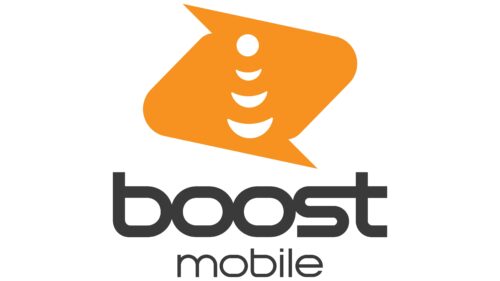
The Boost Mobile logo is friendly and cheerful. It resembles a flag waving in the wind. The symbol spreads waves of friendliness and kindness, signifying the delivery of information from user to user, making people’s lives easier.
Boost Mobile: Brand overview
| Founded: | June 23, 2001 |
| Founder: | Peter Adderton |
| Headquarters: | Irvine, California, U.S. |
| Website: | boostmobile.com |
Boost Mobile is an American cellular company founded in 2001 by three businessmen and Nextel Communications. It has been owned by Dish Wireless since 2020. The company specializes in unlimited prepaid plans and offers flexible collaboration without annual contracts or credit checks. The carrier holds a 5% share of the US mobile market and has revenue of around $7 billion.
Meaning and History
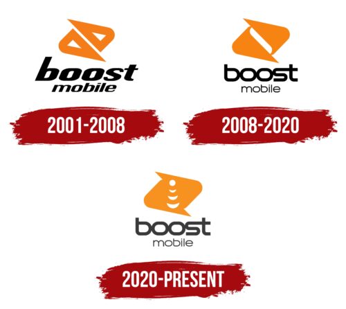
Throughout its relatively short history, the company has experienced several logo updates, which are related to changes in ownership. However, the overall concept of the emblem remains constant, demonstrating the success of the initial idea. A light orange icon and the brand name are present in each variation of the emblem. The small, compact image conveys the provider’s positioning, values, and features: data transfer speed, communicativeness, and a desire to help customers connect with the world.
What is Boost Mobile?
A brand providing wireless services in the United States, with over 9 million subscribers. The carrier is renowned for its unlimited packages with varying amounts of internet data. It produces button phones and smartphones based on Android and Microsoft Windows Phones.
2001 – 2008
The Boost Mobile logo consists of a diamond divided in half into two triangular shapes, with the name written on two levels.
The image carries significant meaning:
- It indicates two separate branches. Initially, the company was founded in Australia in 2000 and appeared in the US a year later. Similar packages with different names are offered in these countries by different operators.
- It demonstrates the connection between two people talking on the phone or two inner worlds.
- It symbolizes the movement of sound and internet flow to the user and back. The sharp, multi-directional ends in each triangle intensify the impression.
Boost Mobile is written in bold glyphs without capital letters. This approach highlights the package’s fullness, additional bonuses, ample talk time, and numerous text messages. The carrier does everything to make customers feel supported.
The company’s name has three complementary meanings:
- Mobile communication that contributes to the country’s economic growth and development.
- Growing mobile coverage, expanding its reach, and gaining more customers. The company successfully targeted users with bad credit history and those wanting to purchase a package for 1-2 months.
- A mobile offer that includes more services and capabilities than others. The carrier’s first feature was providing unlimited talk time within the network. At that time, unlimited plans were rare.
The forward tilt of the text indicates a desire to grow and expand into new territories. Initially, the offer was only available in California and Nevada, but it gradually extended to other US regions.
2008 – 2020
Triangular shapes have been elongated to interlock with each other as a symbol of reliable mobile connectivity. This illustrates how robust and stable Boost Mobile’s network is, how swiftly it responds to issues, and how vigilantly it maintains connection stability. As a result, subscribers receive high-quality services, which designers have emphasized through graphic techniques.
The inscription also indicates the reliability of the connection. It is now not italicized but straight, with “fused” letters. These letters truly blend, thereby confirming the strength of the mobile network. Glyphs in the top row seamlessly transition from one to another, evident at the junction between “s” and “t.” The text in the bottom row consists of thin letters with minimal spacing between them. In both instances, the fonts are sans-serif, rounded, with few angles.
2020 – today
In 2020, the former owner of Boost Mobile, Sprint, transferred customers from its secondary direction exclusively to Boost Mobile. It then merged with a competitor and transferred the brand ownership to Dish Wireless.
The new owners transformed the brand’s logo, reflecting the idea of unification and the theme of mobile signal in it. The two triangles merged, demonstrating the company’s merger and network expansion. A white dot is drawn on the surface of the united figure, with lines emanating from it, depicting the wireless signal.
Previously, Boost Mobile provided services using other mobile networks under contract. The appearance of a prototype mobile tower and signal on the logo indicates a change in this matter, acquiring its network. After the acquisition, Dish Wireless provided Boost Mobile with the hardware part of its T-Mobile network. Now, both tariff plans and towers are in the hands of a single owner.
Font and Colors
The orange, white, and black create a pleasant, friendly color palette for the emblem. The palette emphasizes the theme of communication and the scale of the operator.
- Orange. The color of contact between people, communication, and conversations. The shade conveys the company’s care for uninterrupted communication between loved ones, friends, and partners. It tells about the company’s positioning as a friend, open to communication, and always ready to help.
- White. The color encapsulates the transparency of the air and the invisibility of sound waves going from phone to phone. White is the beginning. New tariff plans, new opportunities.
- Black. The dark palette represents power. It indicates the extent and wide coverage of consumers. It hints at simplicity and affordability.
The thin, rounded, horizontally stretched letters demonstrate expansion and distribution. They show a decent volume of services in each package. Thin glyphs add elegance and lightness, showing how quickly the signal spreads.
Boost Mobile color codes
| Shadow Gray | Hex color: | #3b3b3c |
|---|---|---|
| RGB: | 59 59 60 | |
| CMYK: | 2 2 0 76 | |
| Pantone: | PMS 447 C |
| Neon Tangerine | Hex color: | #f7901e |
|---|---|---|
| RGB: | 247 144 30 | |
| CMYK: | 0 42 88 3 | |
| Pantone: | PMS 151 C |
