


![]() Boss Baby Logo PNG
Boss Baby Logo PNG
The Boss Baby logo symbolizes power, confidence, and superiority. It reflects the main character’s ambition for leadership and his business approach to life. However, the emblem’s childlike elements remind us that even in the adult world, there is room for playfulness and spontaneity.
Meaning and History
![]()
The Boss Baby logo is an important tool in promoting the franchise. It is used on merchandise, posters, websites, advertising materials, and other information carriers, enhancing the films’ recognizability. The memorable image of a baby, encoded in the letters “O” and “A,” captures the audience’s attention. The long tie is associated with leadership, highlighting the main character’s life philosophy. The emblem conveys the essence of the main character, a blend of childlike spontaneity and adult ambition.
What is Boss Baby?
Boss Baby is a media franchise based on the eponymous 2017 animated film, which is an adaptation of Marla Frazee’s book. It’s a project of the American studio DreamWorks Animation. The story’s plot spans a lengthy period, from Ted’s birth to his adulthood. The main characters live in a fantastical world where a company produces babies. However, not all of them end up in families, as it turns out that even among children, there are careerists in business suits.
2017
![]()
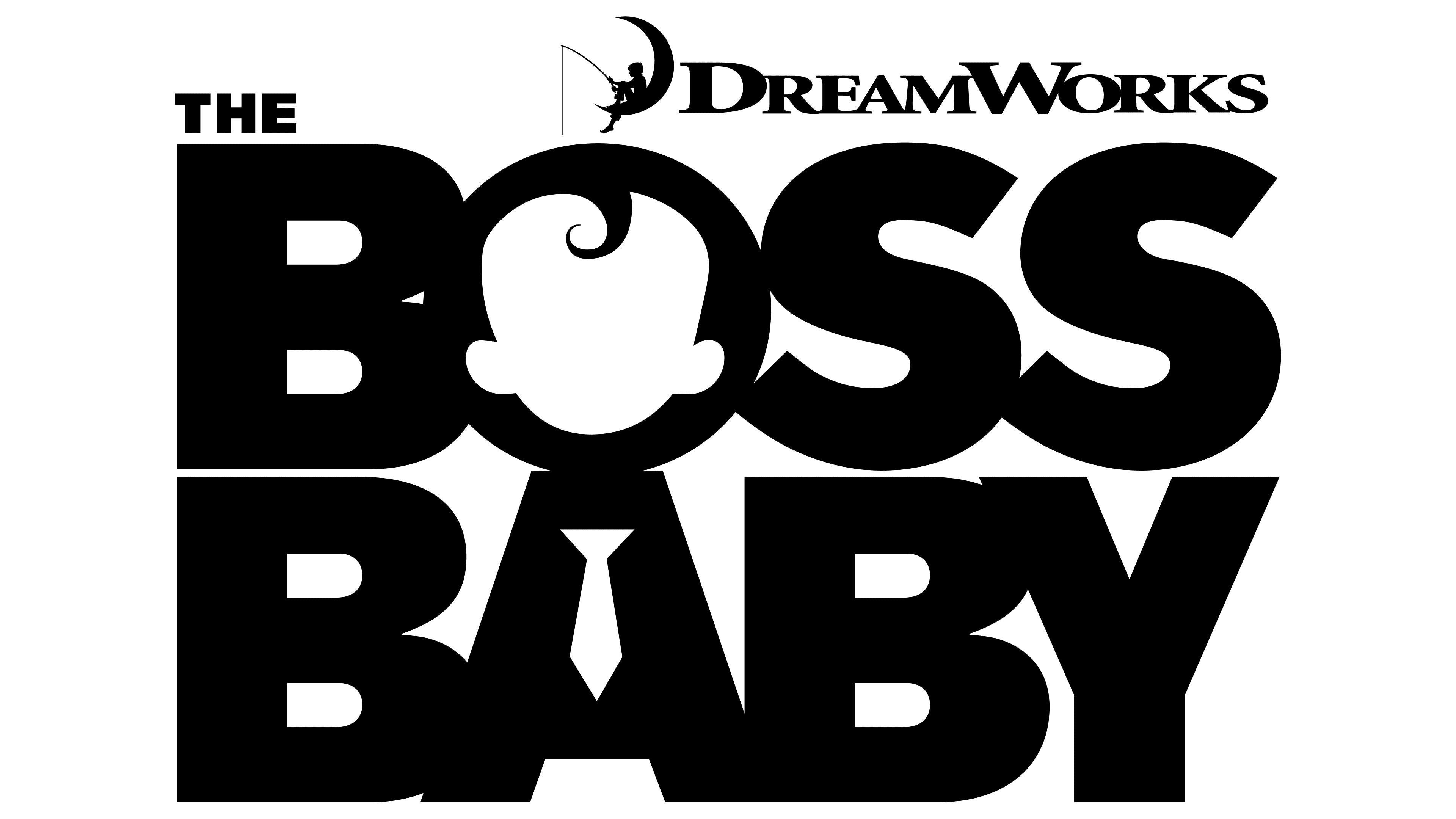
While creating the animated film The Boss Baby, the development team handled its logo. The designers presented the project’s name as a two-level inscription, where the letters “O” and “A” form the silhouette of the main character. In the negative space inside “O,” a head with ears is depicted. In turn, “A” looks like a torso with legs. The small white tie hints that the child in the film wears a suit and aspires to career growth.
The letters in both lines are connected, facilitated by the wide, bold font. The blue gradient and gray shadows make the emblem look three-dimensional. Above the phrase, there’s a small article, “THE.” In the top right corner is the DreamWorks logo, consisting of two elements: the studio’s name and the famous icon of a fisherman sitting on the moon.
2021
![]()
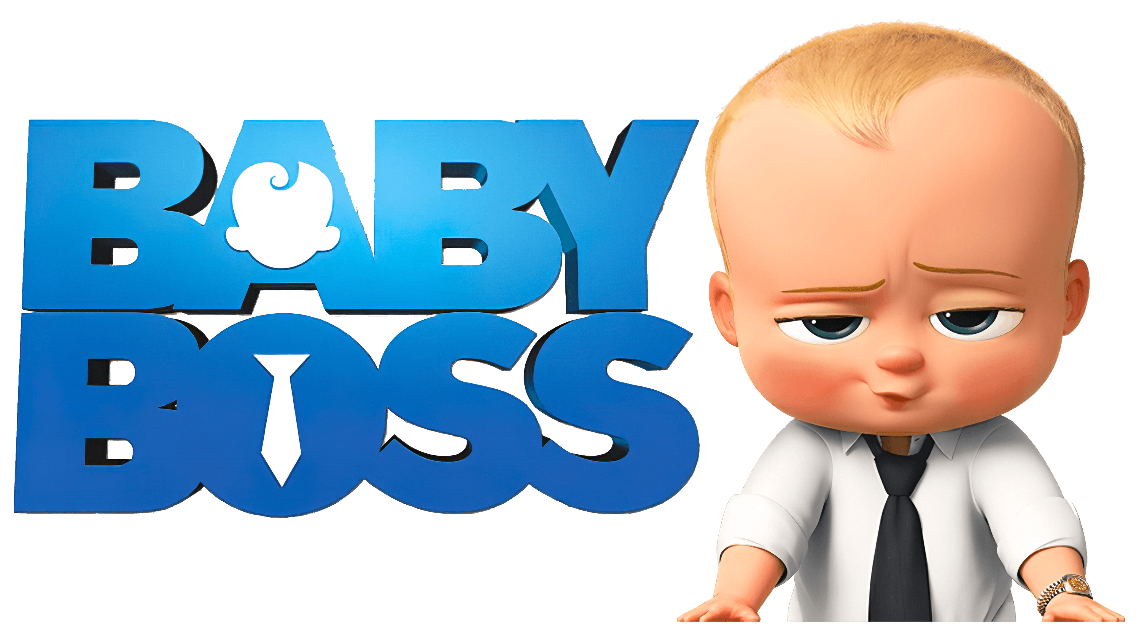
In 2021, a sequel named The Boss Baby: Family Business was released. Its creators developed a logo similar to the emblem of the first animated film. But there are a few differences.
- Under the words “BOSS BABY,” there is no common gray shadow because there’s an additional line, “FAMILY BUSINESS,” below. The letter color resembles gold, and the two “S” at the end look like dollar signs. This hints at the career growth theme that concerns the main character.
- The white face and tie, depicted within “O” and “A,” are outlined with thin yellow lines. This makes them stand out more against the glyphs.
- The “DreamWorks” inscription is still in the top-right corner, but it no longer includes the famous studio symbol: the fisherman sitting on the moon.
Minor details have been changed. The designers did this to enhance clarity and improve the logo’s perception.
Font and Colors
The animated film’s title is set in bold, sans-serif letters. A unique set of glyphs was created specifically for Boss Baby; hence the unconventional shapes of “A” and “O,” which together form the silhouette of a child. The logo features the DreamWorks studio’s textual sign. The inscription is made in the brand’s font with long serifs.
Due to the blue gradient, the emblem appears three-dimensional. This is an attempt at marketing appeal to children, who are the primary audience. The phrase “FAMILY BUSINESS” is colored gold because it is associated with wealth. The color palette symbolizes dynamism, energy, and activity, which aligns with the main protagonist’s character.