


![]() Bostik Logo PNG
Bostik Logo PNG
The light and ironic Bostik logo makes everyone who sees it for the first time smile. And it is not surprising, because the logo doesn’t resemble any official symbolism, but rather a picture with a curious story from life. The company that produces glues and sealants deliberately chose this approach to demonstrate the high efficiency of its compositions, even on vertical surfaces. And the designers succeeded!
Bostik is a leader in the chemical industry, a French manufacturer of adhesives and sealants for the consumer, industrial, and construction sectors with an annual turnover of 2.1 billion euros. It is part of the Arkema Group and operates in 40 countries worldwide, offering products produced according to its own patented formulas. The company was founded in 1889. The head office is located in the city of Colombes (France).
At first, it was an American company called the Boston Blacking Company, which manufactured dyes for natural leather. It was manufactured in Chelsea, Massachusetts. Sometime later, the manufacturer changed its specialization, switching to producing glue for connecting rubber soles to the top and to selling shoe care products. This happened when the company became a subsidiary of USM (United Shoe Machinery) and its chemical division.
Then the brand expanded and achieved international status, and began supplying its products to the market. For the first time, the word “Bostik” was mentioned in the 40s of the 20th century; then a whole series of products under this name appeared on store shelves. Due to their success, the company adopted this name. This event took place in the 1960s. Then the company repeatedly passed from owner to owner until it became an independent concern. As a result, in 2015, it was bought by the global chemical group Arkema.
Meaning and History
![]()
In the early years of the company’s existence (when it was still the Boston Blacking Company), cans of shoe-care formulations depicted a black shoe and included informational inscriptions. At the top was the company’s abbreviated designation, Be-Be-Co, and under the boot was a tape bearing the brand. In 2013, she received a modern version of the logo, which is still used today and remains the only sign of Bostik’s visual identity.
What is Bostik?
Bostik is a leader in the chemical industry, producing adhesives and sealants. This is a French corporation with an annual income of 2.1 billion euros. At first, the company produced paint for leather products and was called Boston Blacking. It received its current name in the 1960s. The company was founded in 1889. The headquarters is located in Colombes (France). The company is now owned by Arkema.
Before 2000
Until 2000, Bostik, an adhesive manufacturer, often changed hands, a fact reflected in its identity. Among the logos of that period, there is a minimalist wordmark in dark blue. It contains only the brand name, which uses a set of custom glyphs. All letters are bold and massive, while some of them (“s,” “k”) have protruding corners, similar to serifs. The “s” counterpart can be found in Florida Serial Heavy by SoftMaker, and the “t” in Noveo Sans Black by FontSite Inc.
2000 – 2004
![]()
In the 1990s, Bostik became part of the oil and gas group Total, which was renamed Total Fina in 1999 and merged with Elf Aquitaine in 2000, becoming TotalFinaElf. As a result of the merger of the two companies, their divisions, Bostik and Atofindley, formed a new brand – Bostik Findley. On the logo, its name is written in dark blue capital letters. The font resembles a cross between Rleud Narrow Black by Stawix and Octin College Black by Typodermic Fonts Inc. On the left side is a stylized “A” in the form of a delta. Its original shape and bright orange color are a tribute to the Atofindley heritage. The glyph is depicted inside a shield with three dark-blue arrow-shaped corners.
2004 – 2013
![]()
In 2004, the brand was renamed Bostik and received a new emblem that reflected its name. Only the letters “B” and “k” recall the old symbol, a stylized “A”; they also have open parts. “B” has an open lower intra-letter gap, and “k” has a short diagonal separation. Combined with bold italics, this design makes the inscription slide and move.
Another element that adds internal dynamics to the logo is a long, thin red line. It goes around the world on the right, capturing it in an oval. The strip symbolizes the high technology used to produce innovative adhesives and other Bostik products. And its deep crimson hue harmonizes with the blue of the inscription.
2013 – 2021
![]()
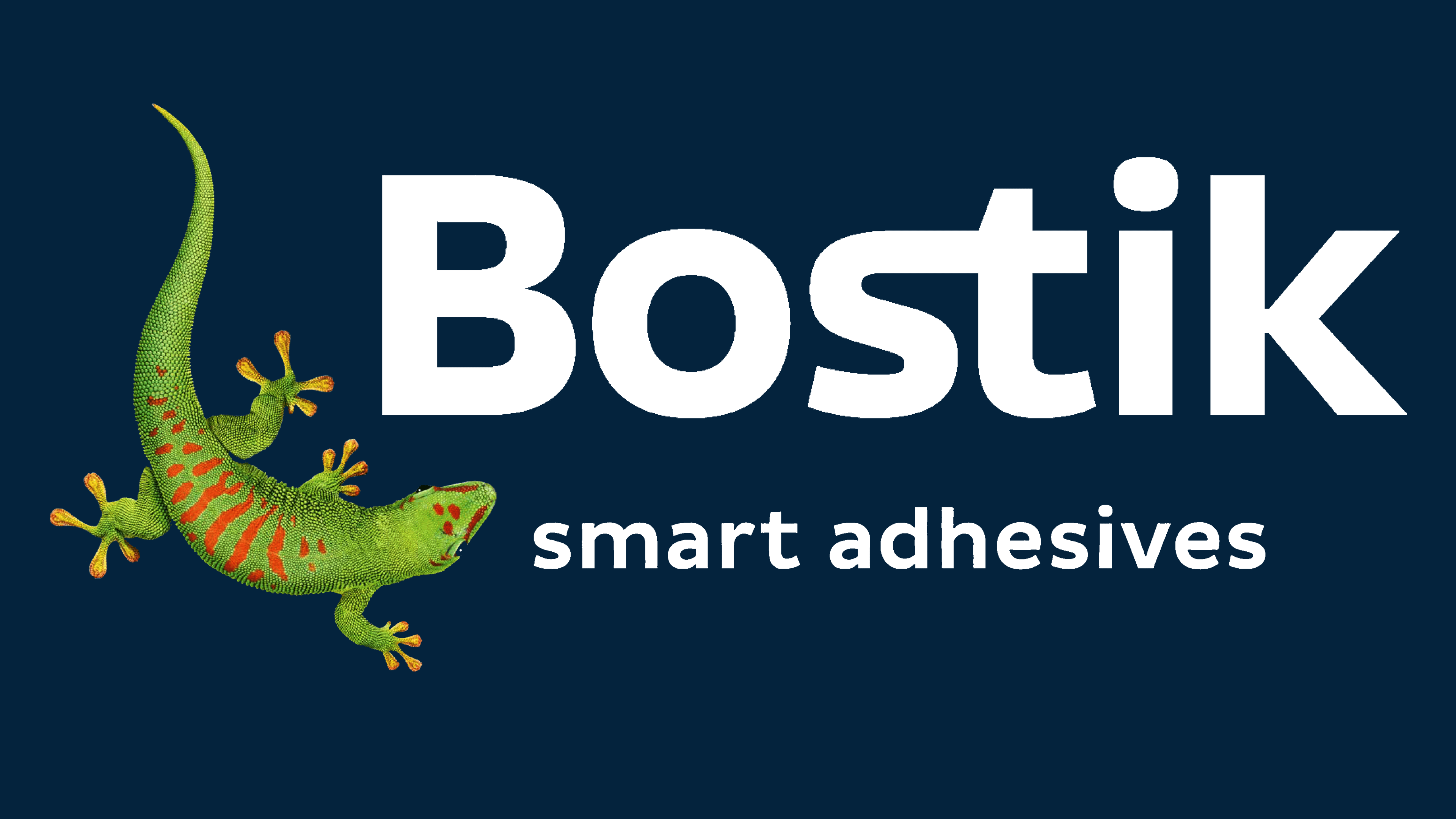
The logo depicts a gecko, a small reptile known as the chain-footed gecko. This is due to the peculiarity of its fingers, which are provided with tenacious suction cups so that the animal can confidently stay on any surface. Such strength is a conceptual characteristic of the adhesives and sealants brand products. The unique lizard is painted a natural green with red-brown spots. Starting from the neck, the body is thickened, and the lower part, on the contrary, is narrowed and ends with a sharp tail.
The gecko’s head is turned towards the company’s name, which is slightly higher. It is in bold, lowercase characters. The only exception is “B,” which comes first in the word “Bostik.” Another interesting feature is the combination of “s” and “t” in the upper position. The bend of one letter flows so smoothly into the crossbar of the next that there is no exact place of transition between them. The bottom row shows the brand’s slogan: “smart adhesives.” It testifies to the adhesive’s strength on any surface and enhances the gecko image. In this case, all characters are lowercase.
2021 – today
![]()
In 2021, Bostik introduced its new corporate identity, strengthening the brand’s connection to its parent company, Arkema. It now reflects values such as simplicity, solidarity, responsibility, high performance, and commitment to innovation. The emblem still depicts a gecko, a creature that can stick to almost any surface thanks to the suction cups on its fingers. This image symbolizes the excellent quality of Bostik glue. The lizard, as before, looks like a detailed animated character. It is located in the lower left corner under the brand name. In this version, the word consists of sans-serif capital letters. The colors are brighter than in the previous logo.
Font and Colors

The word part of the Bostik logo is set in a smooth sans-serif typeface, very close in style to Branding With Type’s Bw Modelica Extra Bold or Cabrito Sans Ext Extra Bold, but with sharper angles. Another of its features is a horizontal connecting line between the letters “s” and “t.” For the “smart adhesives” motto, the designers used a classic typeface reminiscent of Pluto Sans Medium or Polaris Bold, designed by Aviation Partners.
The corporate palette is multi-structured because, in nature, the gecko has a multi-layered color. In this case, the predominant colors are green, red, brown, black, and yellow.
![]()