


![]() Bratz Logo PNG
Bratz Logo PNG
The Bratz logo conveys the atmosphere of a children’s kingdom for princesses. The emblem contains information about beautiful outfits, balls, and joint games. Each community member is a real star who can immerse herself in the special world of a fairy tale.
Bratz dolls were a serious competitor to Barbie, who has been the queen of the toy market since 1959. They appeared in 2001 and instantly became popular because girls could realize their passion for fashion with them. Bratz is now an entire franchise owned by MGA Entertainment. Under it, the manufacturer produces various entertainment products, including video games, videotapes, and TV series.
At the start of the 2000s, Bratz dolls, created by Carter Bryant and launched by MGA Entertainment in 2001, came onto the fashion doll scene as a fresh face. These dolls stood out for their large heads, almond-shaped eyes, full lips, and trendy outfits, quickly becoming a favorite among kids. Jasmine, Chloe, Jade, and Sasha, the original Bratz, offered a new kind of cool that contrasted sharply with the traditional Barbie doll.
By 2005, Bratz had captured a large share of the doll market, underscoring its massive appeal. MGA didn’t just stick to dolls; in 2004, they branched out into music with Bratz Rock Angelz, adding instruments and CDs to their lineup, proving their innovative edge.
But it wasn’t all smooth sailing. Mattel, where Bryant used to work, sued over the rights to Bratz, leading to a lengthy courtroom battle. Despite this, Bratz continued to grow, adding new lines like Bratz Kidz and movies to their brand.
However, by the late 2000s, changes in what kids wanted and competition from new dolls like Monster High led to a waning of Bratz’s popularity. The legal fights with Mattel forced MGA to pause in 2010, but in 2013, Bratz returned with new designs and characters, showing MGA’s dedication to keeping the brand alive and relevant.
Today, many still love Bratz dolls, which hold a special place in the fashion doll world. MGA continues to release new Bratz items, keeping the brand alive for fans old and new.
Meaning and History
![]()
The line of dolls brought fame to its creator and many problems. It was invented by Carter Bryant, one of Barbie’s designers. He was still working for a competing company owned by Mattel at the time. Despite this, Bryant took Bratz’s sketches to MGA, got a new position, and immediately resigned from the old one. When Mattel learned of this, it sued the former employee, alleging he violated his employment contract. Legal disputes continue to this day. During this time, a series of dolls changed at least six logos.
Bratz quickly became more than just toys. They were icons of fashion and attitude, resonating with a generation ready to show off their unique style. Each new collection was eagerly awaited, and these dolls became must-haves, known for their big eyes, full lips, and trendy outfits that could dazzle any fashion show.
These dolls were designed for pre-teens, reflecting their aspirations and vibrant personalities. Bratz was for the young at heart, those who felt ready to step into a world full of dreams and possibilities. They weren’t just playing with dolls; they were exploring their future selves, with Bratz as their fearless guide.
What is Bratz?
Bratz is a famous line of dolls introduced in 2001 that posed a challenge to Barbie. Created by MGA Entertainment Inc., these are not just beautiful toys with similar appearances but rather a group of friends with individual personalities. Each doll has its own hobby and unique style. They have distinctive facial features, such as large lips, high cheekbones, and wide-open eyes, and have become popular due to their fashionable outfits and hairstyles.
2001 – 2009
![]()
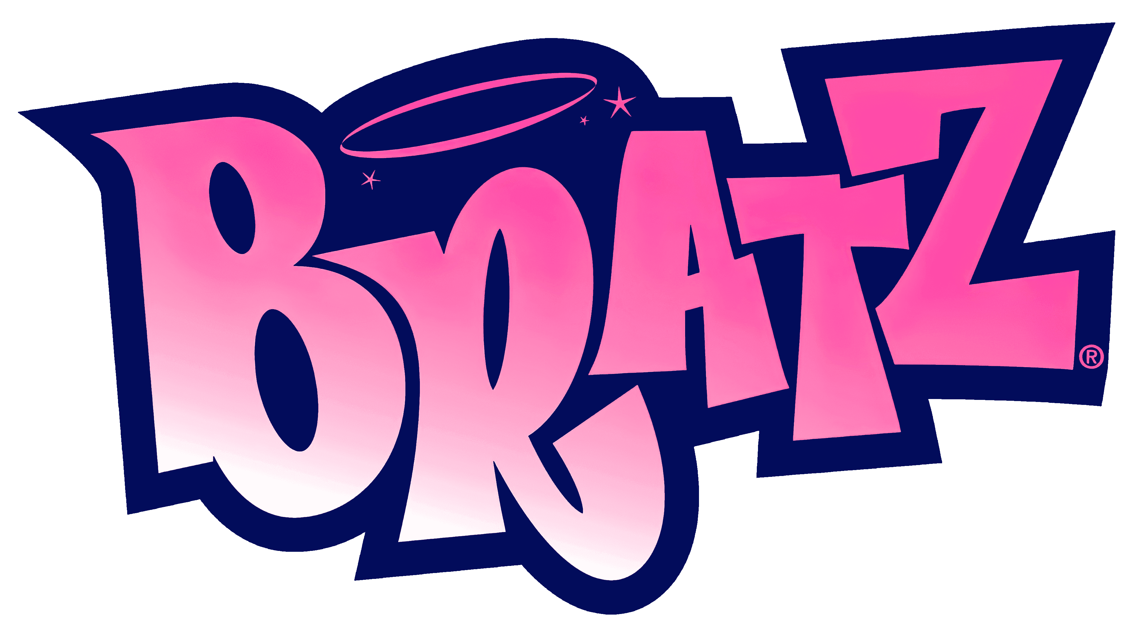
The first version featured pink “BRATZ” lettering with jagged, bouncing uppercase letters. Above the R was a golden halo, and small five-pointed stars glittered around the word. The brand name appeared bulging due to the gradient and subtle light outlines. All design elements were crafted to capture children’s attention.
2007
![]()
In 2007, a musical comedy film dedicated to the famous doll line was released. Its logo contained the pink lowercase word “Bratz.” All letters were linked. Above “r,” as before, there was a halo with two asterisks, but it turned pink. Light spots at the bends created the volume. The same emblem was used on some products.
2010 – 2012
![]()
The 2010 logo is similar to the 2001 version, although a closer look reveals differences:
- The letters were redrawn because their proportions changed slightly.
- The gradient disappeared, and a thin black outline appeared.
- The designers removed the stars around the edges, leaving only three on top.
2012
![]()
Throughout 2012, boxes with dolls were decorated with a golden emblem covered with sparkles. At the same time, the inner outline of the letters became dark pink. The form remained unchanged.
2013 – 2014
![]()
The Bratz logo, used in 2013-2014, can be called the most minimalistic. The brand name was first written in white. The designers chose an individual font, making all letters lowercase except for the first “B.” A gray gradient shadow behind the word complemented a wide black outline.
2015 – 2017
![]()
Minimalism has been replaced by glamor. The designers repainted the lettering in blue and designed it as a sticker, folding the bottom corner next to the “Z.” All letters have been converted to uppercase and outlined with a thin outline. The golden halo descended directly to the “R.” The bottom of the “T” was covered with a small sticker with pink lips.
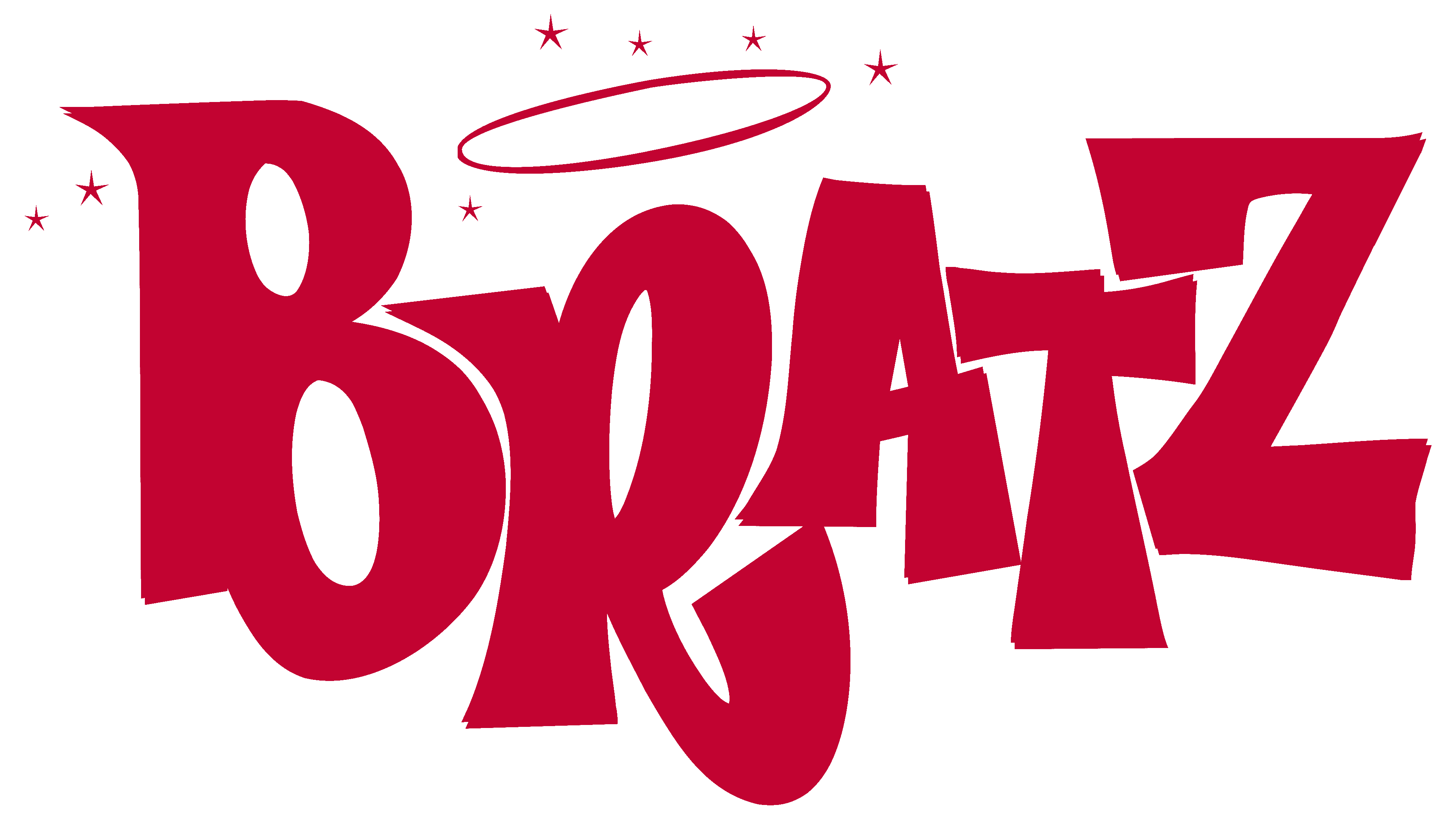
2018 – 2023
![]()
All experiments ended with the manufacturers returning the doll line’s original logo. The original design has not changed and continues to delight Bratz fans.
The authors of the word mark sought to make the design intriguing to psychologically influence children. Without strict straight lines, “convex” letters, stars, and bright colors attract attention. It is a clever marketing tool designed to increase sales.
2023 – today
![]()
The Bratz logo captures the brand’s boldness and style, blending early 2000s youth culture and fashion to immediately highlight its unique identity. It features soft shades of pink and purple that blend into each other, creating a vibrant and appealing look. Pink represents playfulness and femininity, while purple adds depth and is associated with creativity and magic, fitting the Bratz aesthetic perfectly.
The logo’s letters are rounded with contrasting outlines, making them pop and expressive. The bold fonts and curved lines reflect the daring and carefree image Bratz aims to convey.
A gold crown above the “R” emphasizes Bratz’s “royal” status in the fashion doll market, symbolizing the brand’s success and popularity among young people. This element suggests excellence and uniqueness, indicating that owning a Bratz doll is special and valuable.
This new Bratz logo speaks to the brand’s trendy, modern image, reflecting its values of diversity, self-expression, and friendship. During Bratz’s peak popularity, the logo symbolized a new generation of dolls that broke the norms, offering kids and teens a new way to express their individuality.
Font and Colors
Since all the lettering on the Bratz logos was hand-drawn, they are second to none. The font looks like a bubble font because the letters appear three-dimensional due to the gradient. The main colors are pink in several shades and golden.
The new Bratz logo features an edgy sans-serif typeface that exudes a modern, youthful vibe. Capital letters are used throughout, emphasizing the brand’s bold, spirited nature. The font’s angularity suggests a break from tradition, which aligns perfectly with the Bratz identity of pushing fashion boundaries.
The letters are encircled with a rounded outline, softening the angularity and adding a sense of playfulness. The font’s weight is heavy, with thick strokes that convey confidence and presence. This is complemented by clever color gradation that gives the letters a 3D appearance, adding depth and vibrancy to the visual experience.
Color-wise, the palette transitions from a light, almost bubblegum pink to a delicate blush pink. This gradient softens the overall look and resonates with the brand’s appeal to a young, style-conscious audience. The surrounding contour shifts from a deep rose to a rich purple, framing the logo with a touch of sophistication and depth.
Crowning the logo, the golden crown glitters as if touched by sunlight, symbolizing Bratz’s regal standing in the world of fashion dolls. The sparkle of the crown serves as a visual metaphor for the brand’s enduring allure and aspirational quality. This element of shine and luster reinforces the idea that Bratz dolls are not just toys but icons of style and fashion.
FAQ
What do Bratz dolls represent?
When they hit the scene, Bratz dolls brought a fresh and daring twist to fashion dolls, offering an alternative to the classic Barbie with their unique looks and modern outfits. With their big heads, striking eyes, and full lips, each Bratz doll showcased its personality and style, appealing to kids looking for dolls that celebrated diversity and broke away from old-school ideals.
These dolls were all about edgy fashion, mirroring the cool trends of the early 2000s and promoting friendship, confidence, and self-esteem. Bratz encouraged kids to appreciate what makes them different through a lineup that highlighted inclusivity and cultural diversity. Yasmin, Cloe, Jade, and Sasha, the original Bratz, were just the start of a brand that embraced everything from urban to ethnic styles.
Bratz also explored various interests through their dolls, from music to sports, showing kids that it’s cool to pursue any hobby or dream, regardless of stereotypes. They evolved into a cultural phenomenon, branching into music, movies, and games, and became icons of their time, championing the idea that it’s awesome to be yourself.
What does Bratz mean?
The name “Bratz” cleverly twists the term “brats,” usually used to describe kids with a bit of a rebellious streak. This name captures the Bratz dolls’ unique blend of edgy fashion, confidence, and trendiness, setting them apart from more traditional dolls. The brand celebrates being cool and fashion-forward, appealing to kids who appreciate being themselves and standing out.
“Bratz” was picked to connect with young people who cherish individuality and self-expression, themes at the brand’s heart. With various characters showcasing their styles and personalities, Bratz lets kids find a doll that reflects their interests or qualities they admire, encouraging them to embrace their uniqueness.
What does Bratz stand for?
Bratz dolls are all about a fresh, stylish take on the world of fashion dolls, championing individuality, diversity, and empowerment. They came into the scene as a cool alternative to the usual dolls, reflecting what young people are into today.
Here’s what Bratz stands for:
- Individuality: Each Bratz doll has its unique name, personality, and fashion sense. This encourages kids to be themselves and show off their style.
- Diversity: Bratz features dolls from diverse backgrounds with various skin tones, hair types, and stories, showing that everyone deserves a place.
- Fashion: Known for their trendy clothes and accessories, Bratz dolls keep up with the latest styles, helping kids explore their creativity and self-expression through fashion.
- Friendship: The stories surrounding Bratz dolls highlight how close the characters are, underscoring the vital importance of good friends in life.
- Empowerment: With their can-do attitude and wide range of interests, Bratz dolls inspire girls to dream big and know they can achieve anything.
Bratz dolls promote confidence, strength, and daring, offering kids a playful way to engage with the world around them while staying true to themselves.