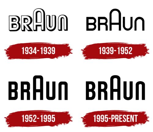
The Braun logo is concise and smooth. It demonstrates a combination of progressive ideas with perfect design, pointing to the impeccable performance of the devices thanks to a well-thought-out structure.
Braun: Brand overview
| Founded: | 1921 |
| Founder: | Max Braun |
| Headquarters: | Kronberg im Taunus, Germany |
| Website: | braun.com |
Braun is a German private company, a manufacturer of small household appliances. The range includes 2,000 products in categories such as beauty and hygiene, kitchen appliances, health, and irons. Sold in 60 countries, since its founding, 100 million products have been sold. Procter & Gamble, through Gillette, owns 30% of the company.
Meaning and History
The company was founded in 1921. However, the first logo only appeared 12 years later. Initially, the company was engaged in the production of radio components for other manufacturers. The identity was needed when the team started producing their radio receivers combined with record players. The emblem and brand name were developed for them in 1934. In the future, the founder’s sign changed a little, with only minor touches added. Therefore, the image of the first logo became the company’s calling card for 100 years.
What is Braun?
A German conglomerate with 9,000 employees, valued at $7 billion. It specializes in producing electrical appliances: electric shavers, epilators, toothbrushes, juicers, kettles, meat grinders, and blenders.
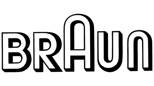
1934 – 1939
The manufacturer’s logo consists of a voluminous inscription of Braun with a highlighted central letter A. The main purpose of the visual sign is to reflect the brand’s advanced ideas and distinctive design.
The brand is named after the engineer and founder of the company, Max Braun. The company belonged to his descendants until 1962, who made significant contributions to the establishment and development of the brand. Therefore, the Braun surname is the main focus of the logo.
The emphasis on the letter A:
- Creates harmony. The element is central in the inscription and divides the word exactly in half.
- Reflects the special form of the products and unique ergonomic design. The round curve of A resembles 1) the speaker on radio receivers, which was located on top as a protruding bump, and 2) the round knob for tuning stations. Later, shavers with a round frames, oval cameras, and slide projectors appeared.
- Indicates the double A in the center of the founder’s first and last name.
- Reminds of the first product – receivers. The curve in the name is similar to sound waves.
The capital element signifies growth and development. Starting from a workshop, the company gradually climbed the “mountain,” achieving prosperity. In the 1960s, Braun became a well-known international brand. Ironically, after the ascent in the logo followed a descent, which predicted a further reduction in production and a decline in the manufacturer’s popularity. The peak of the brand’s history falls right in the middle: the 1950s-1980s.
1939 – 1952
The inscription gained elegance and smoothness. This change occurred due to the refinement of the glyphs, now rendered with semi-thin lines. That is, designers turned shadows into full-fledged elements and removed the white part of the letters, making them appear more compact. The emphasis on the large “A” remains, as does the similarity between “u” and “n,” which seem like mirror reflections of each other.
1952 – 1995
During this period, the font of the inscription changed to extra-bold and less smooth. The letters acquired clipped and slightly rounded corners. Designers stretched the glyphs upward, making them thinner and taller.
1995 – today
In 1988, the company became private again. In the 1990s, to maintain its market position and stand alongside more successful competitors, Braun underwent restructuring and rebranding. Some divisions were sold.
The symbol’s update involved a few minor details compared to the 1952-1995 logo.
The curves of the letters, instead of rectangular elements with rounded corners, acquired smooth round lines, demonstrating the ergonomics of the manufacturer’s products and preparing the company for a smoother, more fluid path. The symbols of the name hide the core values: perfect design, absence of decoration, and ease of use.
Font and Colors
Braun logos have been associated with black and white shades for 100 years. After various experiments and combinations, the owners finally settled on a charcoal-black color.
- White – demonstrated innovation. The founder implemented leading industry developments in production. The color indicated the principle of radio operation: radio waves spread through the air.
- Black – an expression of strength and stability, as well as the color of the plastic products.
The transition from white to dark shades indicates the power and maturation of the brand—transformation into a giant that has defeated its competitors.
The font resembles Neubau Grotesque Bold. Bold glyphs speak of expansion to other continents, a wide assortment, and large sales volumes. The use of capital letters reinforces the impression.
Braun color codes
| Black | Hex color: | #000000 |
|---|---|---|
| RGB: | 0 0 0 | |
| CMYK: | 0 0 0 100 | |
| Pantone: | PMS Process Black C |

