![]() Breaking Benjamin Logo PNG
Breaking Benjamin Logo PNG
Breaking Benjamin’s logo is extravagant, mysterious, and mystical. It looks like a spell, conveyed graphically, that affects the subconscious immediately. Massive elements exude confidence, complex shapes reveal deep philosophy, and the simple form represents pure introspection.
Meaning and History
![]()
In its early days, Breaking Benjamin performed soft music and didn’t have the popularity it has now. However, with the arrival of the second lineup, their repertoire drastically changed, leading to frequent radio airplay. Fans were captivated by the nerve prevalent in the new styles. The band’s name also came unexpectedly when Benjamin accidentally broke a rented microphone during a performance and returned it to its owner in that condition. The second lineup of the music group was forced to keep this name for two reasons:
- The new band, Plan 9, was often called incorrectly and frequently confused with Planet 9.
- Burnley had a lot of promotional materials left with the previous name.
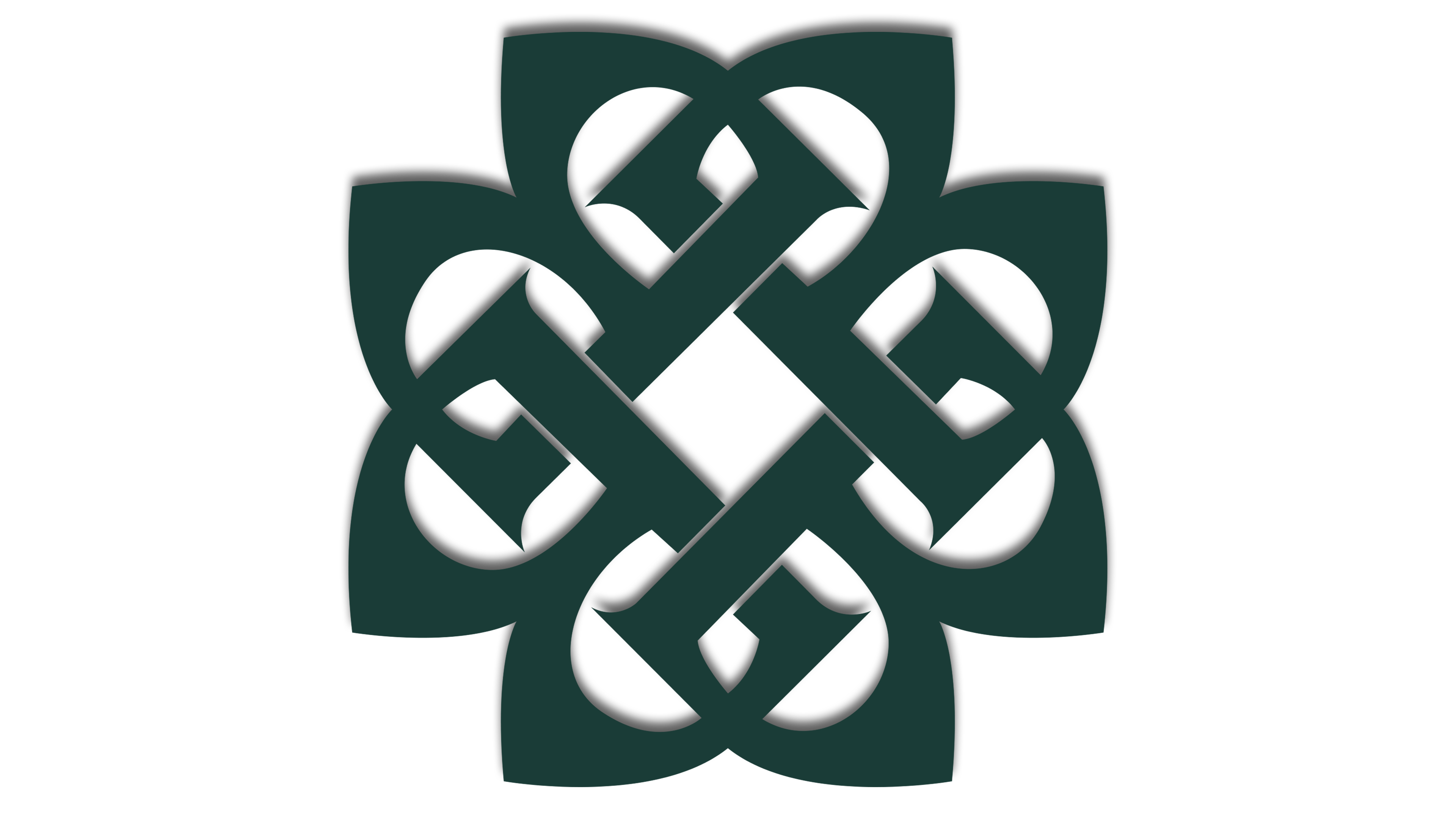
The name served as the basis for a graphic-text logo, which took on a mystical aura, closely intertwined with folklore ornamentation. It’s a Celtic knot. In this case, it symbolizes unity, as it represents four “B” letters connecting the musicians in a single spiritual brotherhood. The symbol is tattooed on each member’s hand.
What is Breaking Benjamin?
Breaking Benjamin is a rock band from the USA, based in Wilkes-Barre, Pennsylvania. They started performing in 1999 with Benjamin Burnley, Jeremy Hummel, Mark Klepaski, and Aaron Fink. Later, the band was relaunched in 2014 with other musicians (the first attempt failed due to creative differences). Their main styles are metal, rock, and post-grunge.
2002
![]()
The mystical element, in this case, has practical significance, as the “B” clearly visible in the Celtic knot’s curls symbolizes the band Breaking Benjamin. It is their unifying force, the center of attraction, and the beginning of beginnings. The logo is formed from wide bands: from the outside, they resemble petals with sharp ends, and inside, they form a complex structure with miniature serifs. The lines intertwine like the threads of a cinch, and they transition to a new level, similar to a Möbius strip. The sinuous ornament is slightly modernized, so it looks like a tangle of snakes.
At the bottom is the full name of the music group, arranged in a single horizontal row. Unlike the top element, it is clear, simple, and easy to understand. All letters are lowercase. The thin glyphs are adorned with small serifs, similar to the bands in the Celtic knot.
Font and Colors
For the inscription, the musicians chose a needle-point typeface, non-bold, with smooth lines and miniature serifs. It is called Eidetic Neo Omni. The letter “B” in the graphic pattern resembles a glyph from the Butter font.
The logo’s palette is modest: black and white. It most accurately conveys the mood of the tracks and connects the two opposite sides of life, dark and light. Monochrome sets the tone for the songs and perfectly supports the emblem’s style. However, the background can vary depending on the symbol’s location.