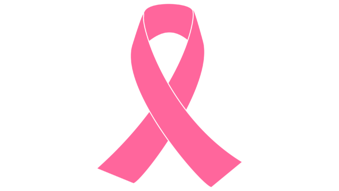
The Breast Cancer logo calls for the support of all those who are fighting the disease. The emblem is filled with regret and sadness, but it also shows that there is hope. The disease, which surrounded the patient, is not a sentence.
Breast Cancer: Brand overview
| Founded: | 1992 |
Meaning and History
The main symbol of Breast Cancer treatment is a pink ribbon folded in half and forming a loop. It’s in the public domain: it doesn’t belong to any organization. It can be freely used by companies that want to show support for charities that raise money for cancer research, diagnosis, and treatment. Items marked with this ribbon are believed to be part of a Breast Cancer fundraiser. This is a way to express support for sick people.
At the same time, there is such a form of marketing as Pinkwashing. It lies in the fact that charitable organizations use the pink ribbon for selfish purposes to advertise their products and increase sales. In the worst case, these products themselves cause cancer because they contain ingredients that increase the likelihood of occurrence. For example, activists believe that the cancer drug Astra Zeneca releases toxins that trigger its development. And KFC used the pink ribbon symbol to sell fried chicken, even though junk food causes obesity and puts most consumers at risk.
Breast Cancer is a brand that brings together sick people and those who want to help them. He encourages wearing pink ribbons and buying things marked with them to support the fight against cancer. The origin of this symbol dates back to 1992. As far as is known, Charlotte Hayley wanted to draw public attention to the problem of insufficient funding for cancer prevention. She handed out cards decorated with peach ribbons on the streets to do this.
The Estee Lauder Companies Inc. and the online magazine Self asked the activist for permission to use the tape as part of Breast Cancer Awareness Month. Charlotte Hayley turned them down because she didn’t want anyone to turn her charity idea into a commercial project. Then the companies repainted the pink ribbon and thereby bypassed all legal prohibitions.
Font and Colors
On the one hand, the Breast Cancer brand uses the pink ribbon for good purposes – it raises public awareness of a deadly disease and calls to pay attention to sick people to help them financially or psychologically. Skeptics argue that the tape distracts consumers from real problems – primarily because scientific companies have not made any progress in the fight against cancer. The symbol inspires hope and creates the illusion of the existence of some medicine, which in fact, does not exist. It is ineffective and is used only as a marketing tool.
The tape does not contain inscriptions. Its main distinguishing feature is a soft pink color. It was chosen due to gender stereotypes that pink represents women. Of course, the Breast Cancer symbol could have been peach, but the owner of the rights to the peach ribbon did not want global companies to use her idea for commercial purposes.
Breast Cancer color codes
| Pale Magenta | Hex color: | #ff7ddc |
|---|---|---|
| RGB: | 255 125 220 | |
| CMYK: | 0 51 14 0 | |
| Pantone: | PMS 231 C |
| Persian Rose | Hex color: | #ff39ab |
|---|---|---|
| RGB: | 255 57 171 | |
| CMYK: | 0 78 33 0 | |
| Pantone: | PMS 806 C |


