The Bridgestone logo has hidden dynamics, urgently needed for the company to produce parts and other car components. Its austere style emphasizes the seriousness of the brand and the high importance and reliability of the partnership. In this way, the designers found the optimal balance between marketing and visual identity so that the manufacturer attracts attention for further development.
Bridgestone: Brand overview
| Founded: | 1 March 1931 |
| Founder: | Shojiro Ishibashi |
| Headquarters: | Kyobashi, Tokyo, Japan |
| Website: | bridgestone.com |
Meaning and History
Bridgestone was started by two firms that existed separately but then merged and created a new production structure. The first is the Firestone Tire & Rubber Company, founded by Harvey Firestone in 1900. Its head office was in Akron, Ohio. The second is Bridgestone Tire Company, Ltd. She appeared in 1931 and became the progenitor of the modern corporation.
After the merger of the two companies, the new owner decided to start producing tires based on Japanese technology rather than American or European ones. At the dawn of its formation, Bridgestone experienced many difficulties, both of an industrial nature but also of a commercial one, trying to achieve big sales. As a result, she focused on the quality of products and production processes, which became the reason for the rapid popularization of products in many markets worldwide.
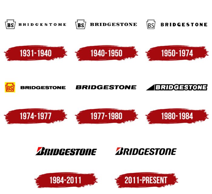
The name of this enterprise comes from the language tracing of the name of the founder Ishibashi: “ishi” – “stone,” “bashi” – “bridge.” That is, in fact – a “stone bridge.” He laid the foundation for an unusual image on the logo in the form of two connected trapeziums – large and small. They convey the configuration of a reliable bridge made of durable material. The color palette of the symbols is simple, indicating the company’s seriousness. To date, there are eight variants of Bridgestone’s visual identity.
What is Bridgestone?
Bridgestone is a Japanese company that produces components and spare parts for cars and trucks. It is in first place in the world in the manufacture of tires. The founder of the enterprise is Shojiro Ishibashi, who opened it in 1931 in Kurume (Fukuoka Prefecture). Now it is the largest international corporation with 181 industrial sites in 24 countries.
1931 – 1940
The debut emblem was simple. It contained only two components: a miniature icon and the manufacturer’s name. The first was a complex graphic image composed of two trapezoids encircled by a thin black line around the entire perimeter. With the same color, the designers painted the letters “BS” inside, an abbreviation for the word “Bridgestone.” On the right was the name of the Japanese company. It was typed in a custom font with miniature serifs.
1940 – 1950
During that period, the developers of the Bridgestone logo made some corrections to it. First of all, they chose a different font – expressive and distinct, with large bold letters decorated with short serifs.
1950 – 1974
In 1950, another attempt was made to improve typography to make the visual identity of the Japanese corporation look more impressive. Therefore, the designers proposed massive letters – even, smooth, without serifs. The changes also affected the icon, which was on the left. Thin frames were used for it, and the glyphs in the center became elongated upwards. But the structure of the emblem was completely preserved.
1974 – 1977
The logo, one might say, has radically changed:
- He received color.
- The designers changed the elongated font to a flattened one.
- They added a square.
As a result, the icon was colored in black, yellow, and red, making the inscription wider and denser. However, due to the narrow inter-character space, the name of the Bridgestone company was hard to read, even in the upper case.
1977 – 1980
The icon disappeared from the Bridgestone logo, and the letters were, on the contrary, enlarged, which is why they occupied the entire space. In addition, the authors of the logo worked on the style of the inscription, as a result of which it received a right-sided slope. But the designers kept the smoothness of the letters.
1980 – 1984
To modernize the logo and elevate the visual identity to new heights, the developers used the technique of negative space. They circled each letter with a thick black line, leaving a white void inside. As a result, the glyphs were connected. On the left, a dark triangle was added, laid on one edge, and the other was in front of the letter “B” and was aligned with it in height.
1984 – 2011
PAOS, Inc has developed a new identity for Bridgestone. It changed absolutely everything – from the font to the graphics. For example, the triangle was recolored red, flipped, and made a “B” element. It was at the top left and replaced the corner of the letter. The glyphs were presented in the style of Nightwraith Italic – rounded, streamlined, sans-serif, with a point in the inner space.
2011 – today
The current version of the logo is based on the previous version. However, it has become more refined and easy to read – with rounding outside and inside. The line width of the letters is half as wide as before, although their style is retained. The only exception is “R,” in which the leg is no longer curved but straight. The color of the triangular element “B” has become darker by several tones, so now it is closer to burgundy.
Font and Colors
Bridgestone’s visual identity has evolved steadily and evenly. Its evolution took place within the framework of one form: on the right – the company’s name, and on the left – a graphic symbol. The fonts were actively changing: in each new logo, the typography was significantly different from the previous one. But the corporate palette remained unchanged and always contained monochrome.
For the emblems of the Japanese industrial corporation, the designers chose a restrained but massive typeface. In particular, these are fonts that are as close as possible to Garamond Nova Pro Ultra, Battlefin Black, Annonce Regular (or its free analog Reservoir Grunge Regular), and Nightwraith Italic. They make the inscription large and geometric, which is just right for a manufacturer of components and components for transport equipment.
The corporate palette consists of a combination of black and red in two shades. The 1974-1977 logo also used yellow. The background is neutral white. This range emphasizes the technical focus of the brand and its dynamics.
Bridgestone color codes
| Lust | Hex color: | #e2231a |
|---|---|---|
| RGB: | 226 35 26 | |
| CMYK: | 0 85 88 11 | |
| Pantone: | PMS Bright Red C |
| Black | Hex color: | #000000 |
|---|---|---|
| RGB: | 0 0 0 | |
| CMYK: | 0 0 0 100 | |
| Pantone: | PMS Process Black C |


