


![]() Bring Me the Horizon Logo PNG
Bring Me the Horizon Logo PNG
Designers infused the Bring Me the Horizon logo with energy and aggression to reflect the rock band’s style. The dynamic shapes symbolize ongoing creative development, while the abstract images are associated with mixing various musical genres. This emblem design conveys BMTH’s creative approach to art.
Bring Me the Horizon formed in Sheffield in 2004, when Oliver Sykes, Lee Malia, Curtis Ward, Matt Kean, and Matt Nicholls started a band built around extreme music. Sheffield already had a strong rock background through artists as different as Def Leppard and Arctic Monkeys. Still, BMTH came from a harsher deathcore scene.
Their debut album, Count Your Blessings, was released in 2006 on Visible Noise. It gave the band a place in British heavy music, though critics often called the sound raw and derivative. The real step forward came with Suicide Season in 2008, where production improved, the writing became more personal, and the band began reaching audiences in the United States. In 2009, Jona Weinhofen joined as rhythm guitarist.
The 2010 album There Is a Hell, Believe Me I’ve Seen It. There Is a Heaven, Let’s Keep It a Secret introduced electronics and orchestral textures into the metalcore base. Sempiternal followed in 2013 after Weinhofen left, marking a shift toward alternative metal with electronic elements. The album reached number three in the UK chart, while Sykes publicly spoke about his drug addiction.
That’s the Spirit, released in 2015, moved further from metalcore toward alternative rock and pop-rock. The change divided older fans but brought in a larger audience, often compared to Linkin Park’s move from nu metal to broader rock. Amo reached number one in the UK in 2019, adding pop and electronic influences. POST HUMAN: SURVIVAL HORROR arrived in 2020 with heavier material, guest artists, and large-scale production.
Meaning and History
![]()
The primary logo of Bring Me the Horizon features the band’s name in graffiti-style lettering. According to vocalist Oliver Sykes, it was inspired by a line from the final episode of Pirates of the Caribbean: “Bring me that horizon,” spoken by Jack Sparrow. The musicians felt this quote perfectly expressed their desire to travel and perform concerts worldwide. It embodies a thirst for adventure and a wish to see everything on the planet. The rock band aims to break out of conventional boundaries, as evidenced by their experimental genre fusion and recognizable emblem. BMTH’s creative potential is manifested in everything from music to visual identity.
What is Bring Me the Horizon?
Bring Me the Horizon is a musical group working in pop-rock, synth-rock, alternative, and metalcore genres. Formed in 2004, its members, then aged 15 to 17, signed with Thirty Days of Night Records. The British band is renowned for its original arrangements, emotional lyrics, and innovative sound, anchored by Oli Sykes’ powerful vocals. BMTH has many successful albums, including Post Human: Survival Horror, Amo, and That’s the Spirit.
2004 – today
![]()
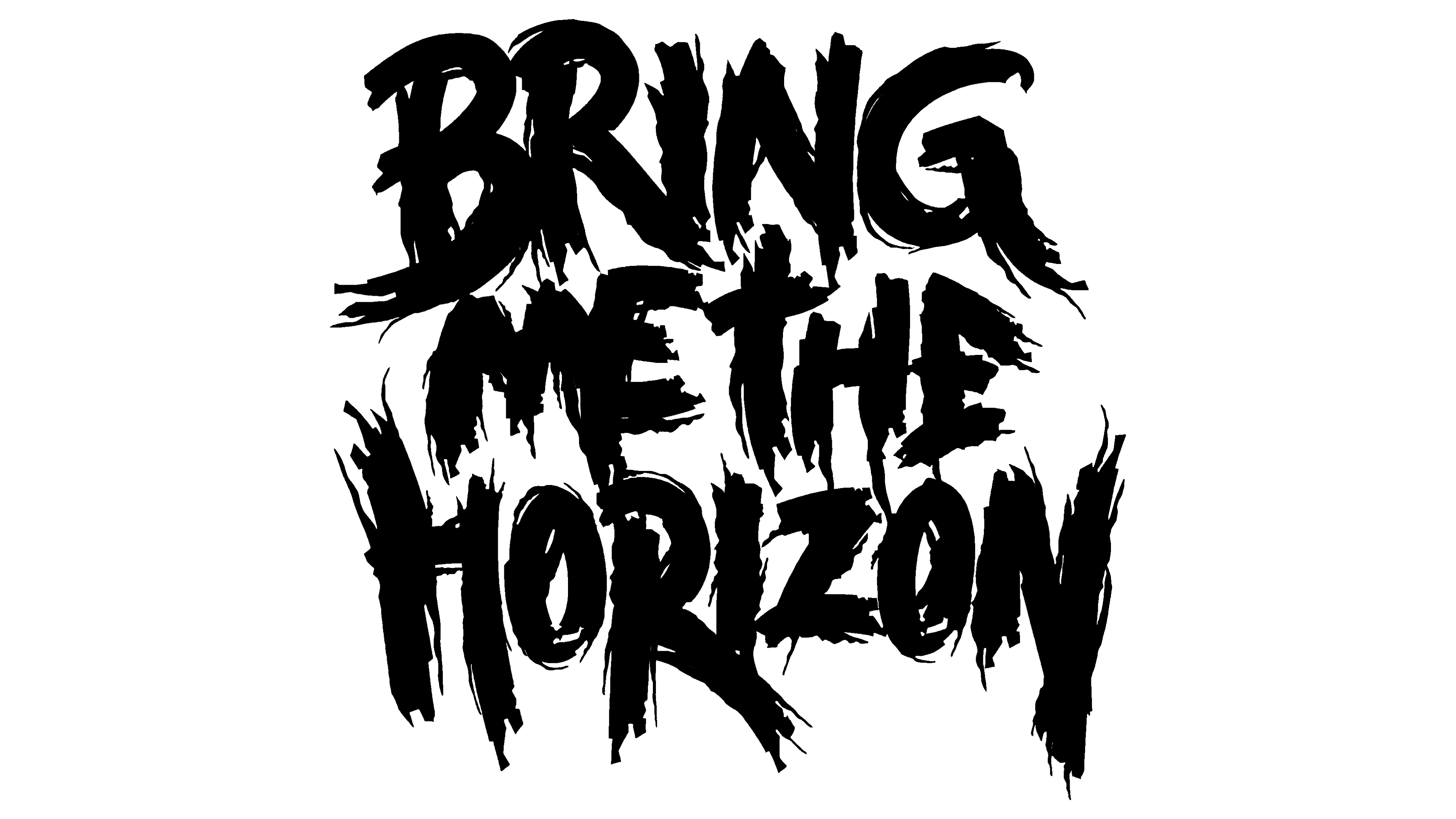
The Bring Me the Horizon logo resembles graffiti because it is done in a characteristic style. The band’s name is divided into three levels. The large words “BRING” and “HORIZON” are positioned at the top and bottom, with the smaller “ME” and “THE” in between. All letters are uppercase, but the initials “B” and “H” are further enlarged. The font resembles Gothic due to split strokes, slanted cuts, and decorative protrusions. Geometric patterns are depicted around it, appearing as an extension of the glyphs.
The white inscription is in the negative space inside a large black spot. Uneven splashes and streaks of paint surround it. Graffiti is a form of street art that allows artists to express ideas and feelings. In this case, it reflects the aesthetics of the British rock band, demonstrating a rebellious character and a freedom-loving approach to music.
Symbol

Although the band “Bring Me the Horizon” has no connection to Thelemites, it uses one of Thelema’s symbols, the unicursal hexagram. This is a modified version of the Star of David that can be drawn with a single continuous stroke (hence the name unicursal). Unlike the regular six-pointed star, the lengths of the rays here vary. In the center are two diamonds formed by intersecting lines.
Such an image was originally found in the secret society Golden Dawn documents. Adepts of the magical order considered it a symbol of the Moon and Sun. Later, Aleister Crowley adapted the polygon for his occult movement. For Thelemites, this figure reflects the principle “Do what thou wilt.” That is, it encourages opposing the rules of society and religion if they hinder achieving the desired.
Bring Me the Horizon uses the unicursal hexagram as part of its artistic concept. This is an attempt to surround the musical group with an aura of mystery to intrigue fans. The ancient symbol may also reflect philosophical and spiritual aspects important to the band members, as it is associated with ideas of unity, harmony, and balance. In one emblem version, designers colored the contours of the six-pointed star in turquoise and placed it inside a black circle. Thus, the geometric figure became even more expressive.
Font and Colors
The rock band’s name consists of letters drawn in graffiti style. The logo’s creators developed a unique set of glyphs, using bold and Gothic fonts as a basis. Such an informal inscription design emphasizes BMTH’s connection with the youth subculture.
The logo’s black-and-white palette reflects the drama and expression characteristic of Bring Me the Horizon’s music. Additional colors, for example, turquoise, can be used in the unicursal hexagram. This is one manifestation of creative freedom and self-expression.
![]()