


![]() British American Tobacco (BAT) Logo PNG
British American Tobacco (BAT) Logo PNG
The British American Tobacco logo is the benchmark for negative space. Thanks to this design trick, the main elements stand out clearly against the neutral background. They attract the eye and demonstrate the brand’s key direction: its commitment to innovation and its willingness to improve the quality of its tobacco products.
In the late 1890s, American tobacco magnate James Buchanan “Buck” Duke pushed into Britain by buying Ogden. Thirteen British firms, led by H.D. & H.O. Wills, responded by forming Imperial Tobacco Company. The price war ended with a market-sharing agreement that led to the creation of British American Tobacco.
British American Tobacco Company Ltd was registered on September 29, 1902. American Tobacco received two-thirds of the capital, while Imperial Tobacco held one-third. American Tobacco agreed to stay out of Britain, Imperial stayed out of the United States, and BAT handled the rest of the world. From the start, it inherited factories and assets in China, Germany, Canada, Australia, South Africa, Japan, and New Zealand.
BAT expanded quickly across the West Indies, India, Egypt, Scandinavia, Indonesia, and East Africa. China became one of its main markets. By 1919, the Shanghai factory was producing more than 243 million cigarettes a week. In 1937, BAT made and distributed 55 billion cigarettes in China.
In 1911, the U.S. Supreme Court broke up American Tobacco, forcing it to sell its stake in BAT. BAT was listed on the London Stock Exchange and came under British leadership. World War II and China’s 1949 revolution damaged the business, and BAT left China in 1953. In 1994, it bought American Tobacco, gaining Lucky Strike and Pall Mall. In 1999, the merger with Rothmans brought Dunhill and Kent into the fold. In 2017, BAT bought the remaining stake in Reynolds American for about $49 billion, strengthening its position against Philip Morris International.
Meaning and History
![]()
Even though the company was founded back in 1902, only three versions of the logo were presented to the target audience. Minimal changes have been made to the new variants, making the British American Tobacco emblem more modern and confident. The brand’s visual recognition is extremely high, driven by the worldwide demand for tobacco products.
What is British American Tobacco?
It is the world leader in tobacco product sales and owns many world-famous brands. More than a hundred years of history have made it extremely popular with millions of customers worldwide.
1902 – 1992
![]()
The original version of the logo appeared sometime after the company’s founding. It was an emblem with a blue-and-white color palette. The base was square with significantly rounded corners. The upper part, which occupied 2/3 of the total volume, was painted blue and depicted a tobacco plant with three leaves. The lower part, painted white, bore a verbal inscription: the company’s abbreviation, “BAT.” The name is in classic bold serif type. All uppercase letters look powerful and confident, drawing the attention of potential buyers.
1992 – 2020
![]()
The first redesign took place almost 100 years after the corporation’s founding. The new version made the logo more modern and progressive. The key change was the removal of the square shape. The two elements, namely the tobacco plant and the verbal inscription, had no boundaries between them. Moreover, orange, not blue, was used for the emblem, allowing tobacco leaves to be associated with the sun’s rays. Thus, the British American Tobacco logo was given an optimistic tone, making it more attractive.
The verbal inscription, in turn, represented not the company’s abbreviation but its full name. A modern and attractive semi-serif typeface was used. All letters, except for those with which new words begin, are in lower case. Their pointed corners are also associated with the sun, and therefore, many users feel a sense of unity between the inscription and the emblem. Moreover, blue and orange colors contrast well and complement each other.
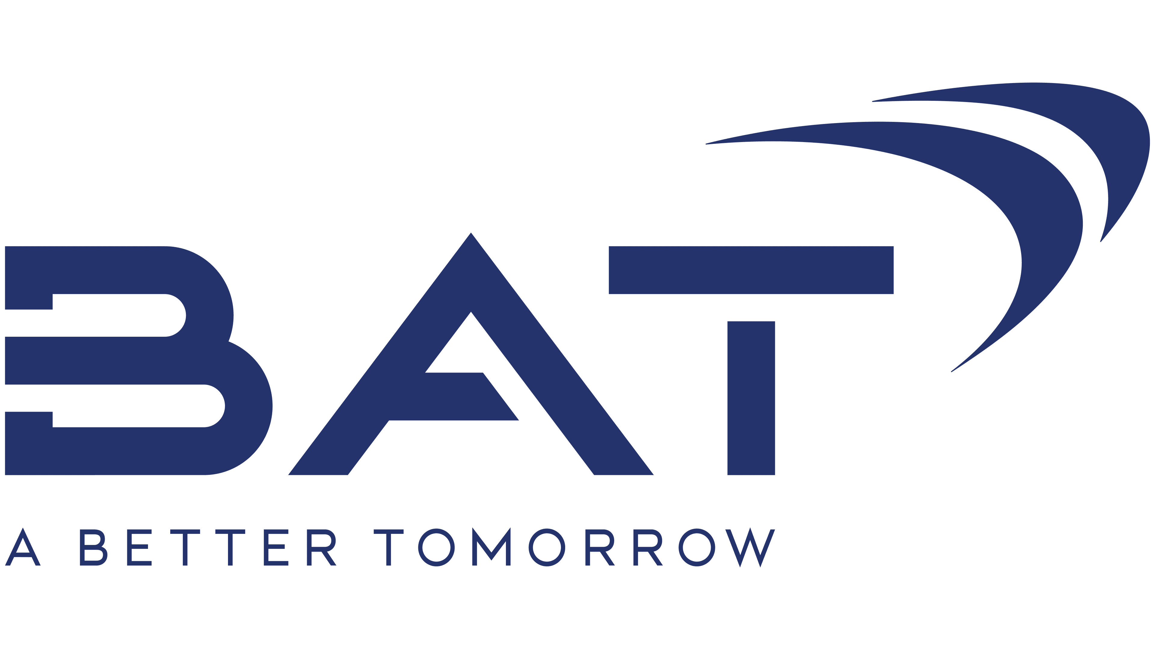
2020 – today
![]()
The 2020 redesign changed the logo as much as possible. After all, the tobacco tree emblem has been completely removed. Consequently, the company’s emphasis was on minimalism. In addition, the abbreviation was again used. The font also succumbed to significant changes. The shape of the letters has become more unique and unusual. The glyphs of the stenciled letters contained empty spaces, adding to the mystique.
Above and to the right of the “T” are two arcuate lines. If we analyze the release of this BAT logo, these arcs indicate the unification of the company’s international and national businesses.
Interestingly, many users and specialists disliked this version of the British American Tobacco logo. Not only because of the unusual forms of writing letters, but also because of the translation of the abbreviation, which is associated with the “bat.” According to most, the coronavirus disease originated because of this flying rodent.
Font and Colors
Given that the logo redesigns occurred after significant periods, the font used also underwent significant changes. For example, the second version used an elegant and modern semi-serif typeface. However, the 2020 version was updated to a mysterious, unusual style that the target audience interpreted in ambiguous ways.
In most variants, British American Tobacco used a white-and-blue color palette with slight hue variations. This color combination is what millions of smokers associate with the company’s activities. The only exception was the second version, which featured an orange tobacco tree with leaves painted in a pattern resembling the sun’s rays.