The emblem burns like a torch, demonstrating the company’s gas reserves. The British Gas logo symbolizes life and development, which is possible thanks to the supply of electricity and blue fuel.
British Gas: Brand overview
| Founded: | 1986 (as British Gas plc), February 1997 (as a subsidiary of Centrica) |
| Founder: | Centrica |
| Headquarters: | Staines-upon-Thames, England, United Kingdom |
| Website: | britishgas.co.uk |
Meaning and History
After privatization, the company changed its corporate style several times with great care. Its leaders did not want the new identity to distort the organization’s essence, so experimenting with logos was limited to modernizing the type and design. The main elements – the lettering “British Gas” and the flame – took on different shapes and colors from time to time.
Now it is a public utility company that provides household services, provides homes with gas and electricity. However, it continues to call itself British Gas and uses the fire emblem. Commitment to tradition reflects the company’s 200-year history, as it began with the gas industry. Once, the brand owners tried to add a globe to the logo so that it would be the embodiment of international status and global aspirations. But this attempt was unsuccessful: the new symbol, rejected by society, was not even used.
What is British Gas?
British Gas is a utility company that serves the population of the United Kingdom. Despite poor reviews and low ratings, the company provides gas and electricity to around 12,000,000 customers, remaining a market leader. Its history dates back to 1997, when it separated from BG Group. At that time, the retail brand British Gas became the property of Centrica.
1986 – 1995
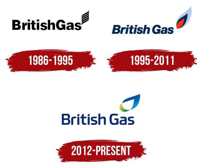
After the Gas Act 1986, which allowed for the privatization of gas supplies, British Gas Corporation was replaced by British Gas plc. The new organization adopted a black and white logo that mentioned its name. The words were written together, but the capital “B” and “G” visually separated them. Above Gas was an abstract flame of five sinuous lines.
1995 – 2011
In 1995, two years before the collapse of British Gas plc, there was a small readiness. The fire has taken on a teardrop shape. Moreover, this version consisted of three parts: red, dark blue, and blue. On the left, as before, was the name of the company. But now, there is a gap between the words, and the font is blue and italic. The logo has been in use for 16 years and has not changed even after it was split into several parts, and Centrica took over the British Gas brand.
2012 – today
The company modernized its corporate identity in the fall of 2011. The changed look was implemented until January 2012. The logo was developed by the marketing agency CHI & Partners, which had previously been involved in advertising for British Gas. The flame has taken on a more abstract form after the update: it looks like a blue-green ribbon with space inside. The lettering is also unusual because the designers have created a stylized typeface with rounded and cut strokes.
British Gas: Interesting Facts
British Gas is part of Centrica plc, a major UK energy and home services company with a long history.
- Early Beginnings: Founded in 1812 as the Gas Light and Coke Company by Frederick Albert Winsor, it was the first public utility company. It brought gas lighting to London and later became British Gas in 1948 after the government took control.
- Changes Over Time: In 1948, the UK gas industry merged into one under the government. However 1986, British Gas became a private company, leading to more competition and efficiency in the energy market.
- Innovation: British Gas has pioneered natural gas exploration, particularly with the North Sea gas fields, enhancing the UK’s energy supply and economy.
- Becoming Private: The 1980s privatization marked a major change, with British Gas splitting into different entities, including Centrica plc, which kept the British Gas retail brand.
- Broad Services: In addition to supplying gas and electricity, British Gas offers boiler installations, repairs, and home insurance, catering to various customer needs.
- Renewable Energy: The company actively supports the shift to renewable energy, offering solar energy products, electric vehicle charging, and energy-saving services to homes and businesses.
- Smart Home Tech: British Gas has embraced digital advances with smart meters and the Hive smart home range, allowing customers to control their heating, lighting, and security remotely.
- Energy Efficiency: It participates in schemes to help improve home energy efficiency and reduce bills, offering advice, assessments, and financial support for insulation and heating system upgrades.
- Helping Vulnerable Customers: British Gas runs programs like the British Gas Energy Trust to help those struggling to pay their energy bills.
- Future-Focused Research: The company invests in research on low-carbon technologies and collaborates with various organizations to explore new energy solutions, including energy storage and renewable generation.
British Gas has shown a strong commitment to innovation, customer needs, and environmental goals, starting with gas lighting and leading in energy supply and services.
Font and Colors
Although British Gas has long since expanded its business, its emblem still features fire. True, it is leaf-shaped, reflecting its broad offerings in the energy industry and its environmental awareness. Negative space forms another flame – a smaller one.
Older logos used the classic Helvetica font – first straight, then italic. The new typography has been redesigned to replace the British style with custom designs. The narrowing of the “G” gives the impression that “a” and “s” are moving. The dots above the “i” are neither round nor square. They correspond in shape to the cut and rounded tops “r,” “t,” and “h.”
The color scheme of the logo looks fresh. It includes several shades of blue (# 0490D7 to # 0462B4) and green (# AFCC43 to # 299940), which are presented as a gradient. The inscription, in turn, is dark blue (# 012973).
British Gas color codes
| June Bud | Hex color: | #afcc43 |
|---|---|---|
| RGB: | 175 204 67 | |
| CMYK: | 14 0 67 20 | |
| Pantone: | PMS 374 C |
| Pigment Green | Hex color: | #299940 |
|---|---|---|
| RGB: | 41 153 64 | |
| CMYK: | 73 0 58 40 | |
| Pantone: | PMS 7739 C |
| Rich Electric Blue | Hex color: | #0490d7 |
|---|---|---|
| RGB: | 4 144 215 | |
| CMYK: | 98 33 0 16 | |
| Pantone: | PMS 2925 C |
| Denim | Hex color: | #0462b4 |
|---|---|---|
| RGB: | 4 98 180 | |
| CMYK: | 98 46 0 29 | |
| Pantone: | PMS 7455 C |
| Dark Sapphire | Hex color: | #012973 |
|---|---|---|
| RGB: | 1 41 115 | |
| CMYK: | 99 64 0 55 | |
| Pantone: | PMS 280 C |


