 British Midland International Logo PNG
The logo for British Midland International (BMI), previously a major domestic and international carrier in the UK, represented the airline’s extensive network and commitment to serving passengers across Europe and beyond. Designed to convey reliability and professionalism, qualities the company prides itself on, the emblem reflects the airline’s evolution from its origins as Air Schools Limited to a significant player in the British aviation industry. The design symbolizes the brand’s role as a connector of cities and cultures, facilitating business and leisure travel with a focus on excellent customer service.
British Midland International: Brand overview
British Midland was established in 1949 under the name Derby Aviation Limited. At first, it concentrated on aircraft maintenance at East Midlands Airport, charter flights, and pilot training. After changing its name to British Midland Airways in 1959, the company started offering frequent passenger service between East Midlands, Birmingham, Manchester, Glasgow, and Edinburgh airports.
The company focused on regional services connecting UK cities as it progressively grew its route network in the 1960s. The airline added new turboprop aircraft like the Fokker F27 and Vickers Viscount. By the decade’s end, the brand operated roughly 20 domestic routes.
The airline kept up its explosive growth in the 1970s. The company started operating international flights to places in continental Europe after receiving its first jet aircraft, the BAC 1-11. The first international route was established in 1975, from East Midlands to Amsterdam. Larger Boeing 737 and 707 planes were added to the fleet.
The company’s expansion picked up speed in the 1980s. The airline swiftly expanded its footprint once it started running flights at London’s Heathrow Airport. New Boeing 737-300 and wide-body Boeing 767 aircraft were added to the fleet. The route network spread to major European business hubs and resorts around the Mediterranean coast.
Following the purchase of the brand by brothers Michael and Peter Bishop, the company was privatized in 1992. Under their direction, the airline continued its rapid expansion at Heathrow, gaining over 14% of the available slots. With flights to Chicago and Washington, the route network considerably grew, reaching over 30 cities in the UK, Europe, and the USA. The company’s 2000 admission into the international Star Alliance was a significant turning point.
British Midland changed its name to BMI British Midland and then just BMI in the late 1990s and early 2000s. Under the new branding, the airline positioned itself as a premium service provider for business travelers and wealthy customers. During this time, the company purchased new Embraer ERJ-145s and Airbus A320 and A330 aircraft, enabling route network optimization and increased operational efficiency.
However, starting in the middle of the 2000s, low-cost airlines, especially EasyJet and Ryanair, started to put more and more pressure on the company due to competition. As a result, the airline’s financial performance gradually declined. German airline Lufthansa purchased a 50% interest in the brand in 2007 and increased that ownership to 80% in 2009.
While under Lufthansa’s management, unsuccessful attempts were made to reform the company and bring it back to profitability. In 2011, due to mounting losses, the airline decided to sell. British Airways (BA), a British airline that had long aimed to solidify its position at Heathrow, was the primary competitor.
The agreement to sell the company was finalized in April 2012. For £172.5 million, British Airways purchased the struggling airline’s assets. As a result, BA secured an extra 56 slots at Heathrow, further establishing its superiority at this important London airport. British Airways incorporated most of the brand’s fleet and routes into its operations.
Meaning and History
What is British Midland International?
It is a British airline based in the United Kingdom. It operates flights connecting the United Kingdom to Europe, the Middle East, Africa, and Asia. Known for its high service standards, it offered various classes of service, including economy, premium economy, and business class. The airline was recognized for its frequent flyer program and amenities for business travelers. It was eventually acquired by International Airlines Group (IAG) and integrated into British Airways, ceasing operations under the BMI brand.
1956 – 1964
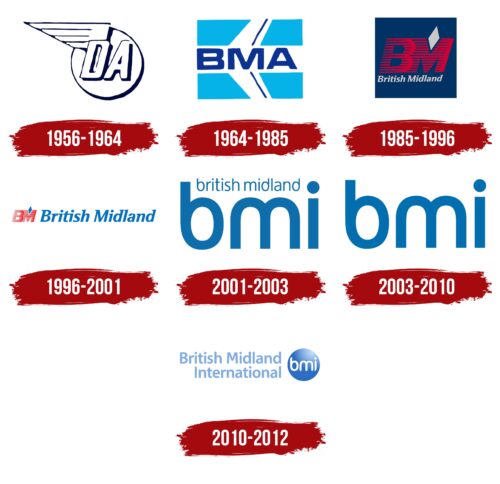
From 1956 to 1964, British Midland International, initially established by a flight training school in Derby, used a logo that reflected its roots and specialization. The logo visually represented the company’s mission and close connection to the aviation industry.
The central element of the logo, a circular symbol representing the globe, symbolized the company’s global ambitions and its aim to connect different parts of the world. This element highlighted the international scope of British Midland International’s activities despite its relatively modest size in the early stages.
The abbreviation “DA” on this symbol stood for Derby Aviation, pointing to the company’s origins in Derby, where the flight school was established. This detail in the logo reminded the company of its initial focus on pilot training and development, which was foundational for its subsequent growth in the aviation sector.
A wing positioned next to the letter “D” strengthened the logo’s association with aviation. This element left no doubt that the company’s activities were closely linked to flying and aviation technology. The wing symbolizes speed, mobility, and the aspiration to reach new heights, all key attributes of any airline.
1964 – 1985
After renaming British Midland Airways, the airline introduced a new logo reflecting its current status and ambitions. The central element of the logo was the abbreviation “BMA,” which was placed on the image of a pristine white airplane. This airplane, depicted against a blue sky, seemed to float like a cloud, evoking a sense of lightness and freedom of flight.
A distinctive feature of the design was that the airplane was shown without visible front and rear ends, as if it did not fit within the bounds of the space. This technique drew attention to the uniqueness of the design and symbolized the company’s large ambitions to exceed the ordinary and continuously expand its boundaries. The hint of an incomplete image of the airplane emphasized British Midland Airways’ dynamic growth and expansive strategies, including acquisitions of competitors and expanding its impact on the aviation market.
The logo was square, which gave it an appearance of solidity and stability, associated with the flags of major national or international organizations. This shape and style of the emblem symbolized British Midland Airways’s power and stable position as a significant player in the aviation arena.
1985 – 1996
In 1985, British Midland significantly strengthened its brand by selecting dark blue as the primary color for its livery and logo. This shade of blue was chosen deliberately: it is associated with reliability, authority, and stability, aligning perfectly with the company’s image as it aimed to emphasize its dominance in the skies.
Dark blue paid homage to the British flag, highlighting the airline’s national identity and deep roots in the United Kingdom. Against this backdrop, red capital letters “BM,” adorned with stripes, were placed to create a visual effect reminiscent of wind streams. These elements enhanced the design’s dynamism and symbolized the company’s speed and aggressive pursuit of growth.
Beneath the abbreviation “BM,” the company’s full name—British Midland—was displayed in gray. The gray color was chosen for this text because it is associated with airplane metal, underscoring the company’s aviation specialization and technological equipment.
The logo’s special attention is given to a gray diamond positioned above the letter “M.” This feature serves as a distinctive accent in the design, emphasizing British Midland’s uniqueness and leadership qualities. The diamond symbolizes quality and excellence, crucial for an airline striving to be a leading player in the market.
1996 – 2001
The company’s emblem design features conciseness, rigor, and elegance. This approach was deliberately selected to highlight the company’s new service direction—introducing business class on domestic flights. This development signifies the airline’s commitment to satisfying the growing demands of business passengers who prioritize comfort and functionality.
In redesigning the logo, the company moved away from the bulky rectangular backgrounds common to many airlines. Instead, it adopted a more restrained and elegant approach, focusing solely on the red letters of the abbreviation executed in a distinctive style. The company name is rendered in a light blue serif font, which adds visual lightness and professionalism to the logo.
The emblem resembles a business card: it is restrained and professional, aligning well with an airline’s image that aims to offer it’s clients high-quality service and flights. The clean lines and absence of extra elements in the logo design emphasize the company’s professional and serious approach to its activities, highlighting its dedication to innovation and excellence.
2001 – 2003
After joining the international aviation alliance Star Alliance, the airline needed to rethink its brand identity to better align with global markets and avoid confusion with other brands. Market research showed that international passengers rarely associate the name “Midland” with the United Kingdom or an airline. In contrast, locals often confused “British” with British Airways and “Midland” with Midland Bank.
In response, the company made a strategic decision to abbreviate its name to “BMA,” which is easier to remember and maintains brand recognition at an international level. The new logo, featuring three large blue letters, was designed to reflect the company’s modernity and dynamism. The smooth curves of the glyphs resemble the maneuvers of airplanes in flight, emphasizing the connection to the aviation industry and mobility.
The company’s former full name was added above the new logo in a light font to ease the transition period and maintain a connection to its past. This design choice helps existing customers adjust to the new brand identity while preserving the company’s recognizability.
The new logo design emphasizes simplicity and ease, making it ideal for the modern passenger looking for a reliable and straightforward carrier.
2003 – 2010
As part of a new branding phase, the airline further simplified its logo, focusing on minimalism and modernity. The letters of the logo became slightly lighter, adding elegance and visual lightness, enhancing perception and making it more appealing to the modern passenger.
This color change refreshed the appearance and reflected the company’s commitment to innovation and adaptation to current design trends. Light tones symbolize the brand’s accessibility and friendliness, highlighting its openness and readiness to serve a wide range of customers.
The company’s full name was removed from the logo, further simplifying the design. This decision emphasizes the brand’s confidence in its recognizability by initials alone and its desire to ensure cleanliness and simplicity in its visual presentation. Now, as light and minimalist as possible, the emblem reflects modern design trends where less is more.
2010 – 2012
The Bmi airline logo, effectively used to strengthen its brand internationally, visually represents a blue sphere that symbolizes the Earth. This sphere is illuminated on one side by the bright light of the Sun, which adds depth and dynamism to the logo. This image highlights the global scale of the company’s operations and its presence on all continents, reinforcing Bmi’s image as an international carrier.
The white letters of the abbreviation “bmi” placed on this terrestrial globe further emphasize the airline’s universality and global reach. They stand out brightly against the blue background, highlighting the ease and accessibility of flights worldwide.
The company’s full name, “British Midland International,” is written on the left side of the logo in airy, semi-transparent letters. This writing style creates the impression that the words are woven from the air, enhancing the association with the aviation industry and the ease of flights. This technique serves as a gentle reminder of the carrier’s full name, keeping the brand in the minds of consumers and enhancing its memorability.
FAQ
Does British midlands still exist?
The airline company formerly known as British Midland International (BMI) no longer operates independently. It underwent several transformations, and in 2012, International Airlines Group (IAG) acquired the company and merged it with British Airways, ending its independent status.
Following the merger, British Airways absorbed all aspects of the company, including its flights, staff, and aircraft. The acquisition significantly strengthened British Airways’ position, particularly at London Heathrow Airport, where it had a strong presence. British Airways is now considered one of the dominant airlines at Heathrow, second only to the larger airline conglomerate managed by IAG.
Who owns British Midland?
The company, formerly British Midland International, known as BMI, was once an independent airline but has undergone numerous ownership changes. In 2012, it was acquired by International Airlines Group (IAG). Before this transition, the majority stake in the company belonged to the large German airline Lufthansa. Due to financial problems, Lufthansa sold the company to IAG, which owns British Airways. Following the acquisition, it was integrated into British Airways and ceased to exist separately. The company’s former operations and assets are now incorporated into British Airways as part of the overarching IAG structure.
When did British Midland stop flying?
It ceased operations on October 27, 2012, after merging with British Airways. Established in 1938 as Air Schools Limited, the airline has undergone many changes. It began operations as British Midland Airways on 1 October 1964 and was renamed BMI British Midland on 1 February 2001. The company was a well-known airline in the United Kingdom, operating primarily from London Heathrow and Manchester airports. The merger with British Airways resulted in the company ceasing to operate as an independent airline, and its routes, workforce, and operating assets were merged with those of British Airways.
