 British School of Motoring Logo PNG
The British School of Motoring logo is modern and vibrant. It promises easy and free handling of cars. Each curve of the emblem resembles a road that motorists will travel on. In their classes, they will learn to master straight tracks and sharp turns.
British School of Motoring: Brand overview
The British Driving School (BDS), one of the first in the UK, began in London in 1910 under the direction of S.C.H. Roberts. The school initially catered to the elite, including aristocrats and prosperous professionals, and trained chauffeurs in specially designed dual-control cars.
With the advent of the 1920s and the proliferation of automobiles to the general public, BSM adapted to the new environment by extending driver training to the broader community.
During the turbulent years of World War II, BSM changed its focus, temporarily discontinuing civilian training and concentrating on specialized “military driving” courses. This allowed military personnel to drive their vehicles skillfully.
The post-war boom of the 1950s and 60s and the compulsory introduction of the UK driving test in 1935 fueled BSM’s growth. On the wave of growing prosperity, the company expanded its influence to the whole UK.
The second half of the XX century was a period of further development for BSM: it joined small regional driving schools and opened new training centers. This expansion strengthened BSM’s position in the market.
A significant milestone in the company’s development was the merger of BSM with AA Driving School in 1999. The merged company became dominant in the British driver training market, training over 500,000 novice drivers annually.
BSM operates as an important segment of the AA, with over 300 operating locations. True to founder Roberts’ vision, it is committed to improving knowledge and road safety.
Over the past century, BSM has evolved from a niche chauffeur training institution to a comprehensive educational institution. BSM now offers a multifaceted training program that includes beginner lessons, modernized testing, and refresher courses. BSM has trained countless British drivers through these services, blazing a unique trail in the country’s driving history.
Meaning and History
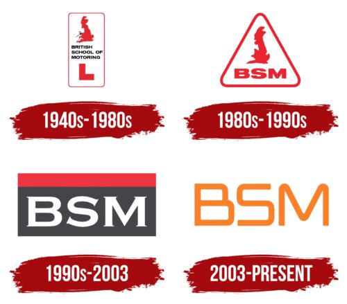
1940s – 1980s
The first emblem of the school was an elongated rectangle with rounded corners, resembling a road information sign.
At the top was a red silhouette of England and, next to it, a car steering wheel. This image indicates that the school offers training and licenses for driving within the country.
In the center, the school’s full name is displayed in black capital letters, clearly visible to traffic. Below this, the letter L is shown, which in England denotes the license plates of beginner drivers. A plate with the letter L would be attached to the front bumper to indicate a learner.
The red and white color scheme matches the colors of the English flag. The contrasting shades make the logo look festive and appealing.
1980s – 1990s
The new emblem, designed to represent views on driving education, encountered several design issues that made it difficult to perceive—using monochrome red as the primary color was too harsh and could be off-putting since red signifies danger or caution, which isn’t always suitable for a learning environment that requires calm and focus.
The issue was compounded by the unclear silhouette of England in the design, which appeared too blurred and shapeless. This makes it difficult for viewers to understand what is represented on the logo and how it relates to the driving school’s activities. The image’s ambiguity and lack of clarity significantly impair the overall logo perception and can diminish its effectiveness as a visual identification.
Changes to the emblem’s shape were related to introducing new learner signs, now represented by letters in a white triangle with a red border. This design move demonstrates that the vehicle is used for driving instruction and belongs to a driving school. Such symbolism is important for ensuring road safety as it informs other road users that there is a novice driver.
While the large red letters of the abbreviation on the emblem are clear and easy to read, the lack of their explanation can make their meaning unclear to those unfamiliar with the context or specifics of the driving school.
1990s – 2003
The 1990s emblem, designed for driving schools, uniquely combines elements reminiscent of a license plate with a headlight feature. The visual design of this emblem was thoughtfully crafted to meet functional requirements while being memorable. A red stripe on the emblem alerts other road users that a learner operates the vehicle. This design aspect is crucial for road safety as it signals special driving conditions.
Large white letters on a gray background symbolize asphalt and create a clear and visible contrast. These letters stand out against the background and glow in the dark, enhancing the sign’s visibility at night and in poor weather conditions. This is particularly valuable for ensuring safety while driving in challenging conditions.
The white letters symbolically indicate that the driver is a novice, just beginning to learn driving skills. Using this color in the emblem’s design aids in quickly and easily identifying new drivers on the road, which is essential for preventing potential traffic accidents.
2003 – today
The logo uses a shortened version of the name, making it minimalistic. The abbreviation “BSM” is in bold type. The letters are capitalized, chiseled, and stretched horizontally, which gives them a worm-like appearance reminiscent of the NASA emblem. The upper part of the letter “B” sharply differs from the lower part in that it is smaller and shorter. All glyphs have rounded ends and smooth curves. The main color of the sign is dark orange, symbolizing activity, perseverance, and belief in oneself.
The dark orange color resembles a warm fire—it attracts the eye but does not dazzle. The letters’ curves resemble small smiles, giving a friendly look even with their businesslike nature. The logo is simple yet powerfully energizing, like a delicious cookie requiring only a few ingredients.


