The simple structure in which the bicycle manufacturer’s logo is designed emphasizes the general accessibility of its products. At the same time, the Brompton logo is robust, stylish, and unique. The shape of the glyphs is similar to that of the frame structure, which makes the inscription easy to grasp. And the sleek lines add balance to the mark.
Brompton: Brand overview
| Founded: | 3 June 1976 |
| Founder: | Andrew Ritchie |
| Headquarters: | Greenford, Greater London, England, UK |
| Website: | brompton.com |
Meaning and History
When it comes to visual brand recognition, it is at a high level. This was made possible through minimal changes to the logo, which has already become familiar to the target audience. Changes were made more than once, and they did not concern the main image but the addition of emblems in the form of three bicycles in different positions. The main emphasis is on the retro style, which should make potential customers nostalgic for the 60s when a bicycle was the only means of transport for many.
What is Brompton?
They are quality bicycles from a famous British brand which has been producing this means of transport for more than 40 years.
Old
The first Brompton logo consists of the company’s name written in a massive, bold serif typeface on every letter except the T. The font appears to be typical of the 1970-1980 period. The entire inscription is made in capital letters, which gives it even more massiveness and strength. Overall, the logo looks simple and concise yet evokes a sense of reliability and quality, which is ideal for a company that makes high-quality folding bikes. All these details have helped create a recognizable brand that many people have come to love over the years of its existence.
before 2019
The original Brompton logo is quite minimalistic. It’s wordy lettering inside a rectangle with thick black outlines. In turn, the name is readable thanks to its balanced style and ample letter spacing. As a result, the logo looks cohesive and confident.
The clear and attractive serifs with rounded outlines should make many people think of bicycle wheels. If you abstract away from the name and try to get to the bottom of it, the logo is reminiscent of the design of the first bicycles produced at the beginning of the last century. The white and black color scheme makes the image austere, but it conveys to customers the very essence of the company’s work.
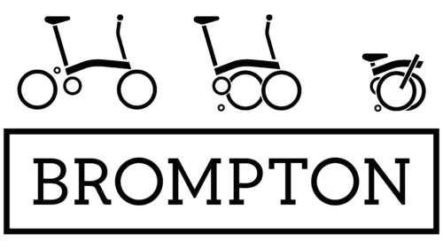
More often than not, Brompton used this version of the logo. However, sometimes schematic images of three bicycles were also added to the advertising campaign. Given that the organization specialized in folding bicycles, it is not surprising that these pictures showed them in different positions. An additional image was made using black and red lines. However, when used on a black background, the lines changed to white, which looked interesting and contrasting.
2019 – today
The new Brompton Logo adopted in 2019 includes several design changes. One of the most noticeable element is the frame that wraps around the brand name. In the new version of the logo, the smooth inner corners of this frame have been removed, giving it a sharper and more modern look.
Some changes have been made to the font used to write the company name. Although the changes are not too noticeable at first glance, this new font gives the logo a fresher and more modern look. The new font is simpler and cleaner, making the logo look more recognizable and understandable to consumers.
Overall, the new Brompton Logo design retains the core elements of the old version while updating it in line with current trends and market demands. Removing the soft corners and using a new typeface allows the logo to look more dynamic and relevant while maintaining brand recognition and visual identity.
Font and Colors
The lettering of the Brompton logo is based on classic black lettering with clear serifs that look harmonious and confident. The medium-thick lines in the lettering add elegance and make the inscription look interesting and informative in nature. If we talk about the font of the inscription, it is most similar to Gambero Regular and Full Slab SC 50 Black. Both of these fonts are done in the old style with serifs.
The logo is based on a black and white color palette. In certain cases, red lines also appear when adding schematic images of the bike. A concise range of colors shows an elegant combination that will suit any background. Thanks to this solution, the Brompton logo fits all possible textures without losing the core message directed at the target audience.
Brompton color codes
| Black | Hex color: | #000000 |
|---|---|---|
| RGB: | 0 0 0 | |
| CMYK: | 0 0 0 100 | |
| Pantone: | PMS Process Black C |


