The Brussels Airlines logo captures the essence of Belgian culture and the airline’s key role in connecting Belgium with the rest of the world. The emblem is a modern take on a beloved Belgian symbol—the dot. The design features elements that reflect a welcoming and inclusive atmosphere, mirroring Brussels’s cosmopolitan and international spirit, often referred to as the de facto capital of Europe. The logo conveys a sense of movement and connectivity, emphasizing the airline’s commitment to facilitating travel and cultural exchange.
Brussels Airlines: Brand overview
The Belgian airline Syndicat National pour l’Etude des Transports Aeriens (SNETA) was established in 1923 when Brussels Airlines’ history began. It was renamed SABENA (Societe Anonyme Belge d’Exploitation de la Navigation Aerienne) in 1929, and for most of the 20th century, it served as Belgium’s national airline. However, SABENA halted operations in 2001 due to financial issues that worsened after the September 11 attacks.
The assets of the defunct SABENA were acquired by private investors in 2002, and SN Brussels Airlines was established. This carrier took over most of SABENA’s route network, fleet, and IATA code “SN.” On February 15, 2002, the firm started flying, with routes from Brussels to locations in Europe and Africa.
Virgin Express, another Belgian airline, was established in 2001 during the same period. Owned by British entrepreneur Richard Branson, it functioned as an inexpensive airline, providing flights from Brussels to well-known European locations.
Virgin Express and SN Brussels Airlines started their merger process in 2004. The low-cost Virgin Express concept and SN Brussels Airlines’ established network carrier model were to be combined to build a more competitive and financially secure airline. The integration of the two businesses continued throughout 2005 and 2006.
The combined airline formally started flying under the new name on November 7, 2006. Virgin Group (7.3%) and SN Airholding (92.7%) were among its stockholders. The brand incorporated aspects of low-cost operations into its business strategy while keeping the corporate structure, aircraft, and route network of SN Brussels Airlines.
The company progressively upgraded and grew its fleet between 2007 and 2009. The airline began operating flights to New York and numerous African locations after acquiring new Airbus A319, A320, and long-haul A330 aircraft. The route network expanded gradually, reaching 62 destinations by the end of 2009.
In 2008, the German carrier Lufthansa purchased 45% of the company. This was critical in fostering global collaboration and incorporating the Belgian airline into a significant aviation conglomerate. Over the next few years, Lufthansa’s capital contribution to the company grew steadily.
From 2010 to 2016, the brand developed confidently. New Airbus planes were added to the fleet, and the airline’s route network grew, especially in Africa, where it rose to prominence among Europe’s top airlines. The brand’s December 2009 admission into the global aviation alliance Star Alliance was a key turning point, as it created new avenues for collaboration and joint sales with large foreign carriers.
After acquiring 55% of the company’s shares in 2016, Lufthansa took complete ownership of the Belgian airline. The company was merged into the low-cost Eurowings Group, part of the Lufthansa Group, while maintaining its operational autonomy and name.
The brand started modernizing its long-haul aircraft in 2018 and 2019. The airline’s aging A330-200 and A330-300 types were replaced with new Airbus A330-300 aircraft. This made it possible to travel longer distances and produce higher-quality products, particularly in North America and Africa.
The company had 48 aircraft in its fleet as of early 2020, and it operated routes to 77 locations across North America, Europe, and Africa. The airline, which had a well-established hub in Brussels and broad worldwide operations, firmly held a position as a significant network carrier. The brand was able to take advantage of numerous joint venture options with the biggest airlines globally through its membership in the Lufthansa Group and the Star Alliance.
Meaning and History
What is Brussels Airlines?
It is the national airline of Belgium, based in Brussels. It operates flights connecting Belgium to destinations in Europe, Africa, North America, and other regions. The company offers various classes of service, including economy, premium economy, and business class, utilizing modern aircraft and a wide range of in-flight amenities. It is a member of Star Alliance and is expanding its global reach through partnerships with other international airlines.
2006 – 2007
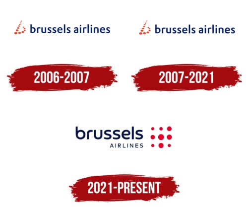
Brussels Airlines officially began its operations between 2006 and 2007 and introduced a logo that stands out among other airlines. The logo includes the company name and a unique element: the letter “b” formed from red dots. This element visually connects with the first letter of the carrier’s name—Brussels—highlighting its ties to the Belgian capital.
The logo’s design concept uses dots of varying sizes, giving it a horizontal orientation. These dots create the illusion of a road stretching into the distance, reminiscent of a runway. The circular lights illuminating the central line at night further enhance this comparison, making the logo recognizable and meaningful as it directly links the visual image to the themes of flight and travel.
The Brussels Airlines logo’s dark blue font is professional and neat, perfectly suited for the aviation industry. This choice of color is intentional, as it is associated with reliability, professionalism, and the infinity of the sky, symbolizing the airline’s commitment to high service and flight safety standards.
2007 – 2021
In 2007, coinciding with the start of Brussels Airlines’ operations, the company decided to change its logo design to adapt it to a new phase of its development. The main change involved modifying the shade of the inscription on the emblem. The previously used color was replaced with a lighter tone. This new shade was chosen to visually convey a sense of lightness and ease of travel with the airline and highlight the technical advancements in the fleet, which have become an important part of the brand development strategy.
Another dot was added to the logo’s symbolic element—the letter “b,” originally composed of red dots. This change was made in response to the superstitions of some passengers who viewed the number 13 as unlucky.
2021 – today
In 2021, Brussels Airlines introduced a new logo and livery as part of its Reboot Plus strategy. The main element is a redesigned “b,” depicted as a square with varying-sized dots. This design symbolizes global connectivity and accessibility. Each dot represents the airline’s destinations, highlighting its extensive reach from major cities to small towns.
The new logo features vibrant red and dark blue colors, symbolizing the company’s experience, reliability, and readiness to embrace new challenges. The modern, smooth, soft font emphasizes the company’s commitment to tolerance and respect for diversity among its customers and employees. The word “Brussels” is displayed in a large font, reinforcing the airline’s identity as Belgium’s national carrier and its role in connecting the country with the world.
The vibrant colors and dot pattern create a visually striking logo that reflects Brussels Airlines’ dedication to progress and excellence. The large, bold “Brussels” highlights the airline’s pride in its Belgian heritage and its importance in the global aviation industry. The overall design blends modernity and tradition, capturing the essence of Brussels Airlines’ vision for the future.
FAQ
Why is Brussels Airlines code SN?
Brussels Airlines uses the IATA code “SN,” which its predecessors, Sabena and SN Bruce Airlines, adopted.
Sabena, the national airline of Belgium from 1923 until bankruptcy in 2001, originally had the IATA code “SN.” Following Sabena’s bankruptcy, SN Brussels Airlines was created and took over Sabena’s IATA code, making it easier to continue its operations and streamline business processes such as bookings and partnerships.
When SN Brussels Airlines merged with Virgin Express in 2006, the company continued using the code “SN” to honor its Belgian origins and maintain its historical ties. Today, the airline is part of the Lufthansa Group, which has expanded its operational capabilities.
Does Brussels airline still exist?
Yes, the airline is still operating. It remains a large company in Europe and connects different parts of the world. With 38 aircraft, it offers flights throughout Europe, North America, and Africa. Such a wide range of flights shows its important role in international travel. The company is committed to providing its customers with various travel options and remains a stable part of the airline industry.
Is Brussels Airlines the same as Lufthansa?
The airline is part of the Lufthansa Group, but it is not the same as Lufthansa. The group includes other major airlines, such as Austrian Airlines, Lufthansa, and SWISS. Each operates under a different brand and provides different services, although all are owned by the Lufthansa Group based in Germany.
It is a member of Star Alliance, the largest global airline alliance, which includes Lufthansa. This membership gives passengers access to a wider network of destinations, smoother flight connections, and consistent service when flying across the alliance’s airlines.


