The Budget Rent a Car logo is a high design style plus large-scale marketing. Such an advantageous association has many positive aspects for the brand, representing car rental. The first is that the logo advertises the company’s services, and the second is that it makes it instantly memorable. The color palette speaks of reliability and convenience, and the font speaks of the wide availability of the service.
Budget Rent a Car: Brand overview
| Founded: | 1958 |
| Founder: | Morris Mirkin, Jules Lederer |
| Headquarters: | Parsippany, New Jersey, United States |
| Website: | budget.com |
Meaning and History
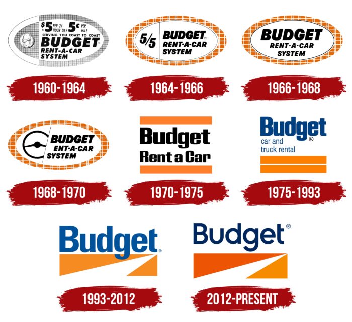
During the existence of the organization, eight logo designs were created. The first four versions were almost identical to each other, and it wasn’t until 1970 that a major redesign of the main elements was adopted. Today, the logo features only the word “Budget,” and therefore, users who have decided to rent a car for the first time may not understand that this company is the best option.
What is Budget Rent a Car?
It is a company through which anyone can rent a car in all major cities in the United States. The company has branches in every state and serves tens of thousands of customers every day.
1960 – 1964
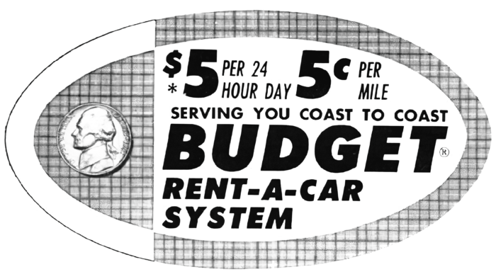
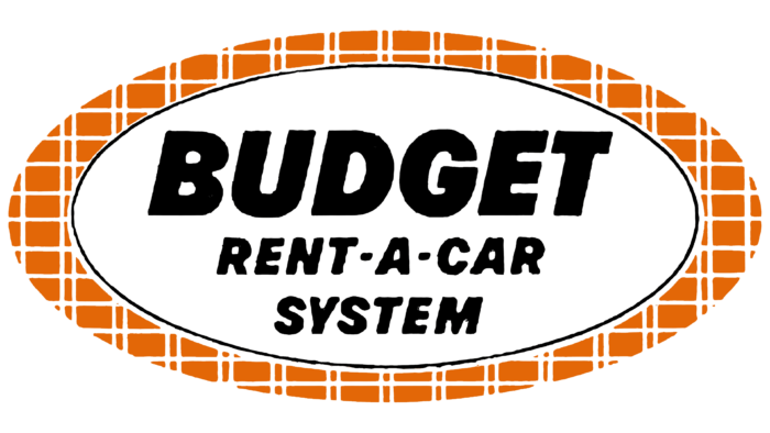
The original logo was presented to the public in black and white. It was an oval with a large amount of information inside that was associated with Budget Rent a Car. For example, the top block contained information about the price per mile driven or an hour rented. Just below that was the slogan of the organization, namely: “SERVING YOU COAST TO COAST.” The letters were small but readable. Next, in three lines, was the company name “BUDGET RENT-A-CAR SYSTEM.” And the word “Budget” was much larger. It was a classic sans serif bold typeface with all capital letters. To the left of the main elements was an image of a cent. Interestingly, either white or a grid was used as the background, which visually resembled cloth.
1964 – 1966
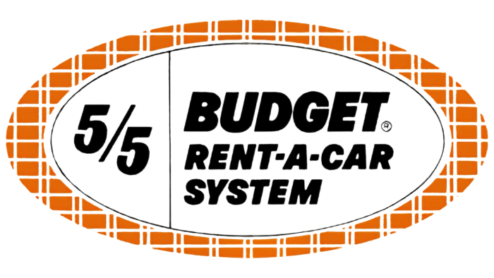
The first update occurred four years later. The logo became more modern and attractive, and some elements that made the Budget Rent a Car emblem hard to read were removed. It was now an oval with a black outline inside the oval depicted in an orange and white grid. The left side of the inner oval had one element, namely the inscription “5/5”. This is probably a reference to the pricing policy. Again, in three lines, the company name was written on the right. The font remained identical.
1966 – 1968
At this stage, the logo was further simplified. It was about the fact that instead of two text blocks, there was only one, namely the company’s name. Again, the font was not changed, but the letters became larger thanks to the extra space.
1968 – 1970
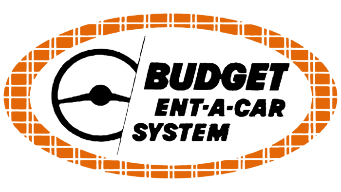
Again the logo was divided into two sections. The right part remained unchanged and presented the name of the company. On the left side was a black image of a steering wheel. It was large enough and stood out in the background. Interestingly, the lower right corner of the steering wheel was divided by a diagonal line that bounded the two sections.
1970 – 1975
For the first time, the company abandoned the oval shape. Also, the only element was the verbal lettering, which was also shortened to “Budget Rent a Car.” Thanks to removing the word “System,” it was on two lines. The font style was also changed to a modern serif typeface. No longer was all letters capitalized, but only the first letters in each word. The lines in the characters became more confident. At the top and bottom of the lettering were two thick horizontal lines in orange.
1975 – 1993
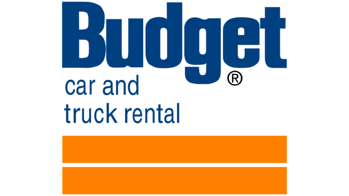
This version of the logo lasted almost 18 years. The two orange lines were now at the bottom and visually resembled a road. The wordmark itself was replaced by a new one. The word “Budget” was written in bold type on the first line. The style of the letters was quite unusual. For example, the vertical line in the “d” was shortened at the bottom. Next, in two lines was “car and truck rental.” They used blue for the name. The font, in turn, was a modern sans serif.
1993 – 2012
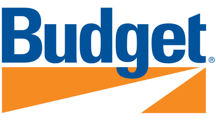
The new redesign resulted in a concise logo. Only one word was written at the top: “Budget.” It was superimposed on the image of the road, which users should associate with vehicle rentals. As a result, the logo looks harmonious and attractive.
2012 – today
The last redesign of the company’s logo to date repeated the previous version. However, now the word “Budget” was not superimposed on top of the road image but moved to the right side of it. Moreover, the image became smaller and about the same size as the font. The color in the name has become darker and more elegant. The new version has become as similar as possible to the logo of the parent company Avis.
Font and Colors
The font in the company name looks fresh and harmonious. At each stage, there were different features in the style of writing the letters. If we talk about the current logo, it stands out with a shortened horizontal line to the left in the letter “t,” as well as a minimalistic “u.” It’s a modern bold typeface with serifs and a nice writing style.
The original orange-white-black color scheme has been replaced by orange-white-blue. Now it looks fresher and friendlier, making potential customers interested in the offer.
Budget Rent a Car color codes
| Cool Black | Hex color: | #00285f |
|---|---|---|
| RGB: | 0 40 95 | |
| CMYK: | 100 58 0 63 | |
| Pantone: | PMS 281 C |
| Persimmon | Hex color: | #ed5505 |
|---|---|---|
| RGB: | 237 85 5 | |
| CMYK: | 0 64 98 7 | |
| Pantone: | PMS 1655 C |
| Neon Tangerine | Hex color: | #f78b00 |
|---|---|---|
| RGB: | 247 139 0 | |
| CMYK: | 0 44 100 3 | |
| Pantone: | PMS 151 C |
