


![]() Buffalo Sabres Logo PNG
Buffalo Sabres Logo PNG
Even incompatible things are compatible. The New York hockey team proved this, as the Buffalo Sabers logo features a bison and a cold weapon. The reason for such an emblem was the club’s name, whose leadership rejected standard, unexpressive, and boring options in search of a name.
The Buffalo Sabres hockey team debuted in 1970, when the NHL expanded to 14 top franchises. The Buffalo Sabres were founded by the Knox brothers, Seymour and Northrup, in 1970. The team is based in Buffalo, New York, USA.
The Knox brothers held a contest to name the team and develop a more original name for the franchise. Many ideas were proposed, such as “Mugwumps,” “Buzzing Bees,” “Buffalo Bisons,” “Flying Zeppelins,” “Buffalo Bulls,” etc. However, the brothers decided such names were too simple and artless for Buffalo teams. Additionally, “buffalo,” “bison,” and “bull” refer to large four-legged animals in the genus Bison. Eventually, the name Sabres won. The owners said they liked Sabres because they are an effective weapon in offense and defense, so they hoped their team would be the same. Anyway, “Bulls,” “Bisons,” and “Buffaloes” are root-related names for the team, as the Buffalo Sabres logo features a bison above two crossed sabers.
In the spring of 1996, Seymour Knox III, the principal owner of the Buffalo Sabres, died. In the 1996-97 season, the team changed its primary colors from blue-gold to black-red. The Sabres moved from Memorial Auditorium to the new HSBC Arena that same year.
Sabertooth, an anthropomorphic saber-toothed tiger, is the mascot of the “Buffalo Sabres.”
Meaning and History
![]()
The “Buffalo Sabres” is a hockey team whose logo features a mighty and aggressive bison, reflecting its spirit. Indeed, “katanas,” “sabs,” “sabers,” and “swords,” as fans call them (since, in addition to the wild animal, the Buffalo Sabres logo previously had two sabers), always try to demonstrate a fighting spirit and a ready-to-win attitude.
Although the Buffalo Sabers logo has no text, it still reflects the team’s name and the city where the club is located. The logo consists of two parts as if they were two words. The first represents the collective image of a “buffalo, bull, bison,” a large artiodactyl. The second conveys the sharpness of the hockey players’ skates on the ice, so sabers represent determination, a striking moment, and maneuverability. Although all emblems have only two objects, they still differ. The franchise has had five variants in total.
What is Buffalo Sabres?
The Buffalo Sabres are a professional hockey team founded in 1970 as an expansion franchise. The team is based in Buffalo, New York, and is a member of the NHL’s Eastern Conference (Atlantic Division). Terry Pegula has owned the team since 2011.
1970 – 1996
![]()
Since the city was believed to be named after the American Bison that once roamed the state of New York in huge herds, this animal was chosen for the first Buffalo Sabres logo. The original logo was a blue circle with a yellow outline. It featured two crossed sabers with yellow handles and a white buffalo between them.
1996 – 1999
![]()
In the late 1990s, the team introduced a new logo and color scheme. The “Buffalo Sabres” moved away from the blue-and-yellow color scheme in favor of black, red, and silver. The sabers from the logo were removed and replaced with a buffalo head with red eyes. This silver-black buffalo with a red outline was the emblem of the “Sabres” until 2006.
1999 – 2006
![]()
The “Sabres” logo underwent another slight redesign. The fourth logo received better color reproduction and improved graphics.
2006 – 2010
![]()
The return to the original blue-yellow color scheme in 2007 was a successful decision, but this design was considered one of the worst logos in sports history. The Buffaslug logo featured a yellow buffalo with white horns and bright red eyes. The animal was depicted in profile, helping to create the effect of a realistically running buffalo.
2010 – 2020
![]()
The “Sabres” logo returns to its original 1970 look, albeit with some updates, including improved graphics and modern details. The current personal identification mark is an improved version of the debut logo. After several transformations, the team management concluded that the first was the most successful in terms of symbolism. Therefore, the team returned it in 2010 and has not changed it. Now, all elements are complemented by thin contour lines, which make the drawing precise and focused.
The bull looks incredibly menacing, although the designers removed the bright red eye color and replaced it with a dark shade. The animal is still depicted attacking from the left. Two surrounding strokes indicate that the hoofed animal is rapidly moving forward: the stripes are located above and below the torso. Thanks to the edging, the sabers also became much more expressive.
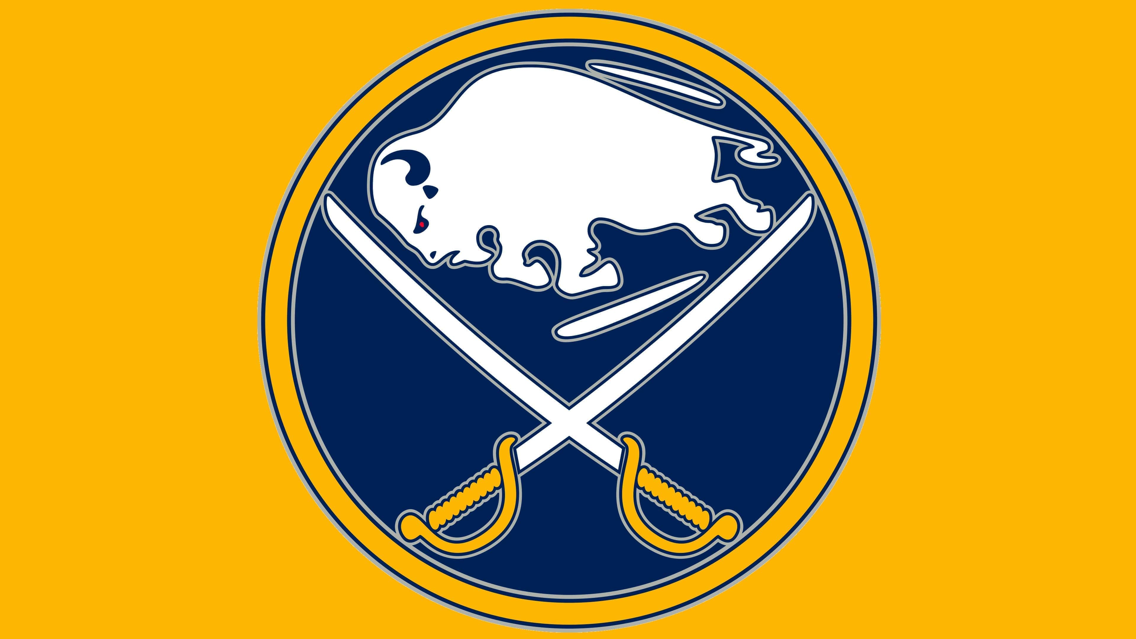
2020 – today
![]()
In 2020, the hockey team finally decided to return to its first logo, so all colors were replaced with classic ones. The circle took on a royal blue hue, and the outer ring and saber handles turned bright gold. Silver accents disappeared, so the elements no longer stood out or appeared convex. The designers also slightly adjusted the details, making the drawing harmonious. Now, the name Sabers, chosen to emphasize the sharpness of the skates, is much better reflected in the long and well-sharpened blades of edged weapons. At the same time, two thin lines above and below the buffalo convey a rapid gliding motion. The red eye, which was not on the first emblem of the Buffalo Sabers, expresses a warlike mood and the ability to defeat any opponent.
Font and Colors
The buffalo image underwent the most experimentation. The debut and current versions are fully depicted; from 1996 to 2006, the emblem featured only the head; in 2010, the withers were added. But the menacing facial expression remained unchanged. The head was always tilted forward as if for a powerful attack on the enemy. The animal sharply extended its horns, demonstrating readiness for attack.
Depending on the period, the central image was supplemented with various details. Often, it was a blue circle with a yellow border and two crossed sabers at the bottom. In other cases, the emphasis is on the artiodactyl’s withers or mane, highlighting the powerful horns.
Although the emblem does not contain text, it is sometimes accompanied by a separate inscription. The team name is rendered in a custom font and placed in two lines.
The emblem has undergone several minor color experiments. It included red, gray, white, and black tones for some time, but now the white-blue-yellow palette predominates.