![]() Burn Logo PNG
Burn Logo PNG
The emblem lights the way for shoppers. The drink is like a ray of light piercing the darkness of fatigue. He lights a fire that calls to the world of fun and joy. The Burn logo accurately conveys the energy drink’s potential and invites you to experience its power.
Burn entered the market around 2000, when Coca-Cola decided to compete in the fast-growing energy drink category shaped by Red Bull. The launch began in Europe and targeted consumers aged 18 to 26. Instead of presenting Burn as a classic soft drink or a purely functional stimulant, Coca-Cola tied the brand to nightlife, clubs, bars, and festival spaces.
Early promotion relied on nightclub sampling. Promoters handed out the drink during hours when the target audience was already seeking an energy boost. The slogan “Fuel your fire” helped frame Burn as a drink for late evenings and long nights. Around 2002, the brand also reached the United States.
The first years did not give Coca-Cola the position it wanted. Burn found an audience in Spain, Poland, and Russia, as well as in resort markets such as Ibiza, where club culture was strong. Still, it stayed weaker in key Western European countries. In 2007, Coca-Cola gave the British agency Karmarama a £5 million budget for a relaunch in Europe and Russia. The plan included Burn’s first UK television campaign and broader digital promotion, at a time when Red Bull led the market, and Monster Energy was gaining momentum.
From 2012 to 2015, Burn shifted part of its image by becoming the official energy drink of Lotus in Formula 1. In 2015, Coca-Cola bought about 16.7% of Monster Beverage Corporation for roughly $2.15 billion. It transferred Burn, Full Throttle, NOS, Relentless, and other energy brands to Monster. Under Monster, Burn remained a separate brand, with Coca-Cola and its partners still involved in distribution. In 2025, the Burn Energy Tour with Mixmag returned to clubs in Gdańsk, Valencia, Bucharest, and Budapest.
Meaning and History
![]()
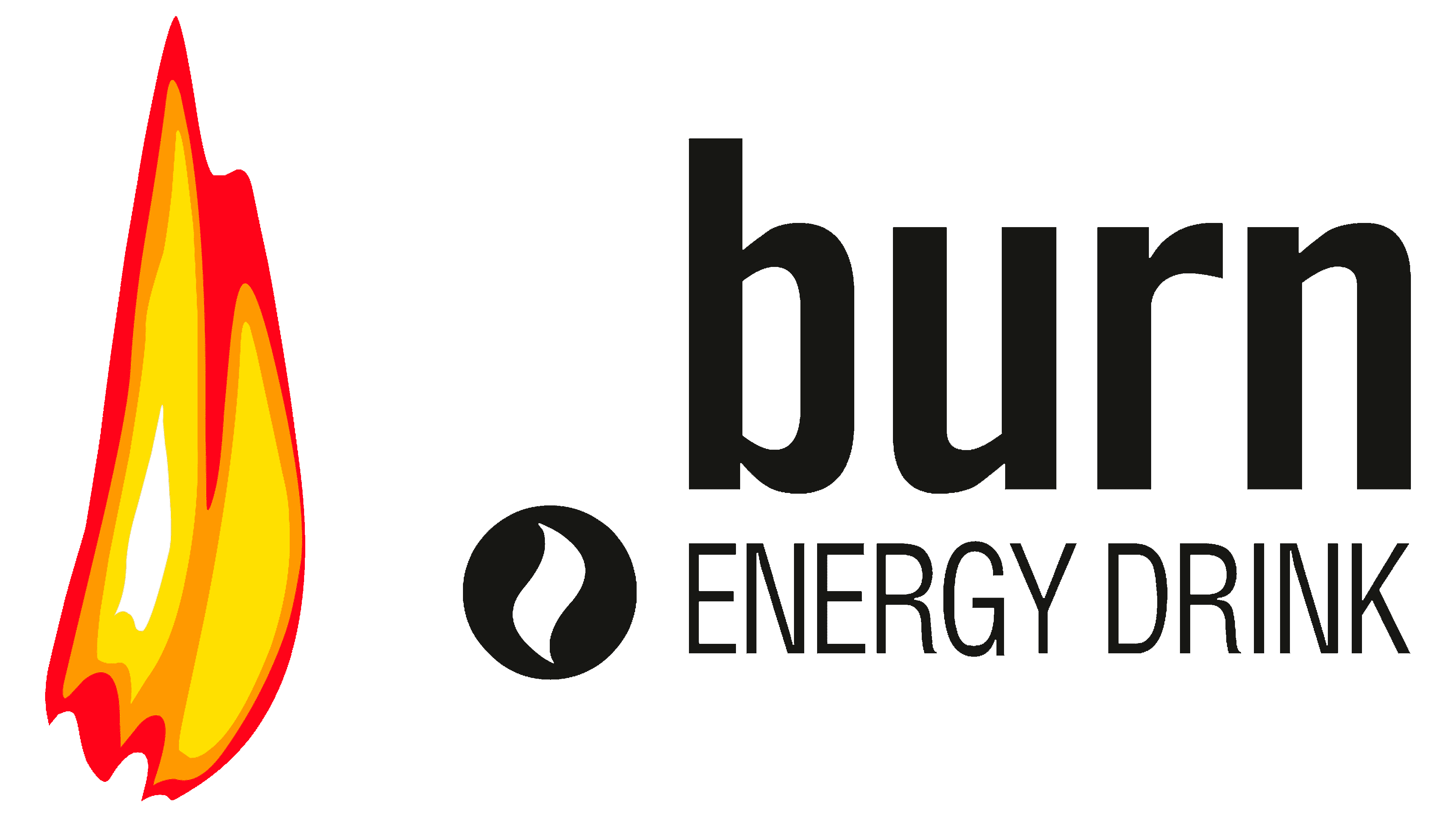
The Burn was developed in 2001 and began selling in the UK. The emblem of the drink is minimalistic but fully conveys the essence of the energy drink and its message: awaken your inner fire. The logo features flames on a black background, with the brand name below.
As planned, the drink symbol brings us back to the time when a person learned to kindle a fire, which distinguished him from all other inhabitants of the Earth. A fire, a family hearth, is a place where new ideas are born in unity and communication. The drink’s refreshing taste should infuse customers with energy, clarity of thought, and a desire to move forward.
The theme of Burn is very closely intertwined with people in creative professions, dance, and music. Energy advertising is associated with artists, DJs, and producers. The drink often sponsors music festivals and organizes dance parties, which align with the energy of movement and the joy of life it seeks to convey.
What is Burn?
This Coca-Cola brand stands out in the energy drink market with its bold flavor profile and significant presence in international nightlife and extreme sports scenes. Its unique taste sets it apart from other energy drinks, while energizing ingredients like taurine, caffeine, and B vitamins provide a powerful boost. A bold approach to increasing alertness and a diverse lineup of flavors with a distinctive “kick” make this drink unique in its segment.
2004 – 2016
![]()
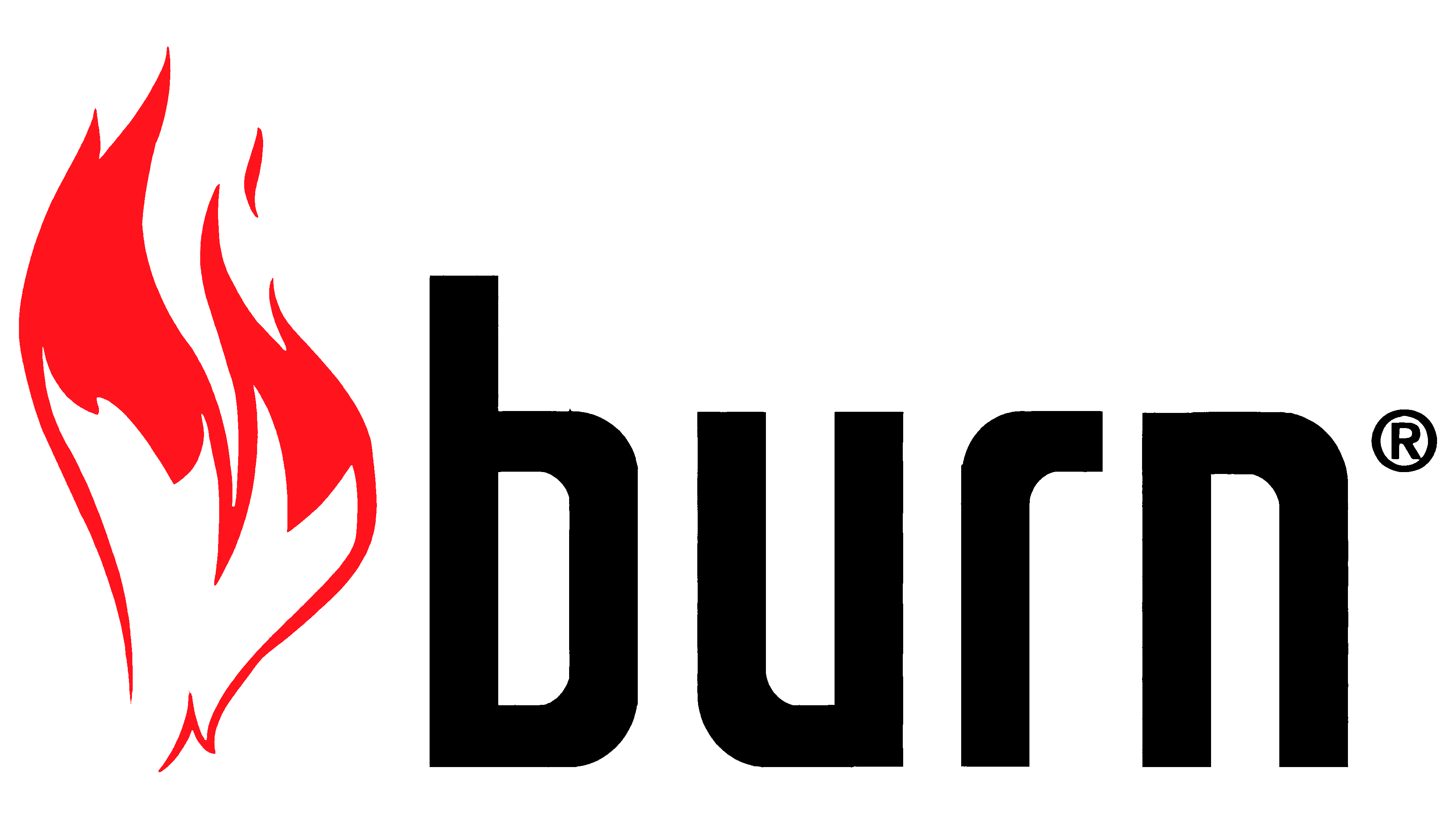
Initially, a deep black background was used for the logo, cut through by bright tongues of flame. The drink seemed to bring light amid pitch darkness. The brand name and the signature “intense energy” were rendered in silver-white with a dark gradient. This performance echoed the theme of fire, with its play of light and shadow on objects near the fire.
2016 – today
![]()
Since 2015, Burn has changed its owner. They became the Southern California-based company Monster Beverage, formerly Hansen’s. Its owners decided to specialize in energy drinks instead of juices. Therefore, we carried out a mutually beneficial trademark exchange with Coca-Cola. In this regard, the development of an updated logo was ordered in 2016. The main task was to increase brand awareness in all countries where it is distributed. Make the logo unique and different from other brands.
The new emblem emphasizes the verbal part of the logo. The background of the square shape became less dark; the flames decreased in size and color intensity. But the name is bright white and written in large. And under the name of a similarly sized brand, the addition is an energy drink. The inscription immediately helps determine which category of goods Burn belongs to. This excludes the logo’s similarity to the brand name of hookah tobacco of the same name, which appeared in America in 2016 and used a flame as its symbol.
An additional icon appeared in the logo, a white circle with a black flame tongue. Image courtesy of “The Coca-Cola Company,” the main distributor of the drink. It also resembles the coffee bean symbol, indicating the presence of caffeine in the drink.
The flame has taken on a more yellow hue, a symbol of freedom, fun, and revealing oneself to the world. The fire’s edge is red because the energy of fun is contagious, igniting everything around it. The logo is even fiercer on the company’s website, in yellow and red colors. The inscription is capitalized, and the flame resembles a bonfire.
Font and Colors
White, black, yellow, orange, and red are the primary colors of the logo. They create a sense of contrast, already demonstrating the drink’s bright, incendiary “character”. The combination of yellow and red shades symbolizes energy, warmth, a good mood, and fun. They destroy fatigue and drowsiness, which symbolize black.
The sans-serif lettering is softly rounded and lowercase, reminiscent of the Bahnschrift font family, while the “energy drink” signature is in DotumChe.