


![]() Busch Light Logo PNG
Busch Light Logo PNG
The Busch Light Logo, a renowned American beer brand, has maintained its emblem design for 62 years. It features the iconic logo with ‘Busch’ in large font and ‘BEER’ in smaller letters below, all in monochromatic blue. This design represents the brand’s identity and symbolizes stability and tradition in the brewing industry. The simplicity and clarity of the logo reflect the brand’s straightforward, no-nonsense approach, appealing to a loyal customer base that values these attributes.
The story of Busch Light began in 1989 when Anheuser-Busch introduced a new light beer under the Busch brand. This launch was driven by the increasing demand for lower-calorie products and the growing popularity of light beer in the United States.
The product was developed as a lighter version of the original Busch Beer, which had been on the market since 1955. It was crafted to meet consumers’ preferences for lower-alcohol, lower-calorie beers while retaining the distinct flavor associated with the Busch name.
In the 1990s, this light beer gained popularity, particularly in the U.S.’s central states. Its positioning as an affordable, easy-to-drink option contributed to its broad appeal.
Expanded marketing efforts in the 2000s further solidified the company’s presence in the market. It became especially popular in small towns and rural areas, where it built a loyal customer base.
Between 2010 and 2015, the brand continued to grow, launching new advertising campaigns and reinforcing its standing in the light beer market. Special emphasis was placed on sports marketing and event sponsorships to connect with a wider audience.
From 2016 to 2020, innovative advertising and strategic partnerships helped attract new customers while retaining loyal fans.
As of 2023, it remains one of the most popular light beer options in the United States, particularly in the central states. The brand continues to evolve by staying true to its core values and engaging consumers through a diverse range of marketing efforts.
This light beer has consistently maintained its reputation as an affordable, high-quality option. It preserves the Busch name’s legacy while appealing to longtime fans and new customers.
Meaning and History
![]()
This is a story of the rise and fall, success, and bankruptcy of the oldest American brewing company, accompanied by name changes, the formation of a visual identity, and changes to the brand logo.
What is Busch Light?
One of the oldest brewing companies in the U.S. is Anheuser-Busch, founded by George Schneider, an immigrant from Germany. In 2008, Anheuser-Busch InBev, the world’s largest beer producer, acquired this company, which owned 12 breweries in America and 10 entertainment venues, overseen by the family entertainment division. The subsidiary Anheuser-Busch Companies, Inc., was the third-largest theme park operator in America and had a stake in a similar venture in Spain, near Barcelona.
1989 – 2000s
![]()
The first light beer from Busch, Busch Light Draft, debuted in 1989. At the top of the logo, a mountain range with snow-capped peaks is depicted against a sky-blue background. The mountains symbolize the natural environment and the purity of the ingredients used in brewing. They also evoke a sense of freshness and coolness, like a light, refreshing beer.
The brand name “BUSCH” is highlighted in bold blue font and capital letters, immediately drawing attention. Below the brand name is a red line that emphasizes the product name. Under this line is a slogan, “Born from natural ingredients, smooth, refreshing beer,” written in a smaller font. This slogan conveys the advantages of the beer, its natural composition and smooth and refreshing quality, appealing to consumers who value these characteristics.
The logo’s color palette, red, white, and blue, is patriotic and appealing to American consumers. It also features an image of a knight on horseback, lending the brand a touch of heritage and tradition and implying a long-standing commitment to quality.
2000s – today
![]()
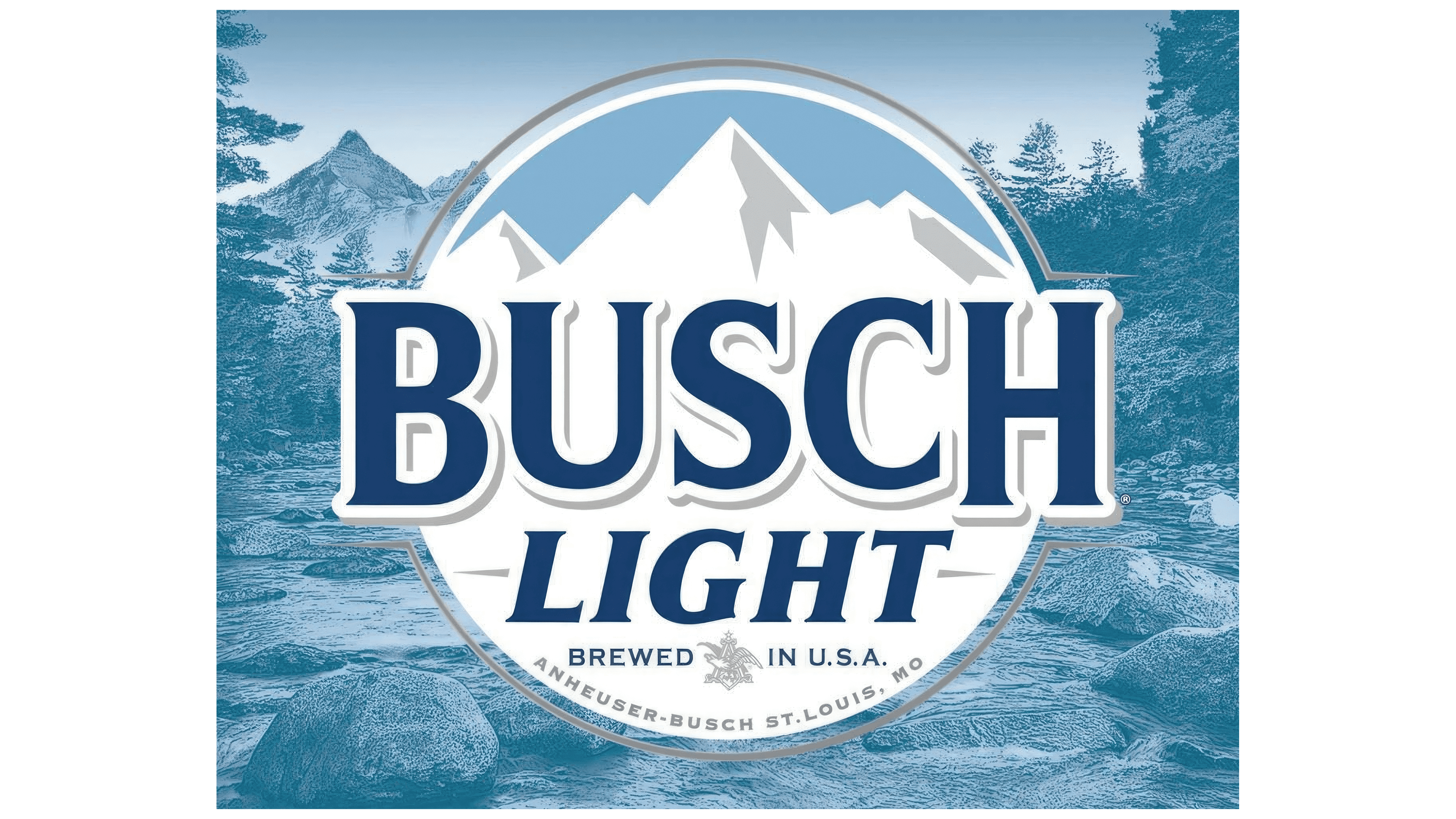
The modern Busch Light Logo symbolizes tradition and quality. At the center, the name “BUSCH LIGHT” is in bold, capitalized letters with a heavy serif font that conveys stability and reliability. The font style has a classic feel that aligns with the brand’s longstanding nature.
The color palette consists of cool blues and whites, traditionally associated with lightness and purity, which the brand wishes to convey about its light beer. The blue is a deep, rich hue that stands out and is often connected with trust and professionalism.
Above the name, the logo features a mountain range with a peak at its center, reminiscent of the previous logo’s mountains, continuing the theme of natural purity and the beer’s crispness. Below the brand name, “BREWED IN U.S.A.” is proudly displayed along with “ANHEUSER-BUSCH, ST. LOUIS, MO,” grounding the brand firmly in its American heritage and emphasizing its regional importance.
Using a crest-like shape and including the Anheuser-Busch emblem signifies the brand’s heritage and commitment to brewing quality. The elements chosen strike a balance between modernity and tradition, appealing to a wide audience while staying true to the brand’s roots.
Font and Colors
In deciding to create a new emblem, considering modern conditions, the owners of Anheuser-Busch approached the change to their logo creatively. The image is enclosed in a gold circle, characteristic of beer. The symbol of snow-covered Appalachian mountains against a contrasting blue sky dominates the entire composition. The text ‘Busch’ is in uppercase, with the first and last letters extended downward, creating a symmetrical image that enhances aesthetic appeal and memorability. The letters are in black, contrasting with the overall composition and echoing the black shadows on some mountain slopes. The letters are highlighted with a gold outline, creating a sense of volume and the impression that light is falling from the left side.
Directly under the company name, centered, as in the old version of the logo, is the word ‘BEER,’ in uppercase, several times smaller than the main text. To the left and right of this word are lines that create the appearance of a horizontal support over which the title hovers. All are golden.
The bottom half of the semicircle is occupied by the slogan “Brewed in the USA,” which divides the company’s trademark into a large letter ‘A.’ It is topped with a five-pointed star, and an eagle breaks through the letter itself, trampling a shield with broken arrows. Around the lower part of the semicircle, the company’s name and the city where its headquarters are located in the USA are written in small golden letters.