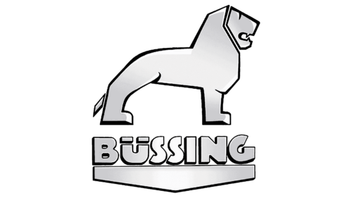
The Büssing logo conveys strength, leadership, and a stable position in the market. The emblem shows the desire to glorify the native city and carry the news worldwide. The sign prophesies great prospects and development.
Büssing: Brand overview
| Founded: | 1903 – 1971 |
| Founder: | Heinrich Büssing |
| Headquarters: | Braunschweig, Germany |
Büssing is a German automaker of the early 20th century that supplied the market with freight and public transport. It became the property of MAN in 1971 and was gradually abolished. The Büssing logo was placed on the models 8000, LU 11, DE65, and ZU-550.
A well-known production began in 1903 by Heinrich Büssing and his sons in an abandoned laundry. The family promoted the first omnibuses by creating the transport company Omnibus Operating Company. Gradually, the Büssing chassis was ordered to London and Vienna, and the company grew to become the leader in the country.
Meaning and History
The manufacturer’s emblem is an image of large size and dominance on the road. At the head of the logo is a majestic grinning lion. Below is the brand’s name, located on top of a triangular monolith. The artist and photographer Hermann Fischer worked on the sign in the early 1920s.
The company was founded in the German city of Braunschweig, in the heraldry of which there is a lion. It is placed on the Büssing transport for patriotic purposes.
What is Bussing?
A well-known transport company in Germany from 1903-1971 occupied first place in the country in the production of buses and third in the production of trucks.
The Predator seems to be standing on a dais, demonstrating a leading position in the market and powerful large machines. The company’s collection includes eight-ton Büssing 8000 and LU 11 for several trailers. Lion – the embodiment of strength, shows the carrying capacity of buses and trucks.
The animal is the king of beasts. The drivers of the company’s vehicles felt like kings. Unlike other trucks, the cabs were spacious; there was no smell of fuel or noise.
The name Büssing comes from the names of the founders. Interestingly, the name is associated with the world of cars and is translated from German as “tire fitting.”
A triangular monolith standing on its tip is a prototype of a balance. To carry passengers and cargo, the company’s vehicles must be properly balanced and have an ideal weight distribution. The symbol tells about it.
The location of the monolith at the bottom of the composition indicates the brand’s main design feature- the cars’ engines were installed under the floor.
Reports monolith and strength. All products of the company were considered practically “indestructible.” Their practicality and advantage are proved by the fact that after the purchase of assets by MAN, for a long time, it sold Büssing models under its name, assigning the brand logo to itself.
Font and Colors
The main color scheme of the logo is a gray gradient with a black border. Gray is the prototype of careful design and painstaking consistent work on each machine. The overflow of shades demonstrates the play of light on the bodies and conveys the feeling of metal. Edging is an element of clarity and completeness, constructive perfection of models.
The inscription font is unique, akin to a Toyster 3D extrude. The two S’s in the center are reminiscent of the bend in the track.
Büssing color codes
| Neon Silver | Hex color: | #cccccf |
|---|---|---|
| RGB: | 204 204 207 | |
| CMYK: | 1 1 0 19 | |
| Pantone: | PMS 427 C |
| Black | Hex color: | #000000 |
|---|---|---|
| RGB: | 0 0 0 | |
| CMYK: | 0 0 0 100 | |
| Pantone: | PMS Process Black C |


