![]() BYD Logo PNG
BYD Logo PNG
The BYD logo encapsulates the company’s commitment to harnessing technological progress to develop future automobiles. It is a symbol of modern design, advanced computerization, and powerful engine capabilities that define their vehicles.
BYD (more precisely, BYD Auto Co., Ltd.) is a Chinese automotive manufacturer that produces a range of vehicles. Its assortment includes electric cars, hybrid cars, gasoline-powered cars, trucks, buses, forklifts, and electric bicycles. One of its divisions, Mercedes-Benz, produces luxury cars under the Denza brand. The firm was established in 2003 following BYD Company’s acquisition of Qinchuan Machinery Works from Norinco. Its head office is located in Xi’an City, Shaanxi Province.
By acquiring an automaker, BYD automatically gained the right to produce cars and other vehicles independently, and it entered into a deal to do so. She gained experience because the Qinchuan plant has been producing cars since 1987. The company began with the QJC7050, featuring a 30.5-cubic-inch engine. At the time of the acquisition, its version of the QCJ7181 Flyer was also in development; the new owner introduced it in 2005 as his own, renaming it the BYD Flyer.
In 2008, the car manufacturer was acquired by Warren Buffett’s Sino-American Energy Holdings. At the same time, a hybrid version of the BYD F3 sedan was released, and exports were established to the Middle East, South America, and Africa. Then, the company began to grow actively while maintaining strict control over technical processes. As a result, BYD was awarded the Top Crash Facility Award in 2013.
In 2020, the company began expanding in Europe with several commercial vehicles. It also won lucrative contracts to supply 406 electric buses to Colombia. Their company will provide this equipment by the middle of 2022, with 1002 units of this type needed. That is, recognition of the BYD brand emblem is increasing annually. By the way, its name, the basis of the visual identity, is an abbreviation for Build Your Dreams.
Meaning and History
![]()
The automotive company BYD uses a text logo based on its name. The abbreviation is present in all versions of the emblem. It stands for Build Your Dreams. Thus, the manufacturer demonstrates confidence in the future, professionalism, and a responsible approach to work. If at first its symbol was standard and resembled the BMW logo, it has now become more original.
What is BYD?
It is a Chinese conglomerate whose name means “Build Your Dreams.” The company includes BYD Auto, a manufacturer of electric vehicles, industrial forklifts, motorized electric bicycles, trucks, buses, and passenger cars. It was established in 2003.
2003 – 2005
![]()
The opening identity mark consists of two horizontal ovals nested within one another. The largest is black with double edging, played by the white and black lines. It includes the company name. The abbreviation “BYD” appears at the bottom and is executed in a sleek sans-serif typeface. The letter spacing is wide so that light characters are visible against a dark background. The central oval is smaller and outlined with a thin white stripe. Its space is divided into two halves by color: the upper zone is blue, and the lower one is white.
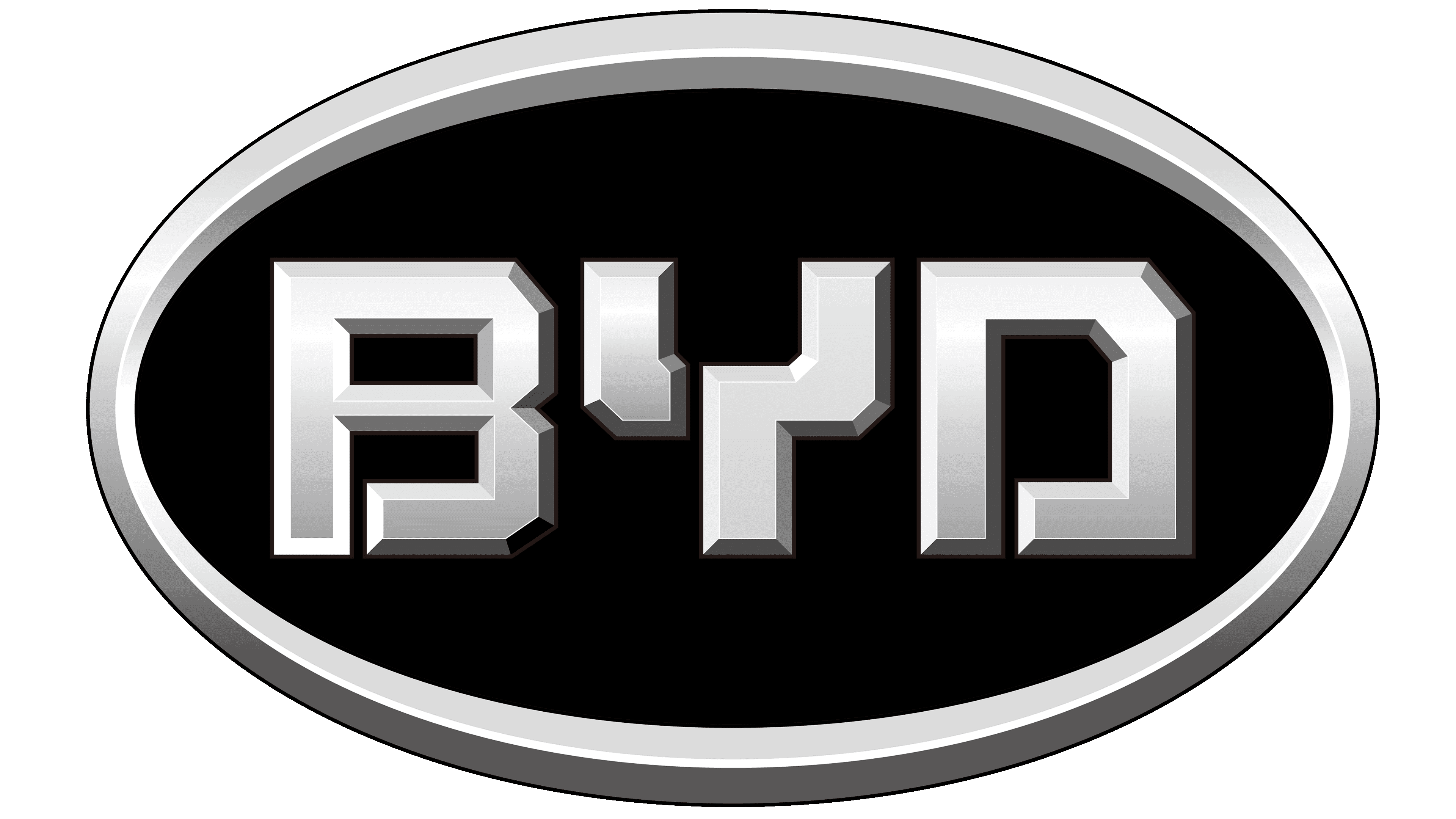
2005 – 2022
![]()
The visual identity redesign follows the Chinese automaker’s decision to avoid any similarity between its logo and BMW’s emblem. The updated icon was introduced in December 2005. BYD inadvertently received a logo that now resembles Kia’s, prompting a move away from the visual association with another well-known company.
The logo features an oval with a red contour line and the same red name set against white space. The outer stripe is uneven in width, with the narrowest sections on the right and left. “BYD” is written in geometric letters, each with a small white stroke, right angles, and outer diagonal cuts.
The company’s logo has been oval since its adoption at the time of its founding. It remained after the redesign, while the remaining elements were removed or changed.
2022 – today
![]()
The new logo version brings calm and tranquility: it features smooth lines, rounded edges, and wide glyphs. This design inspires customer confidence and underscores the safety of cars. To do this, the company abandoned diagonal cuts and straight stripes, making the logo more friendly. The only thing that remained with the letters was a miniature dividing line. It is present in every one of them. The oval has not been modified either: the frame thickens at the top and bottom. But its color has become much darker, approaching a crimson hue.
Font and Colors
BYD uses a custom-designed typeface. The letters are sans serif and resemble geometric shapes. They are even, smooth, and strict. But the proprietary palette changed once: initially, it consisted of black and blue; later, it consisted of red and white.
![]()
The fonts in the logo are individual. But one version uses a typeface reminiscent of CheapProFonts’ Bitsumishi Pro Medium. Looking closely, you can see a distinct similarity between “B” and “Y.” They have the same rounding, shape, and width. The “D” almost matches the glyph from Cassandra Plus Black, which Wiescher-Design designed. However, the exact typographic match is not feasible because the characters in the BYD emblem have a small gap between them. The color scheme was updated to include a dark crimson hue.