


![]() Byju’s Logo PNG
Byju’s Logo PNG
“Learning with us is easy and fun,” says Byju’s logo. The logo symbols represent a large body of knowledge that can be accessed remotely. Their use will help develop a harmonious personality.
Byju Raveendran was born in Kerala in 1980 to two schoolteachers. After engineering college, he worked for an international shipping company, but in 2003 began helping friends prepare for India’s CAT exam and scored in the 100th percentile himself. Those lessons grew into Byju’s Classes in 2007, with exam-prep sessions held in large halls. In 2011, Raveendran and Divya Gokulnath founded Think & Learn Pvt. Ltd. in Bangalore, the company behind “BYJU’S”.
In August 2015, BYJU’S launched The Learning App for school students and candidates preparing for IIT-JEE, NEET, CAT, GRE, and GMAT. The app reached over 2 million users in its first three months. In 2016, BYJU’S became the first Asian company funded by the Chan Zuckerberg Initiative. Sequoia Capital and Tencent Holdings later joined. By 2018, the platform had 15 million users, 900,000 paid subscribers, and had become India’s first edtech unicorn.
Growth turned into an acquisition spree: Osmo in 2019, WhiteHat Jr. in 2020, then Aakash Educational Services, Epic!, and Great Learning in 2021. By 2022, BYJU’S was valued at $22 billion, ahead of Indian rivals Unacademy and Vedantu. Then problems surfaced: delayed accounts, no CFO from 2021 to 2023, layoffs, investor exits, Deloitte’s departure, and searches by India’s Enforcement Directorate.
In 2024, its US unit filed for Chapter 11 in Delaware after a $1.2 billion debt default. India’s tribunal later appointed an insolvency specialist. In October 2024, Raveendran said BYJU’S was worth zero. In May 2025, the app was removed from Google Play over unpaid AWS bills.
Meaning and History
![]()
The brand emerged through the application of the same name, which was launched in 2011 by Think and Learn Pvt Ltd. The software developer and owner of the service was a married couple, Byju Raveendran and Divya Gokulnath. He is an engineer who taught students to take exams and prepare them for tests; she is an educational specialist. Their tandem resulted in a firm offering online learning products based on utilities for K-12 and materials for competitive examinations.
In 2012, Think and Learn gained popularity and entered the prestigious Deloitte Technology Fast 50 and Deloitte Technology Fast 500 Asia Pacific rankings, and has remained on them. After four years of work on digital software called Byju’s: The Learning App, she launched it in the summer of 2015. In 2017, the Byju Math utility for children and the Byju Parent Connect program were introduced, enabling parents to track their children’s learning.
This was followed by several major acquisitions as the company entered the international arena. This is how the popularity of the educational products of the same name expanded, which became not only a series but also an independent brand with its own symbols. In total, there are two logos in his arsenal. They are essentially similar, differing only in minor details.
What is Byjus?
Byju’s is an educational technology developer. It was established in India in 2011 and started as a small startup by two entrepreneurs, Divya Gokulnath and Byju Raveendran. They created an app designed to simplify the learning process and make education widely accessible. The company now offers a vast selection of online courses on various subjects and collaborates with several universities.
2010 – 2017
![]()
The debut emblem appeared with the release of the first program. She not only accompanied her but also presented her, since it contained only an informational, introductory text. The logo’s base is a lilac square with rounded corners. It had highlights and shadows along the edges, which gave it a sense of three-dimensionality, so the sign was perceived as a button to launch the announced utility. Its name was set in two lines: at the top was the word “Byju’s” in large grotesque type, at the bottom was “The Learning App” in small letters. They were set against light lilac and dark purple backgrounds, with a wave-like gradation of shades.
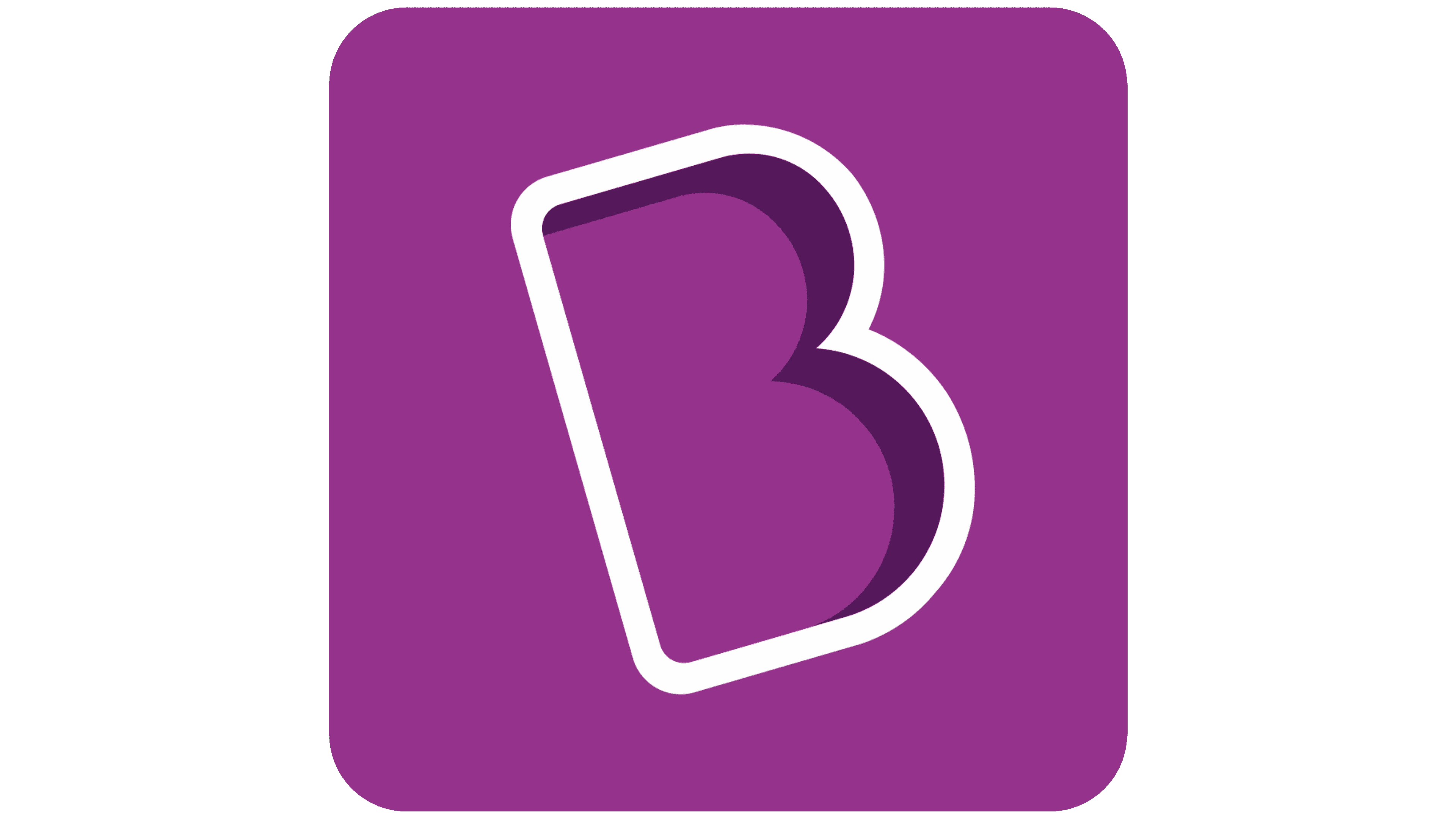
2017 – today
![]()
The current logo looks modern and includes not only textual elements but also graphic ones. It is a diagonal “B”-shaped icon located in the center and the upper-left corner. In the first case, the letter is large, expressive, with a deep shadow on the right and a white border. It looks voluminous as if it is raised above the surface.
The upper part shows a similar symbol, but in a reduced size and a miniature white square. The brand name is also placed next to it. The designers changed their style by capitalizing the beginning of each word. The exception is “Byju’s”: it is in uppercase. The developers have kept the signs’ roundness but have worked on the “B,” reducing its center bar.
The identity of this young Indian company is readily recognizable because, from the very beginning, it adopted its own “face”: a purple convex square. It serves as a basic platform for placing the remaining elements, which, thanks to the contrast, look clear and catchy on it.
Font and Colors
The emblem uses not one but two types of typefaces. The word “Byju’s” is set in a font reminiscent of JCfonts’ Linotte Bold or S-Core’s Core Sans ES 75 Extra Bold, with a slight modification to the “B”. “The Learning App” is executed in simple grotesque, as close as possible to Museo Sans Rounded 700 or Core Sans AR 55 Medium. The color scheme is unchanged: it always features purple (square) and white (letters).