A large selection of goods promises an impressive C&A logo. Clothes in boutiques follow fashion trends and are sold out instantly. The symbols show the turnover of goods, bright and elegant models. The emblem conveys the prosperity of the brand.
C&A: Brand overview
| Founded: | 1841 |
| Founder: | Clemens and August Brenninkmeijer |
| Headquarters: | Vilvoorde, Belgium and Düsseldorf, Germany |
| Website: | c-and-a.com |
Meaning and History
C&A was initiated by the Brenninkmeijer brothers, who opened it in Sneek. They used the enterprise as a Dutch textile manufacturer. Then, to promote business and increase demand for products, Bernard Joseph (son of Clemens) announced discounts, which he began offering in Amsterdam in 1906. As a result, by 1910, there were already ten branded minimarkets in the Netherlands. All of them belonged to the German Brenninkmeijer family, who since the 17th century have been selling textiles and linen products in their hometown of Mettingen.
Inexpensive clothing stores located in the heart of major European cities attracted the attention of buyers, so the brand played a very important role in the economy. Gradually, competition increased, and the manufacturer announced its withdrawal from the UK domestic market. He sold his last boutique there in 2001, although he had been successfully working in the country since 1922. Primark took over eleven C&A stores.
A similar situation occurred in Argentina, where the brand was present until 2009. Then the German publishing house Der Spiegel announced the intention of the owners of the Belgian-German-Danish company to sell the business to one of the Chinese investors. This event happened in 2018, and before that time, C&A was prosperous and even introduced its line of clothing, developed in collaboration with Beyonce. Gradually, it focused on the markets of North and South America and Asia.
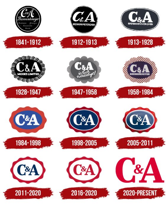
That is, the logo of this fashion brand is widely recognizable. It has been known for a long time because it has remained consistent despite periodic redesigns. There are currently ten variants of the emblem.
1841 – 1912
The first sign was round, and he subsequently transferred this shape to all subsequent emblems. On a black background, several informational inscriptions were informing about the owners of the brand and its location. The characters “C” and “A” denoted the founders’ names – the brothers Clemens and August, after whom the company is named. Large dots were placed after the capital letters. The italic text was surrounded by a thin white line followed by a black border.
1912 – 1913
The brothers shortened the verbal part of the emblem, retaining only their initials and surname in the full version. In addition, the black edge of the medallion was removed, and the font was changed: printed characters replaced italics. The word “Brennenkmeijer” was made in slash typeface, and an ampersand appeared between “C” and “A.”
1913 – 1928
After the redesign, a horizontal oval with text inside was approved: with the surname and abbreviated versions of the owners’ names. The developers aligned the capital letters and changed the shape of the ampersand.
1928 – 1947
In 1928, the logo underwent key changes. The surname in it was replaced with the phrase “Modes Limited,” and a curly frame with elongated rays appeared on the edge of the oval. They symbolized the trading network, in which there were already a huge number of stores.
1947 – 1958
Gradually, the rays, directed in different directions, took the form of semi-ovals, which very much resembled flower petals. Compared to the previous version of the logo, the letters were bold. The designers designed the ampersand (&) as a figure eight (8). To do this, they lengthened his right line, which was slightly bent to the left and went far down. For the slogan, they used handwritten italics.
1958 – 1984
The gray ellipse has been recolored purple. Instead of semi-ovals, red-white stripes appeared in the form of strokes on the frame. The developers removed the company’s motto, so the name of the founders of the clothing store chain was again placed under the inscription “C&A.”
1984 – 1998
Designers experimented with color, resulting in a curly petal-shaped frame turning red. The oval that she surrounded was also repainted, but only in blue, which contrasted with the red. The letters are back in white, and the ampersand has a classic look.
1998 – 2005
The oval was framed with a thin white stripe. The inscription “C&A” remained the same. The intensity of the color spectrum has been boosted, so it looks much brighter and more saturated.
2005 – 2011
While maintaining the old structure, the C&A logo has gained volume. To do this, she added a gradient and shadows and highlights that made the frame wavy. At the top of the central part, there was an extensive light. Because of it, the logo looked whitish.
2011 – 2020
To modernize the emblem, the designers have simplified it. They removed the solid fill of the oval and colored the text part blue. The gradient has been removed, so the symbol is flat and 2D to fit compactly on different media. Crimson was used instead of dark red.
2016 – 2020
Navy blue was dropped from the C&A store trademark color scheme altogether. It has been replaced by red. The rest of the logo has retained its original appearance.
2020 – today
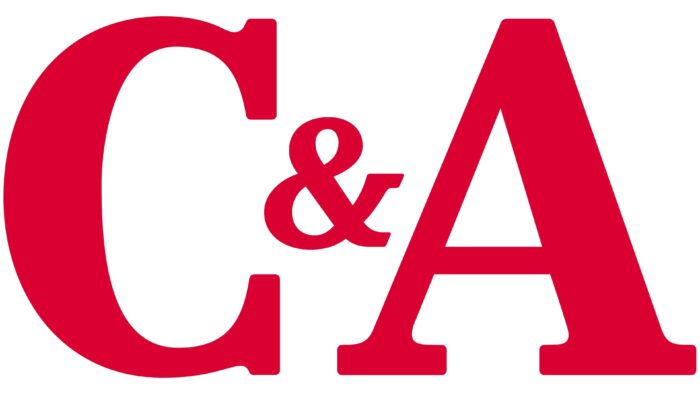
The current version consists of only the verbal part. The oval, wavy border and the separating white ring have disappeared. Instead of them, a laconic sign arose – a large name for a manufacturer of fashionable clothes. Letters and ampersands have a classic look.
C&A: Interesting Facts
C&A is a pioneering fashion retail chain that blends affordability with a commitment to sustainability. Founded in 1841 by the Brenninkmeijer brothers, Clemens and August, in the Netherlands, C&A has grown from a small textile store to a global brand with a significant impact on the fashion industry.
- Early Days and Growth: Starting in Sneek, Netherlands, C&A grew under the Brenninkmeijer family’s guidance. It was among the first to take its stores international, making it a significant name in retail.
- Ready-to-Wear Revolution: C&A changed the game by offering ready-to-wear clothes at a time when most apparel was tailor-made or homemade. This move made fashion more accessible to everyone.
- Leading in Sustainability: C&A has been at the forefront of sustainable fashion, using organic cotton and launching the first Cradle to Cradle Certified™ Gold denim garment, emphasizing its dedication to eco-friendly practices.
- Adapting Globally: With stores in over 20 countries, C&A adjusts its products to meet local tastes, showcasing its flexibility and global appeal.
- Fashion Innovations: C&A introduced specific departments for maternity and children’s wear, catering to previously ignored needs and proving its innovative approach to retail.
- Supporting Sustainable Fashion: Through the Laudes Foundation, previously the C&A Foundation, C&A supports efforts to make the fashion industry more sustainable and fair, focusing on better working conditions and promoting eco-friendly fashion.
- Embracing Digital: C&A has strengthened its online presence, allowing customers to shop online easily and matching the convenience of its physical stores.
- Designer Collaborations: By working with designers, C&A brings high fashion to its customers at affordable prices, making trendy styles accessible.
- Focus on Employees: C&A recognizes the value of a satisfied workforce and invests in employee development and training to ensure a positive workplace.
- Transparent Environmental Efforts: C&A is open about its environmental goals and sustainability efforts, regularly sharing reports on its progress, which helps build trust with customers and stakeholders.
From its origins as a small Dutch store to becoming a global fashion retailer, C&A’s story is marked by innovation, a commitment to sustainability, and the ability to evolve with the times. It continues to shape the industry, pushing for a future where fashion is both trendy and responsible.
Font and Colors
The evolution of the C&A logo was a continuous modification of the form, but not the content. Therefore, all elements in it remained the same. The only exception is the last period when the identity lost its usual paraphernalia: an oval, a curly frame, and a ring. So the icon gradually lost graphics and became verbal. But, despite the changes, he still adhered to a strict style.
For the emblem, the developers used a typeface similar to the Centennial Black font from designer Adrian Frutiger. The corporate palette is built on a combination of blue and red in several shades. But besides them, there were other colors: white, gray, graphite, black, purple.
C&A color codes
| Crimson | Hex color: | #da0032 |
|---|---|---|
| RGB: | 218 0 50 | |
| CMYK: | 0 100 77 15 | |
| Pantone: | PMS 185 C |


