


![]() Cadence Logo PNG
Cadence Logo PNG
The Cadence logo’s visual identity embodies stylish minimalism and sophistication. This is manifested in a graceful font with large intervals, classic colors, and a bright, appropriate accent in the form of a graphic element. The design fully reflects the brand’s essence, combining modern technologies and standards developed over the years.
Cadence Design Systems was formed in 1988, when SDA Systems and ECAD merged in the young electronic design automation market. Both companies were founded in the early 1980s and developed software tools for integrated circuit design. The new company, based in San Jose, California, combined engineering teams, technologies, and product lines under one brand.
In 1991, Cadence merged with Valid Logic Systems, a maker of printed circuit board and chip package design tools. Under CEO Joseph Costello, the company became one of the main names in EDA. Its closest rival was Synopsys, founded in 1986 by Aart de Geus, with a strong position in digital circuit synthesis. By the mid-1990s, both companies were public and competing for leadership in chip design software.
Cadence was drawn into a major legal conflict after former employees founded ArcSys, which was later renamed Avant!. Cadence accused them of stealing source code, and the case led to criminal convictions for several Avant! employees. executives. In 2002, Synopsys acquired Avant!, resolving one of the most-discussed disputes in the EDA industry. Cadence also attempted to acquire Synopsys in 1997, but the deal fell through. In 1999, it bought OrCAD, a well-known schematic and PCB design package.
By the late 2000s, Cadence faced financial reporting problems, restructuring, and layoffs. Its 2008 attempt to acquire Mentor Graphics also failed. In 2009, Lip-Bu Tan became CEO and refocused the company on system design, verification, and IP blocks. In 2012, Cadence acquired Sigrity, adding signal integrity analysis tools. Mentor Graphics remained another major competitor until Siemens acquired it in 2017.
Meaning and History
The company has been a leader in the EDA industry for over 30 years. It is the largest supplier of technologies used in the design of electronic devices. In addition, Cadence has a high rating in engineering services. But excellent brand achievements are not the only thing that distinguishes the company from its competitors.
A distinctive feature is its incredibly concise and stylish design. You can recognize the company by a neat small emblem consisting of only a few elements. The basis is the inscription (company name), with an additional decorative element: a stylish graphic element.
What is Cadence?
Cadence is the largest provider of software products and services in the EDA industry. The main office is located in America (San Jose, California). The brand’s main specialization is software for printed circuit board and microcircuit design. In 2007, Cadence was named one of the top 50 employers in Silicon Valley.
Cadence was created due to the merger of two companies (ECAD and SDA Systems). The event happened back in 1988, and since then, the brand has never lost its position. A visual identity was established in the same period and is still used today. The logo is the company’s name, made in a minimalistic style.
All letters of the inscription are the same size and color, demonstrating the coherence and unity in the company’s work. Other features of the logo include:
- a bright accent in the form of a miniature red strip located above the letter A;
- fairly large spacing between letters;
- original font;
- combination of classic colors.
The overall concept of identity can be called restrained and stylish simultaneously. The logo has more basic colors, which means strict adherence to instructions and rules in the software development process. In addition, the classic look demonstrates the brand’s stability. This means that Cadence has a clear business strategy and consistently sticks to it.
A bright red graphic element dilutes the picture. The detail complements the emblem favorably and symbolizes the desire for improvement, dynamism, and progressiveness. The company’s constant development confirms this. It uses the latest technologies and process developments, which significantly improve the products.
Thanks to this approach, the brand has maintained leadership in EDA for many years. In addition to colors and accents, it is also worth highlighting the font. The name is made in original letters, with straight cuts and rounded corners on some letters. An unusual font symbolizes the company’s direction.
Font and Colors
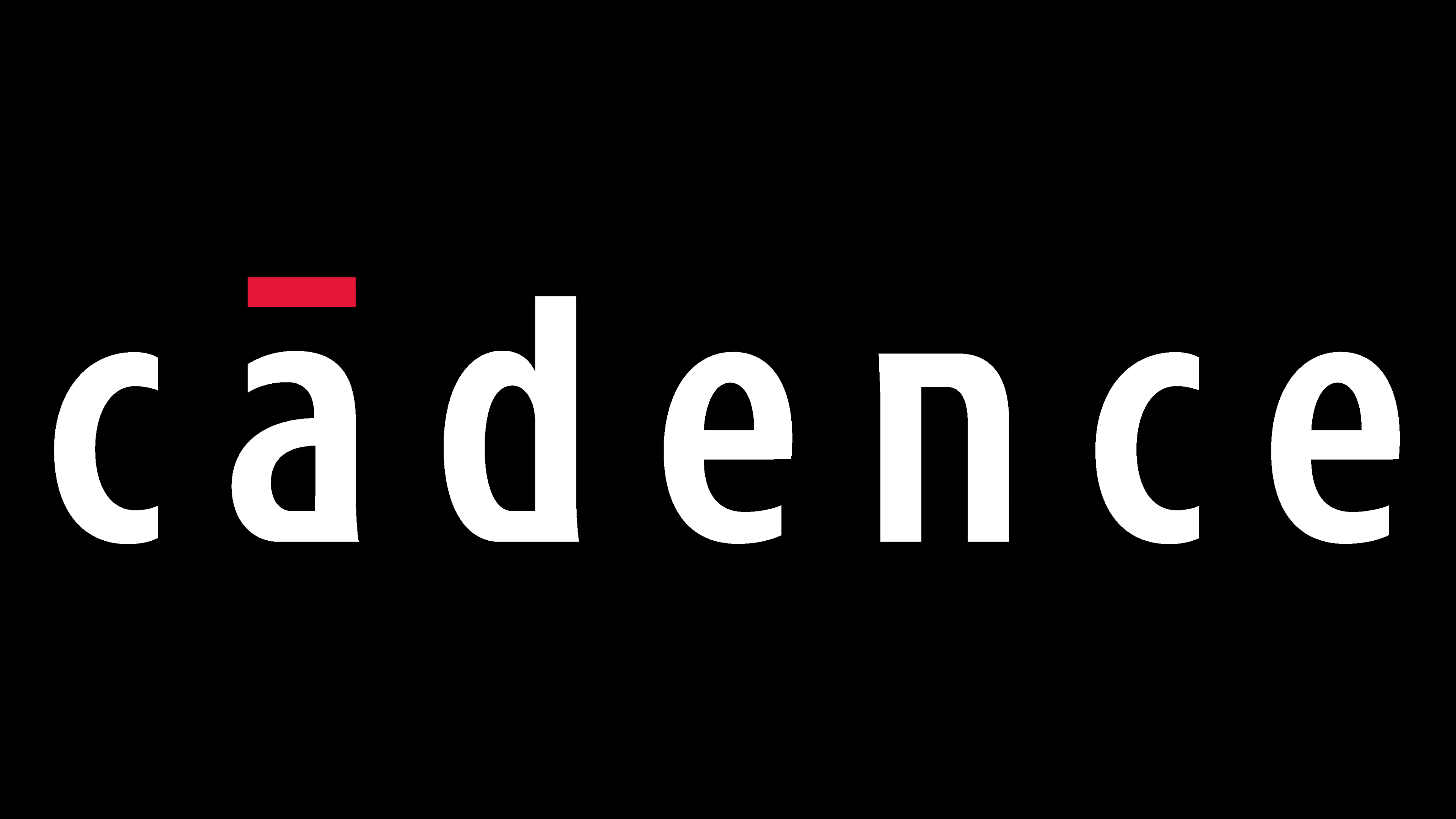
The brand’s emblem is the laconic inscription “Cadence,” set in lowercase sans-serif letters. For the design, a custom font was used that perfectly conveys the company’s scope. It has an original modern design associated with digital technologies. Some letters have slightly elongated and smoothed corners and pointed tails.
The letters N, D, and A are presented in this format. This design adds freshness and lightness to the overall concept. The overall picture conveys harmony and high style. Another feature is the large spacing between letters. Spacing highlights each sign in the brand name, emphasizing its importance and solid status.
A straight horizontal strip above the letter A complements the font. The bright element makes the emblem especially stylish and expressive. It also dilutes the classic colors, which in turn emphasizes the brand’s progressiveness. The color scheme uses black for lettering and white for the background. The standard color is diluted with a red tint to create the graphic element. It symbolizes the company’s passion for its work, strength, and professionalism.