The world-famous Cadillac logo is synonymous with beauty and luxury. It has a rich history, and many looks testify to the innovation of a company looking to the future. This is an ancient heritage in a modern interpretation of the automotive theme.
Cadillac: Brand overview
Meaning and History
There are many versions of the origin of the Cadillac car emblem:
- One version claims that the badge was developed before Christopher Columbus discovered America.
- According to another version, the luxury car brand’s logo was based on images of old Toulouse accounts and was associated with shares held by the King of France.
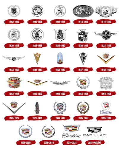
The Cadillac logo has evolved from the bird crest to the black-and-white polygonal shield. It is now an established symbol associated with American luxury cars. Combining an ancient heraldic figure and a modern car grill is an original solution proposed by designers many years ago.
What is Cadillac?
It is one of the many brands of General Motors, a luxury car manufacturer. It was named after the Frenchman Antoine Laumet de La Mothe, sieur de Cadillac, who founded Detroit.
1902 – 1905
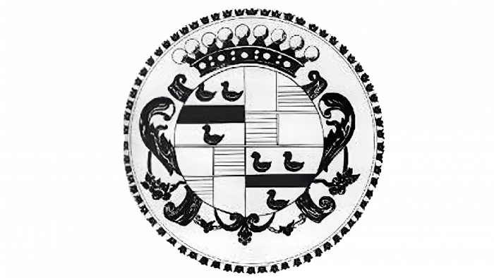
There are several theories about the logo’s original origin. There is a legend among fans of the company’s cars that the logo, in its original embodiment, first appeared before Christopher Columbus discovered America —it was the coat of arms of one of the oldest families of the counts of Toulouse. That is why the logo’s structure, in shape and color, resembles the coats of arms of old France.
After extensive research, it became known that Antoine de la Cadillac was not officially associated with any noble family in France. The automobile company’s legendary founder likely invented much of his aristocratic past to advertise a then-little-known automobile company. The coat of arms that can be seen on the brand’s logo belongs to the famous French family, La Motte.
1905 – 1908
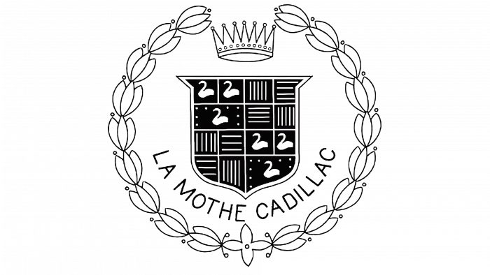
In the first years of its existence, the logo was minimalistic and completely repeated the lines and outlines of the supposedly French noble coat of arms. The basis of the logo is a coat of arms with swans and parallel lines. The crown at the top complemented the composition. There was a circle with a decorative frame around the coat of arms, emphasizing the aristocratic logo. At the bottom of the coat of arms was the inscription “La Mothe Cadillac,” placed at the bottom of the logo. Designers of the time drew inspiration from the coat of arms of the Detroit founder’s family. The Cadillac car trademark was registered in 1906.
1908 – 1914
Before World War I, while the automotive industry experienced its first boom, the Cadillac brand logo became more graphic and bold, emphasizing active development and presentability. The logo plate has become significantly thicker and is now above the main emblem, with the same stylized crown. The slogan “World Standard” replaces the original inscription and is under the arms’ coat.
1914 – 1915
At the beginning of the First World War, the company logo underwent only minor changes. The brand’s design was already recognizable in much of the United States. Its corporate identity had yet to play such a key role in its operations due to the small number of competitors. The strokes and outlines of the coat of arms and the inscription’s font have changed slightly. Simultaneously, the emblem has become more round as the angular outlines of the first cars of the brand have changed.
1915 – 1920
In the second half of the First World War, the logo was significantly redesigned with leaves on the sides of the arms’ coat. This decision was made to mitigate the psychological effect of the war’s destructiveness, which was replaced by pacifist beliefs. Cadillac cars began to appear in every corner of the United States and the world. Their brand became recognizable from afar thanks to the stylish addition of the “iron horses” of one of the world’s best car manufacturers with a harmonious and brilliantly designed logo design.
1920 – 1925
With the advent of the 1920s, the lettering was completely removed from the Cadillac logo. A decorative tulip ring from the original emblem was added to the logo to emphasize brightness and brand awareness. The graphic embodiment of the crown at the top was completely redesigned. The crown had seven pommels, and the ridge part of the logo remained practically intact, perhaps more detailed.
1925 – 1926
In the mid-1920s, a logo shaped like a nut was used. Inside the octagonal figure was a circle with a ring frame. The iconic Cadillac shield was placed in it, divided into four segments, and complemented by a high crown. The name of the car brand was also written there.
1926 – 1930
After the redesign, all the inscriptions were removed. The ring and octagon also disappeared, and the heraldic shield was inside another shield with a pointed base and protruding upper corners. The crown and symbolic patterns were preserved. This logo was used until the late 1920s.
1930 – 1932
After another update, the Cadillac emblem has become clear and detailed. The designers removed the base and left only the central elements: a shield with birds and stripes and a large crown at the top.
1932 – 1933
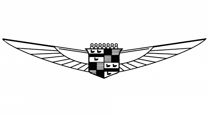
In 1932, the Cadillac logo took on an unusual look. It did not have a cult shield, but widely spread bird wings with traced feathers were used. They were attached to abstract geometric figures over which a crown was depicted. The basis was a black circle with a frame of a double ring.
1933 – 1939
With the advent and proliferation of American aviation, Cadillac also decided to use a universal optimistic motive for its corporate identity. Wings have been added to the logo.
1939 – 1942
A new version of the Cadillac logo was introduced in 1939, at the very dawn of World War II. Now, the logo has become more industrialized—the wings have taken on a rigid shape as a triangle with a crown at the top. Inside the triangle were the swan coat of arms and the corporate colors of the original company crest. The chrome reflections of the logo accentuated the crisp metallic lines, giving the impression of advertising the vehicles themselves’ modern interior.
1942 – 1947
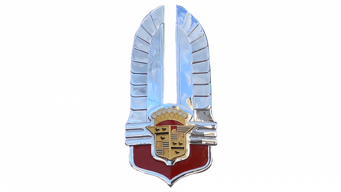
In 1942, the company’s new corporate identity and emblem were presented. The new external incarnation of the automobile giant received an updated shape—now, the wings were directed upwards. A stylized crown was placed in the center of the composition. The classic coat of arms was complemented by the image of a shield below, focusing the consumers’ attention on the comfort and safety of the company’s vehicles.
1947 – 1949
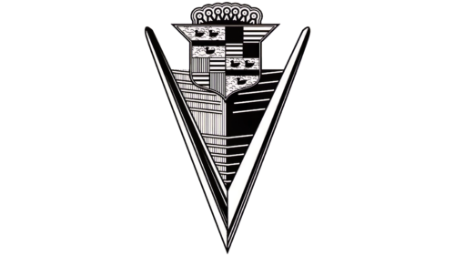
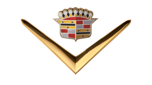
The coat of arms with a stylized crown was at the top. Its lower part went into two symmetrical triangles, folded like an arrowhead. The logo also featured a black and white figure similar to the letter “V.”
1949 – 1953
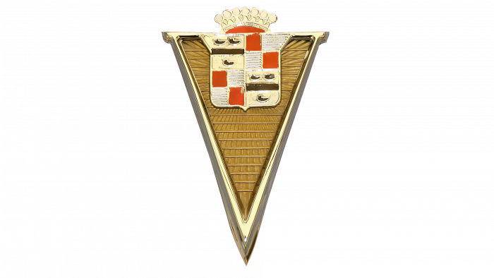
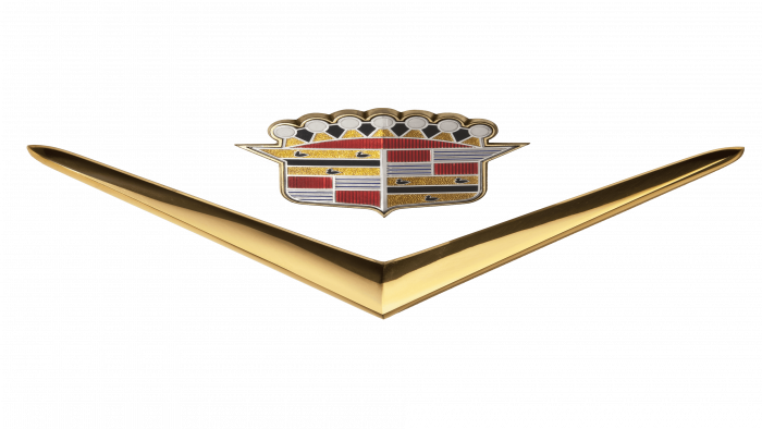
The Cadillac automobile company’s post-war logo is familiar to modern owners of the company’s cars: a symmetrical V-shaped symbol and the same signature accessory—the crown. The logo colors have not changed, but the car owners necessarily polished the checkmark to give their iron horses technological brilliance and visual prestige.
1953 – 1956
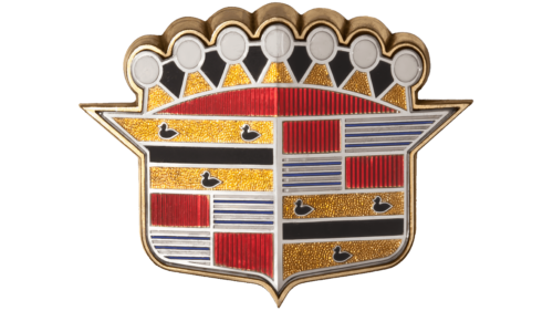
The designers removed the two gold stripes that look like the letter “V.” As a result, only a multi-colored shield with shiny “rhinestones” remained, divided into two parts: light (left) and dark (right). The top, as before, was decorated with triangular crown teeth strung with circles.
1956 – 1960
Many automotive industry giants formed in the middle of the last century. In fierce competition with Japanese and European manufacturers, it was decided to emphasize the American component of the brand and return the classic outlines, complementing them with new details. For example, the symbol in the letter V has already become recognizable to millions of consumers. The coat of arms was lengthened in width, and the classic crown became the graphic accent of the original logo.
1960 – 1963
In the early 1960s, a version of the Cadillac logo without the traditional shield was used. It was a V-shaped design with an extension on which the designers depicted patterns from the shield: stripes and silhouettes of birds. Instead of the usual teeth of the crown, there were round elements with black dots at the top. The main part of the car emblem was silver with a gradient.
1963 – 1964
The most famous form of the Cadillac logo was created in 1963 and has existed as the company’s main corporate identity for over 40 years. The classic company logo is a colorful coat of arms framed by a silver wreath. The coat of arms was painted yellow, blue, and fuchsia with white and black details, giving the logo an extremely creative and modern look that stood out from many competitors.
1964 – 1965
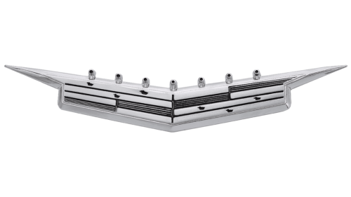
In 1964-1965, the Cadillac logo was simplified. It still contained a heraldic shield with different symbols and a stylized top of the crown, but the designers changed the design significantly. The developers removed all colors except for a few shades of gray and silver. As a result, the patterns on the emblem looked like embossing on metal.
1965 – 1971
The shield became colorful again, with its right side darker than its left. It casts a thin, dark gray shadow to the right and below with blurry edges. In addition, the figure in the form of the letter “V” returned to the logo.
1971 – 1980
In 1971, the Cadillac emblem took on an unusual shape. It looked like an upraised sword with a forked blade and an abstract animal head with long horns. The shield with the crown was in the “hilt” below. A metallic sheen characterized the logo.
1980 – 1985
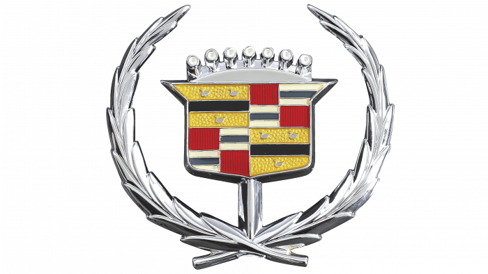
The shield ended up in a wreath folded from two branches. This version used dark and dull colors. The birds were depicted indistinctly – they were lost against the background of other patterns.
1985 – 1995
In 1985, all silver elements acquired a bronze tint. The wreath now has gray outlines that visually separate each leaf. The image of the birds was visible in the yellow rectangles.
1995 – 1999
In 1995, the style of the logo changed: it became two-dimensional and minimalistic. At the same time, all the elements – the crown, the shield, the birds, the multi-colored quadrangles, and the wreath – remained in their original places. The leaves in the wreath were depicted separately, with large indents. And at the bottom, in blue handwriting, was the word “Cadillac.”
1999 – 2009
At the turn of the century, the logo was significantly detailed and stylized to reflect the new technological discoveries and trends. The designers introduced the classic outlines of the coat of arms and the shape of the beginning of the last century, complementing it with a metallic sheen of additional details – this gave the coat of arms a modern look and progressive outlines. The severity of the lines emphasized the elite segment of the car brand.
2009 – 2014
The designers made the Cadillac logo complex by adding more details. First, this affected the colored rectangles, inside which many thin stripes appeared. A silver-gray gradient with white reflections generally dominated the palette.
2014 – 2021
In 2014, the company completely removed the decorative elements from its logo. The main accent of the company’s visual style is a modernized coat of arms with elegant italics, emphasizing the brand’s presentability. Smooth and sophisticated lines of the lettering balance the strict form of the coat of arms.
The Cadillac logo is among the most striking and memorable in the modern premium car market. The brand continued to use the colors chosen as the basis for its corporate identity at the beginning of the last century, making the coat of arms a classic trademark for over 100 years. The ridgelines’ varying thickness is reminiscent of a mosaic and testifies to the brand’s heritage and history of becoming one of the most recognizable automotive companies.
2021 – today
Automaker Cadillac changed its logo in 2021 to fit the new era as it launched Lyriq-branded electric SUVs. This is how a monochrome icon appeared, initially seeming simple: it has an attractive backlight on cars. The designers kept the iconic shield but removed all its symbolic elements, leaving only polygons. Now, the emblem is completely black and white. The inscription also began to look different because a strict grotesque replaced the elegant handwritten font.
Cadillac: Interesting Facts
Cadillac, a car brand founded in 1902 and named after the French explorer who founded Detroit, is among the world’s most prestigious automobile brands. As part of General Motors, Cadillac is known for luxury and innovation.
- Early Recognition: Cadillac got the nickname “Standard of the World” in 1908 when it won the Dewar Trophy for its cars’ reliable and interchangeable parts.
- Innovative Firsts: In 1912, it was the first brand to equip cars with electric starters and lights, making them safer and easier to use without hand cranks.
- V8 Engine: Cadillac introduced the first mass-produced V8 engine in 1915, offering unmatched power and smooth driving that set a new luxury standard.
- Design Milestone: In 1927, Harley Earl designed the LaSalle, Cadillac’s first car with a designer body, making car design a crucial aspect of manufacturing.
- Tailfin Trend: The brand made tailfins popular with its 1948 models, a design inspired by airplanes that symbolized the era’s optimism and progress.
- Comfort Innovations: Cadillac added features for comfort and convenience, like power steering in 1952, standard air conditioning in 1953, and memory seats in 1957.
- The Eldorado Brougham: This 1957 model was among the most luxurious cars of its time, boasting a stainless steel roof, air suspension, and an automatic trunk opener.
- Presidential Limousines: Cadillac has a tradition of providing limousines for U.S. Presidents, reflecting its status as a symbol of prestige and security.
- Fuel Economy Efforts: In response to the 1970s oil crises, Cadillac introduced an engine in 1981 that could deactivate cylinders to save fuel, a precursor to today’s technology.
- Modern Transformation: In the early 2000s, Cadillac revitalized its brand with models like the CTS and a new design approach, “Art and Science,” featuring sharp lines and advanced tech.
Cadillac’s history showcases its role in shaping American luxury and innovation in the car industry. The company continuously pushes boundaries with its commitment to excellence.
Font and Colors
The Cadillac emblem combines the classic outlines of French coats of arms, dating back to the Middle Ages. The main colors are blue, yellow, and fuchsia, one of the car manufacturer’s signature touches. The specific burgundy color symbolizes the presentability of the brand’s products. In the first editions of the coat of arms, Yellow meant that the cars belonged to the premium class. Blue, like most other logos, expresses the seriousness of a company.
Like many of the brand books, the font of the World Standard inscription was handwritten initially. With time, the handwritten version has been preserved; only some of the letters’ outlines have changed. The inscription “Cadillac,” which appeared in the latest editions, is made in the company’s corporate font, repeating the handwriting of the company’s founder.
The Cadillac logo now uses a geometric sans-serif font. Thin black capital letters perfectly balance the shield depicted next to it.
FAQ
What do the ducks mean on the Cadillac emblem?
The ducks in the emblem, called “Merlettes,” are taken from the family coat of arms of Antoine Laumé de Lamothe, Sieur de Cadillac, the founder of Detroit. These stylized black legless ducks became part of the logo when the brand adopted the design.
Merlettes represent the values and virtues of the Cadillac family. According to tradition, these legless ducks could fly but could not land, symbolizing that the family should focus on virtues rather than relying on material possessions. This image highlights the importance of moral integrity and pursuing higher ideals over earthly wealth. The Merlettes complement the brand’s rich heritage and history with a commitment to excellence and noble values.
Why did Cadillac remove the wreath?
The company removed the wreath from its logo to make it more modern and better match the design of its new cars. Andrew Smith, the brand’s executive design director, said the crest continues to symbolize the company and its core values. The goal was to update the logo while maintaining familiar elements.
This change simplifies and expands the logo, making it better suited for automotive grilles and digital media. The new look aligns with current design trends.
What does the Cadillac logo mean?
The logo is based on the coat of arms of Antoine Laumet de La Mothe, Sieur de Cadillac, the founder of Detroit. The shield features yellow, red, blue, and black stripes representing its historical heritage.
- Yellow symbolizes wealth and luxury.
- Red symbolizes courage and bravery, reflecting the brand’s innovative spirit.
- Blue symbolizes courage and loyalty, demonstrating the brand’s commitment to excellence.
- Black symbolizes wisdom and strength, highlighting the brand’s strong foundation.
This design honors the brand’s roots while adopting a modern approach. The shield embodies a combination of tradition and modernity, making it a symbol of luxury and prestige.
When did Cadillac change its logo?
In 2014, the company changed its logo to give it a modern look and better fit the design of its new cars. The update changed the shape of the heraldic shield and added gradients to enhance the three-dimensional effect. The goal was to create a dynamic and visually appealing logo while maintaining the core elements of the original design. This change helped maintain high brand awareness in the automotive market.
Is there any Cadillac in India?
Cadillacs, mostly vintage models, can be seen on Indian roads. These cars are imported by enthusiasts and collectors, as the brand has never officially sold its cars in India. These classic models indicate the brand’s high appeal among car enthusiasts in the country. Despite the lack of an official dealer network, the luxury and prestige of the brand continue to attract the interest and admiration of Indian car enthusiasts.
Is Cadillac a luxury car?
Cadillac is a luxury car manufacturer known for its high-end cars with advanced features and stylish designs. One of the most luxurious models is the 2021 Cadillac Escalade. This model offers premium materials, advanced technology, and powerful performance, making it a standout in the luxury SUV market. The brand remains a symbol of American luxury and innovation, attracting buyers seeking comfort and style.
