


![]() Cadiveu Logo PNG
Cadiveu Logo PNG
The company’s recipes are based on sound scientific evidence and research. The Cadiveu logo embodies the effectiveness of cosmetics. “When buying products, you can be sure of the promised result,” the emblem says.
Cadiveu entered the Brazilian market in 2006 and was founded by Claudia Alcantara. The idea emerged after a failed salon visit, pushing her to study formulations and hair science across several countries before launching the brand in Brazil.
From the start, development and production were based locally, with a team of chemists working on formulas using raw materials from the Amazon, including shea butter, açaí, cocoa, and plant extracts. The brand positioned itself in the professional salon segment rather than mass retail.
Cadiveu focused on keratin treatments during a period when Brazilian straightening gained global attention. Existing solutions often relied on formaldehyde, causing health concerns. The company aimed to create alternatives that did not contain toxic components.
One of the first key lines was Plástica dos Fios, a reconstructive system designed to smooth and restructure hair. It was followed by Brasil Cacau, which became a core product line, as well as Bossa Nova for curly hair and Plástica de Argila, often described as a “hair botox” treatment.
International expansion began early, supported by demand from stylists. Key markets included the US, Italy, Australia, and the Middle East. The brand built an education system with training centers, including one in New York, distinguishing it from competitors such as Inoar and GK Hair.
By the late 2000s, Cadiveu operated in over 50 countries, later expanding to more than 80. Unlike groups such as Wella or L’Oréal Professionnel, the company remained independent.
Meaning and History
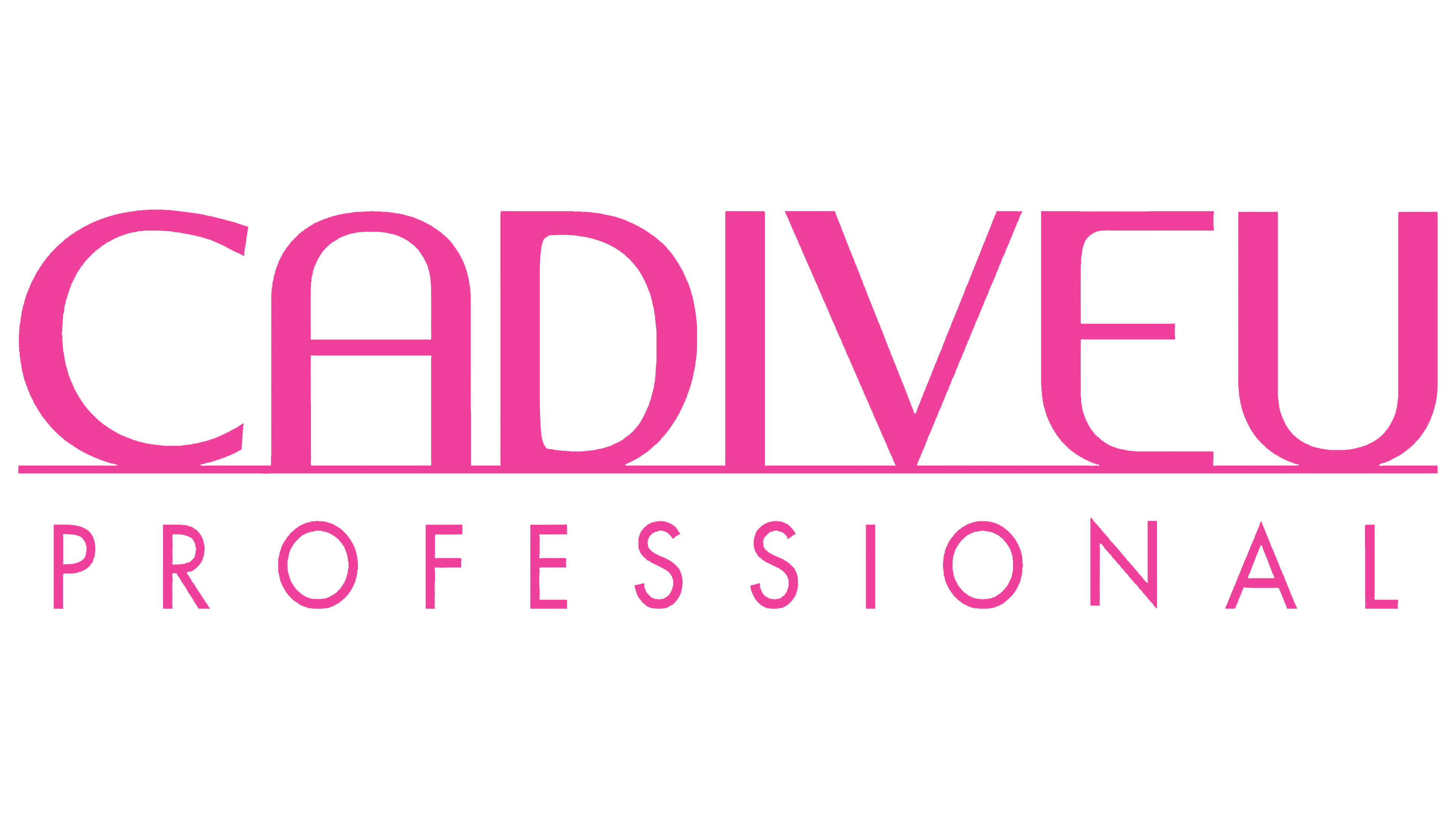
The brand symbols use two font types because the key element of its logo is the name. Like any manufacturer who must place their name on small bottles, they chose the text format.
The logo consists of two parts: the upper part includes the word “Cadiveu,” and the lower part includes the word “Professional.” There is a thin line between them that underscores the brand name. All upper letters merge with it. Moreover, “C” and “E,” as well as “A” and “U,” are almost identical. The designers tried to change them, adding a slight touch of originality. To do this, they cut off the protruding ends “C” and widened the inner lumen “E.” They removed the edge from the letter “A” and depicted it as an elongated arch.
What is Cadiveu?
Cadiveu is a Brazilian manufacturer of hair care products. It offers professional-grade products that can be used at home or in beauty salons, delivering long-lasting, stable results. The company’s main specialization is eco-friendly ingredient-based products. It was founded in 2017.
Font and Colors
The company has emphasized the text, so the typeface has been carefully designed. The highlight of the emblem is the individual font, which is grotesque and has a chopped-up look. The first word is executed in wide lines with a small gap between the signs, which gives the impression that they merge. The second part of the title uses a thin font from the same category (sans serif) but with many characters. For the emblem, the brand chose neon pink.