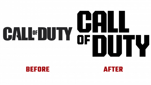
Call of Duty, one of the most iconic video game franchises recognized for its riveting first-person shooter experience, has launched a new logo, marking a significant evolution in its brand identity. Since its debut in 2003, the franchise, published by Activision, has etched itself into the fabric of the gaming industry with a series that spans various combat scenarios, from the gritty theaters of World War II to the high-stakes realms of modern warfare.
The redesigned Call of Duty logo, crafted by the acclaimed agency Koto, signifies a notable departure from its predecessor. The previous logo, known for its military-style stencil strokes, has been reimagined into a design that’s both more cohesive and impactful. Retaining the familiar layout with “OF” in smaller type, the new logo introduces hard-angled contours while eliminating curves, thus achieving a sturdier and more condensed look.
This design shift is aesthetic and functional, enhancing legibility, particularly in smaller sizes. It resonates with the game’s core themes of intensity and action. The logo’s hard angles and solid style mirror the game’s essence of military engagement, making a stronger connection with its audience of avid gamers. The addition of cut-off corners in the letters reinforces the game’s focus on warfare and strategy, adding a rugged, armored feel to the logo.
In tandem with the logo’s transformation, Call of Duty has introduced a custom variable typeface developed with NaN. This typeface echoes the blockiness of the logo but softens it with curved corners and angled letters. The design boasts generous spacing at the joints, forming unique counter spaces that catch the eye. Particular attention is paid to angled letters like “W,” “M,” and “N,” infusing dynamism into the typeface and solidifying the game’s identity.
The introduction of the new Call of Duty logo represents more than a visual overhaul; it’s a strategic move to maintain the brand’s relevance and appeal in a fiercely competitive gaming market. The redesigned logo will be adapted across various game titles within the franchise, each iteration tailored to the theme of the respective game, including “Blackwell,” “Zombies,” and “The Haunting.”
The new branding exudes a sense of boldness and ferocity, embodying key attributes that have defined the Call of Duty franchise through its storied history. This rebranding is a clear statement of the franchise’s intention to continue captivating gamers worldwide while expanding its reach across diverse gaming platforms and experiences.


