


 Calpak Logo PNG
The Calpak logo is elegant and modern, perfectly matching the stylish suitcases, travel bags, and backpacks the company produces. Its simplicity and conciseness emphasize attention to detail, indicating that the brand is committed to high-quality travel accessories.
CALPAK was founded in Los Angeles in 1989 by Edward and Judy Kwon, a married couple who built the company around affordable travel bags and suitcases. Its original name, California Pak, referred to its California roots. In the early years, the founders handled product development, sales, and daily operations themselves.
During the 1990s, the brand expanded its range with new luggage and bag types for different buyers. In the early 2000s, major retailers began carrying its products, which increased sales and visibility. The company also tested new materials and production methods to improve durability. In 2005, CALPAK entered the hard-shell luggage market with a line made for travelers seeking lighter, sturdier suitcases.
A new stage began in 2010, when Jennifer Kwon, the founders’ daughter, joined as creative director. She shifted the brand toward younger customers through updated product design and marketing. The 2013 collection gained attention from fashion media and young travelers, while the 2015 online store gave CALPAK direct contact with customers. In 2016, the brand expanded abroad, focusing first on Europe and Asia.
Astyll, launched in 2017 with marble-print hard-shell luggage, became one of its most visible collections on social media. CALPAK added backpacks and everyday bags in 2018, refreshed its image for its 30th anniversary in 2019, introduced recycled-material luggage in 2020, opened its first Los Angeles store in 2022, and launched EcoTravel in 2023. In 2024, the company announced smart luggage with charging, GPS tracking, built-in scales, and app control.
Meaning and History
What is Calpak?
This brand produces stylish and functional luggage, bags, and travel accessories. The company offers a wide range of products, including suitcases, carry-ons, duffel bags, backpacks, and travel organizers designed to meet the needs of modern travelers. The brand is known for its fashionable designs, high-quality materials, and practical features that enhance the travel experience.
1989 – today
This manufacturer of travel bags and suitcases was founded in 1989 as California Pak and was renamed Calpak only in 2013. At that time, a new logo with a corresponding inscription was needed to showcase the brand’s rebirth in an original image. This was done to attract a younger generation of customers and to reflect the rapid transformation of a modest collection of wallets into a beloved favorite among American travelers.
When creating the emblem for the renowned brand, designers aimed to make it as simple and easy to place on bags as possible. However, practicality is not the only reason for this choice. The appearance of the products played a huge role, as the manufacturer constantly experiments with the shape and color of travel accessories. This means they needed a universal logo that easily adapted to any style.
Thus, the Calpak wordmark contains no unnecessary elements, just the company name, rendered in a minimalist font. But this doesn’t mean the emblem lacks individuality. Each letter is a conditional building block, forming a cohesive image. It symbolizes that the brand’s bags and suitcases are suitable for all travelers, whether they appreciate beauty or value utilitarian practicality.
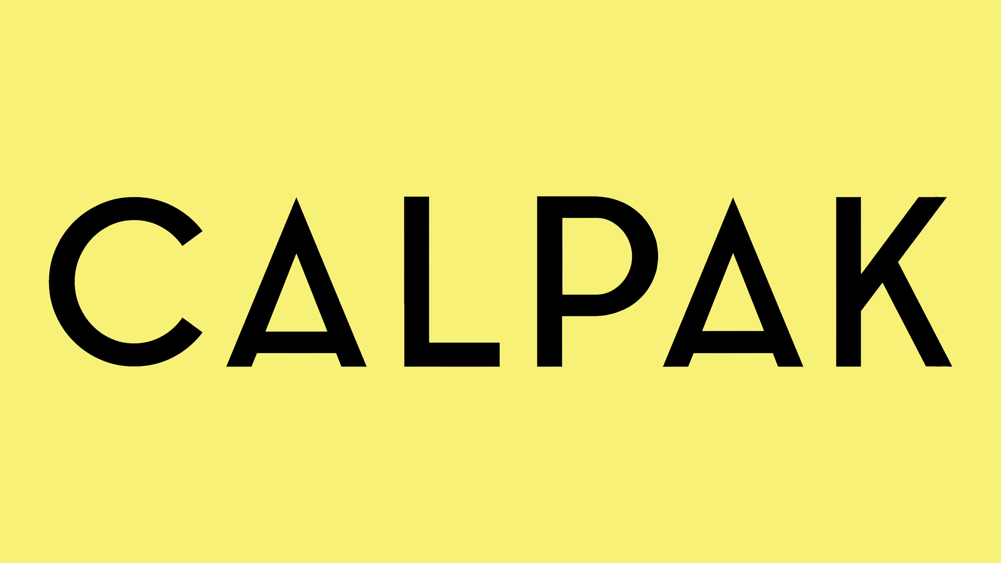
The brand’s identity uses basic geometric shapes: straight lines, diagonals, triangles, and angles. These elements form the basis of the logo. Because of this, the letters appear very simple, but in reality, they contain many unique features:
- The ends of the “C” have uneven cuts.
- The crossbar of both “A” s is lowered.
- The diagonal strokes of the “K” are asymmetrical.
Additionally, its pointed apex makes the “A” resemble an inverted “V,” creating contrast with the rounded parts of the other letters. Such stylistic elements make the inscription unique despite its classic appearance. Overall, the font reflects the influence of the Bauhaus style, which embraces breaking typographic norms, pushing the boundaries of traditional design, and combining functionality with aesthetics. This is evident in the following details:
- The letters are composed of basic geometric shapes.
- The logo lacks complex decorative elements, aligning with minimalist principles.
- The unconventional “A” reflects a spirit of innovation and a willingness to experiment.
The black inscription also reflects the Bauhaus’s philosophy. It creates a sense of restraint and professionalism, and its contrast with the white background emphasizes form. As a result, the Calpak emblem maintains visual clarity, making the brand easily recognizable.