


 Camaro Logo PNG
Chevrolet has chosen a light, stylish Camaro logo for its brand. It embodies high speed and equally high status, adorning the hoods of convertibles with a sporty image. The logo reflects dynamism, maneuverability, flight, and practicality.
The Chevrolet Camaro was born as a direct answer to the Ford Mustang, which was launched in April 1964 and sold more than 400,000 units in its first year. Under pressure from dealers and buyers, Chevrolet moved quickly. Henry Haga led the design work, while the F-body platform used parts from the Chevrolet Nova. The Camaro officially went on sale on September 29, 1966, as a 1967 model.
The first generation ran from 1967 to 1969 and offered hardtop coupe and convertible bodies, with SS, RS, and Z/28 packages. Z/28 was created in December 1966 for Trans-Am homologation by engineer Vince Piggins, who combined a 327 engine block with a 283 crankshaft to reach the 302-cubic-inch limit. Only 602 were sold in 1967, but sales rose to 7,199 in 1968. The RS/SS 396 served as the 1967 Indianapolis 500 pace car.
The second generation arrived in spring 1970 and stayed until 1981. It was longer, wider, and lower, and it was sold without a convertible. The 1973 oil crisis and emissions rules reduced power, and the Z/28 disappeared temporarily in 1974. Yet 1979 became Camaro’s strongest year, with 282,571 cars sold, including nearly 85,000 Z/28 models.
The third generation debuted in 1982 with MacPherson struts, rack-and-pinion steering, a hatchback body, and a 62-degree windshield. IROC-Z appeared in 1985, and the convertible returned in 1987. The fourth generation ran from 1993 to 2002 and gained the LS1 V8 from Corvette in 1998. General Motors ended production of the Camaro and Pontiac Firebird in 2002. Interest returned after the 2007 Transformers film, followed by the 2010 fifth generation, the 2016 sixth generation, and final Chevrolet production in 2024, after the Dodge Challenger had ended.
Meaning and History
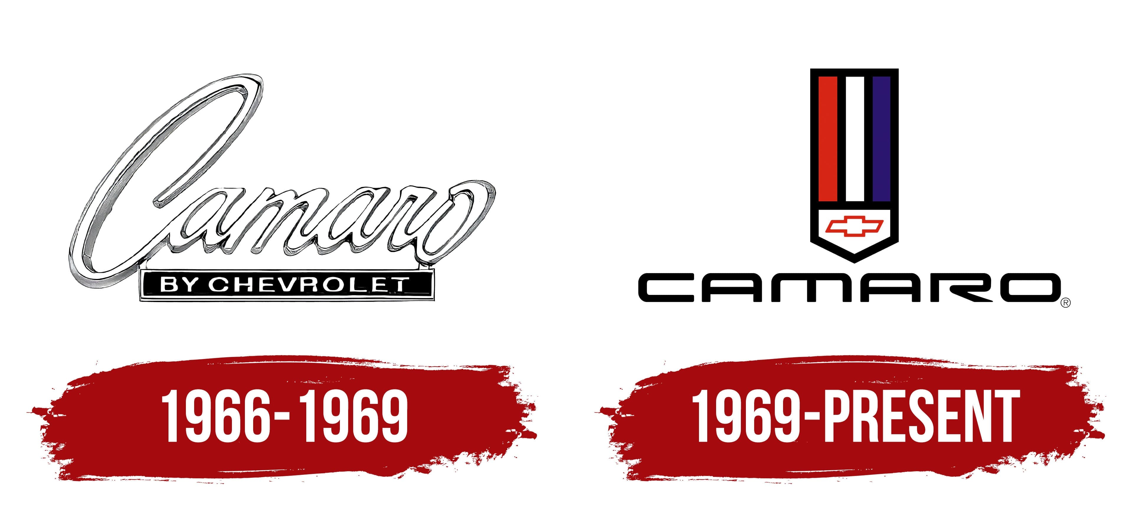
In the first period, four generations of this brand’s cars were presented; in the second, vehicles of the fifth and sixth generations were developed. In each case, a specific logo, based on the name, adorned the hood. It was invented by Ed Rollett (GM Vice President) and Bob Lund (manager of the same company).
The impetus for this idea was a 1936 dictionary book by James Boïelle. It states that “camaro” is a slang word in two languages. In both English and French, it means “comrade, friend, buddy.” Thus, the names of the cars in this series directly indicate that they are friends with their owners and that good comradeship should be maintained with this equipment. That is, the Camaro logo conveys the manufacturer’s concept.
What is Camaro?
This is one of the most recognizable American muscle cars, leading the “pony car” market. This sports car has long used an aggressive appearance and powerful engines, from tire-shredding V8S in the SS and ZL1 versions to more economical V6S. Manufactured in Michigan, it embodies Chevrolet’s philosophy of providing enthusiasts with accessible power and a range of trim options suited to different driving styles and price ranges.
1966 – 1969
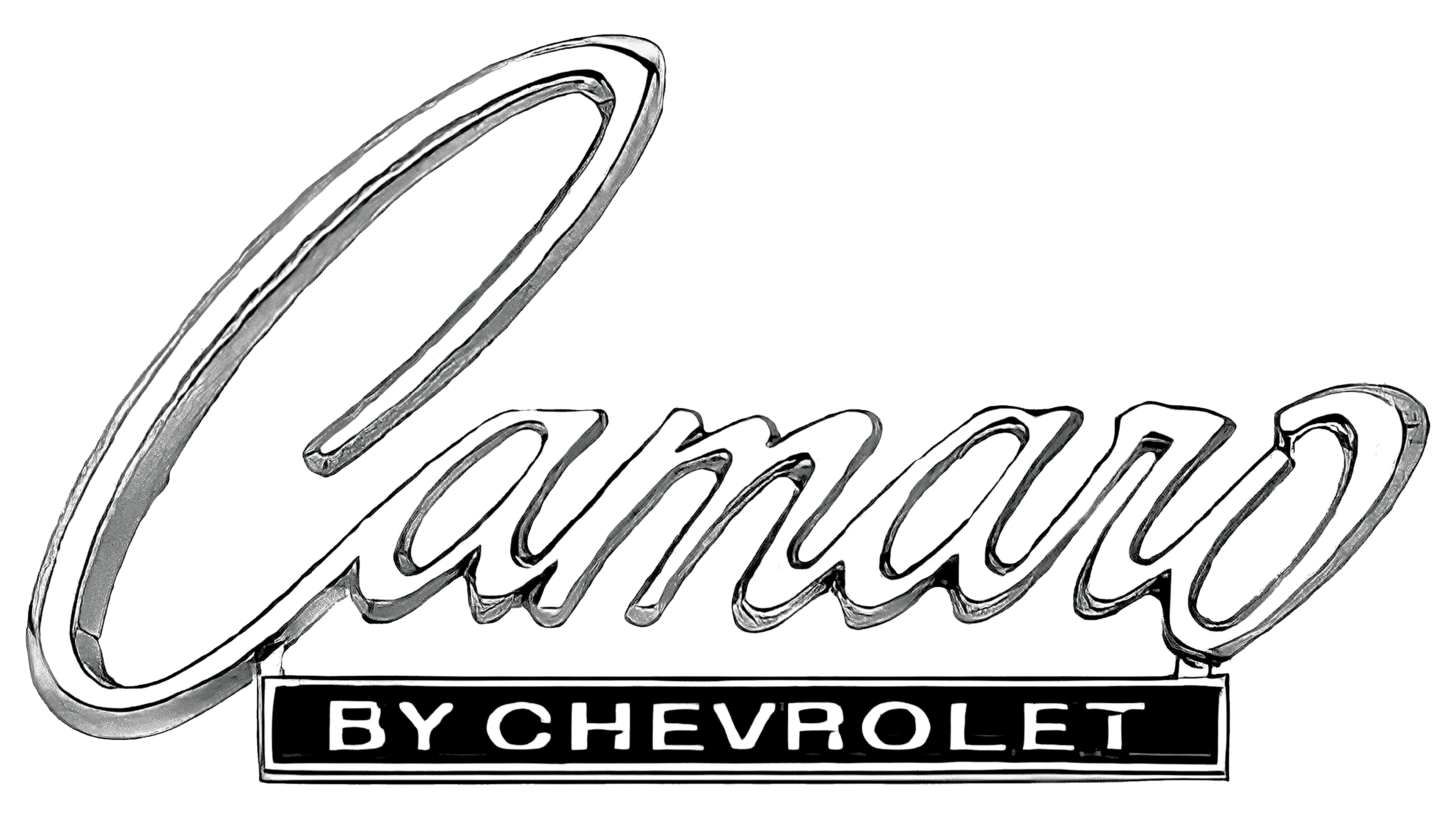
The debut emblem features a cursive inscription in fluent handwriting. The name is connected to each previous letter, transitioning to the next. The glyphs are white, but due to the gray shadows, blurred at the bottom and expanded on the right side, they appear light silver. The three-dimensional contour lines also contribute to this effect. In the second row, a long black rectangle indicates the company the Camaro series belongs to.
1969 – today
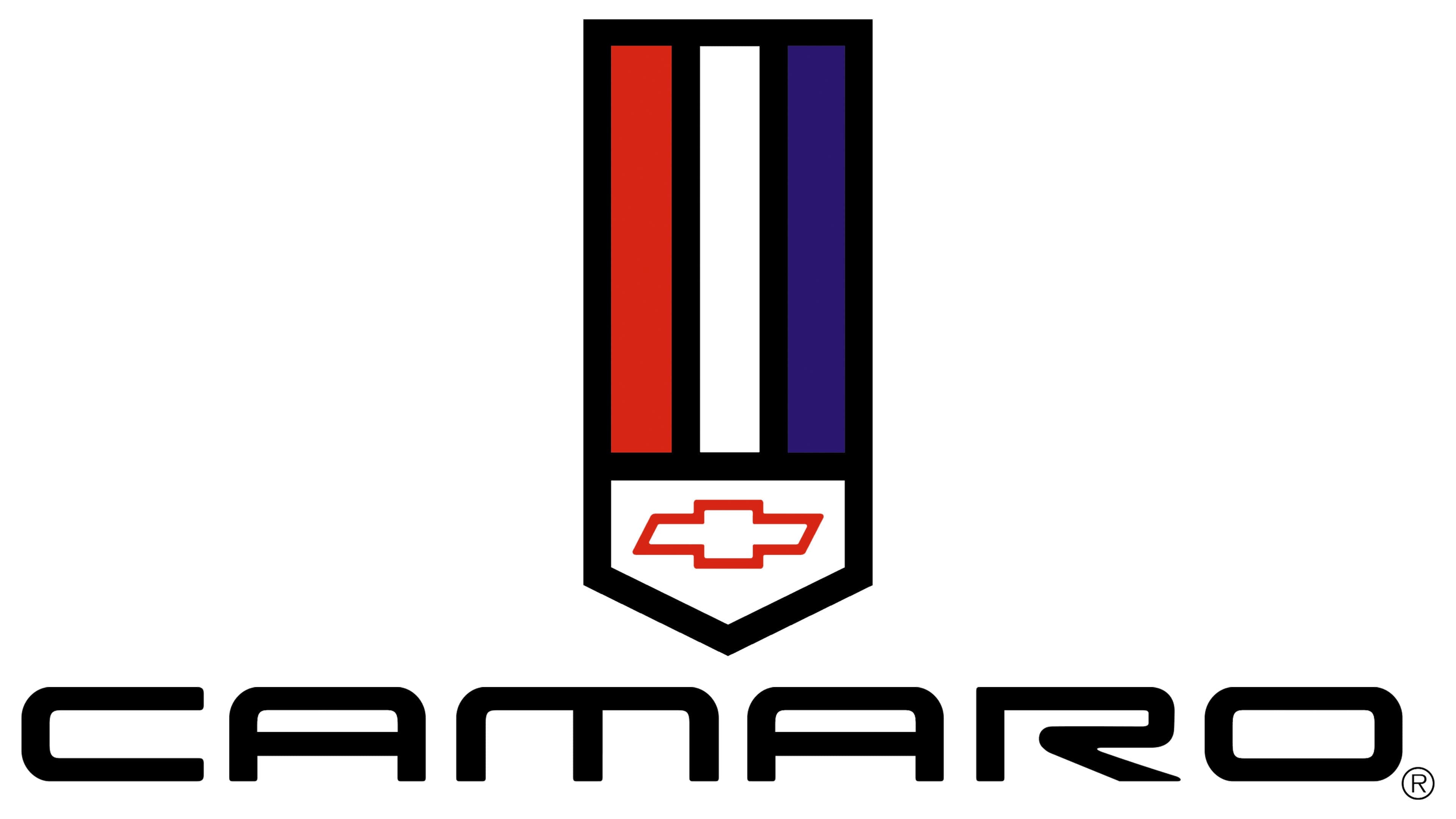
The next logo in the car brand’s history differs significantly from the first. The main feature is a long shield with three vertical stripes of different colors: blue, white, and red. The name has become printed. The font used for it is thin and wide. The rounded letters, a mix of uppercase and lowercase, are the emblem’s highlight. With this typographic technique, designers were able to unify symbols and make them as similar as possible. The only exception is the “R” with a sharp, downward-pointing leg.
The Camaro’s visual identity was initially associated with the parent company that owns the car brand. Therefore, during the first period of its existence, a badge bearing the “by Chevrolet” mark was displayed on sporty convertibles and on all subsequent models. It was located under the main inscription and was designed in a different style. The font was small and thin but stood out against the black rectangle. Later, this indication disappeared, leaving only the series name.
Font and Colors
As car enthusiasts claim, each new-generation car is equipped with an emblem featuring an individual font designed specifically for that model. One of the typefaces is called Oramac, which, spelled backward, means Camaro. In the modern version, the Ultra 911 font is used in a wide, thin, rounded, and flattened style. The letters in it are almost unified, as they are similar in shape.
The emblem palette is restrained but still not without color. The latest logo features bright colors, including blue, white, and red. The debut emblem is silver, chrome-plated, with a black plate at the bottom.