


![]() Canada Dry Logo PNG
Canada Dry Logo PNG
The Canada Dry logo pays tribute to the country of origin and spreads the word about Canada worldwide. The elements convey the drink’s premium quality and taste because, according to the emblem, the brand was served at the table of the crown’s representatives.
Canada Dry began with John James McLaughlin, born in Ontario in 1865. After studying pharmacy in Toronto and training in Brooklyn, he worked at a soda fountain. He saw stronger business potential in drinks than in medicine. In 1890, he returned to Toronto and opened a carbonated water plant for pharmacies.
His first ginger ale followed the darker Belfast style, but McLaughlin wanted a lighter, less-sweet drink. In 1904, he introduced Canada Dry Pale Ginger Ale. “Dry” referred to lower sweetness, as in dry wine. In 1905, the company became J.J. McLaughlin Limited, and in 1907, the trademark was registered.
The brand gained official supplier status for the Vice-Regal household. Its identity changed from a beaver to a crown with a map of Canada inside a shield. Maud McLaughlin created the slogan “The Champagne of Ginger Ales.” After McLaughlin died in 1914, George and Samuel McLaughlin managed the business.
Canada Dry entered New York in 1919 and later opened a plant in Manhattan. In 1923, it became Canada Dry Ginger Ale, Inc. During Prohibition, it grew as a mixer for homemade alcohol. In the 1930s, the brand expanded abroad and added club soda and tonic. Later owners included Cadbury Schweppes in 1986, Dr. Pepper Snapple Group in 2008, and Keurig Dr. Pepper after the 2018 merger. In 2019, lawsuits over “made from real ginger” claims led to compensation and removal of the wording.
Meaning and History
![]()
The Canada Dry logo has a patriotic focus and is inextricably linked to Canada. All its attributes point to this country, from the map to the color choices.
What is Canada Dry?
This is a leading ginger ale brand from Keurig Dr. Pepper, renowned for its perfect balance of ginger flavor and clean, crisp taste. In addition to classic ginger ale, the brand offers club soda, tonic water, and flavored sparkling beverages, maintaining the original qualities that made it famous. This drink is a premium mixer for cocktails and mocktails, and it’s also excellent on its own. It is also widely used as a trusted remedy for an upset stomach.
1904 – 1975
![]()
The drink was created by chemist and pharmacist McLaughlin. It differed in taste from other ales, with minimal sweetness. As the developer planned, the drink was meant to resemble dry French champagne. This was achieved in 1904. The owner reflected this feature in the name, using “dry.”
The first product labels featured a beaver (Canada’s symbol) on a Canadian map. Three years later, Ale received its famous logo, featuring a crown, shield, and map of Canada, when the country’s governor-general marked it and began serving at his court.
The red Canada Dry inscription on the map’s white background alludes to the colors of Great Britain and France, the land’s first colonizers.
The crown above the coat of arms was a count’s crown, as the country’s governor-general was a count. This sign and the golden color of the edging of the coat of arms symbolized the ruling house’s patronage and approval of ale and made McLaughlin ale a royal drink. The gold on the logo creates a sense of volume and shimmers like an amber ale.
The dark green background around the map represents the oceans surrounding Canada. The green color also nods to the green flag of Ontario (McLaughlin’s homeland), Canadian forests, clover, and St. Patrick’s (many Irish settlers live in Ontario, and the pharmacist’s surname has Irish roots).
1958 – 1990
![]()
Ginger ale quickly gained popularity; production was opened in New York, and it began to be exported to other countries. In the early fifties, the company expanded and introduced another product: Tonic Water Club Soda. She was one of the first to bottle her drinks in cans. This was reflected in the logo change.
Raymond Loewy, a well-known industrial designer, designed the new sign. It had an unusual, blurry image, as if under greenish water. Indeed, drinks “crossed the ocean” and began to be sold in other countries. At the same time, gold disappeared from the color scheme, leaving only green, white, and red. However, green was the most predominant color.
The new color scheme echoed the country’s forested nature and its flag, which featured green maple leaves until 1957. In addition, on old maps, the continents had a wide, most often dark green border, like on the logo. The changes created a clear association with Canada; the drink has a fairly long history.
1990 – 2000
![]()
Starting in 1982, Canada Dry changed hands until 1986, when it was acquired by the British confectionery company Cadbury Schweppes. By then, the company had changed direction and was the world’s third-largest producer of soft drinks. The arrival of new owners prompted a change to the brand’s visual symbol.
Canada Dry was now related to Canada only by its origin. Drinks have been introduced and are known in many countries. Therefore, the image of the Canadian map in the shield faded into the background of the new logo. The brand name became central. It is written in large red letters and goes beyond the shield, immediately attracting attention.
The border of the shield and the crown are depicted in yellow and slightly reminiscent of the ale’s color. Outside the composition is a thin green border.
2000 – 2010
![]()
In 1999, Cadbury Schweppes sold its business to The Coca-Cola Company, leaving North America and Europe as its backbone. This was the implementation of a plan to return to the “chocolate” business. At this time, the remaining brands were changing.
The map of Canada has completely disappeared from the logo. However, there was an indication of the brand’s centennial history, the inscription “since 1904” located above the name. The shield tilted, symbolizing the brand’s new beginning. The image of mountain peaks appeared, and the color scheme changed to silver. As on a map, only meridians and parallels have been preserved, showing that the drink is popular in different countries. Light colors and mountains indicated a refreshing taste. Drinks perfectly quench the thirst due to their low sugar content. This message became the primary one when introducing the brand to the market.
2010 – today
![]()
In 2008, the remnants of Cadbury split into two strands. The Dr. Pepper Snapple Group took over the beverage business, and Kraft Foods took over the sweets company in 2010. Canada Dry is under the jurisdiction of Keurig Dr. Pepper. It took a change to the logo to mark these innovations.
The logo partially regains its authenticity: it depicts a map of Canada. The background becomes bright yellow, and the shield border becomes green. They symbolize prosperity, natural composition, and the yellow ginger root, the basis of ginger ale. The form of the crown changes from an earl’s to a viscount’s crown, indicating the first Governor-General of Canada to hold this title.
The brand name extends beyond the shield, as do its drinks outside the country of origin. A more sophisticated font was chosen for letters, and volume was added.
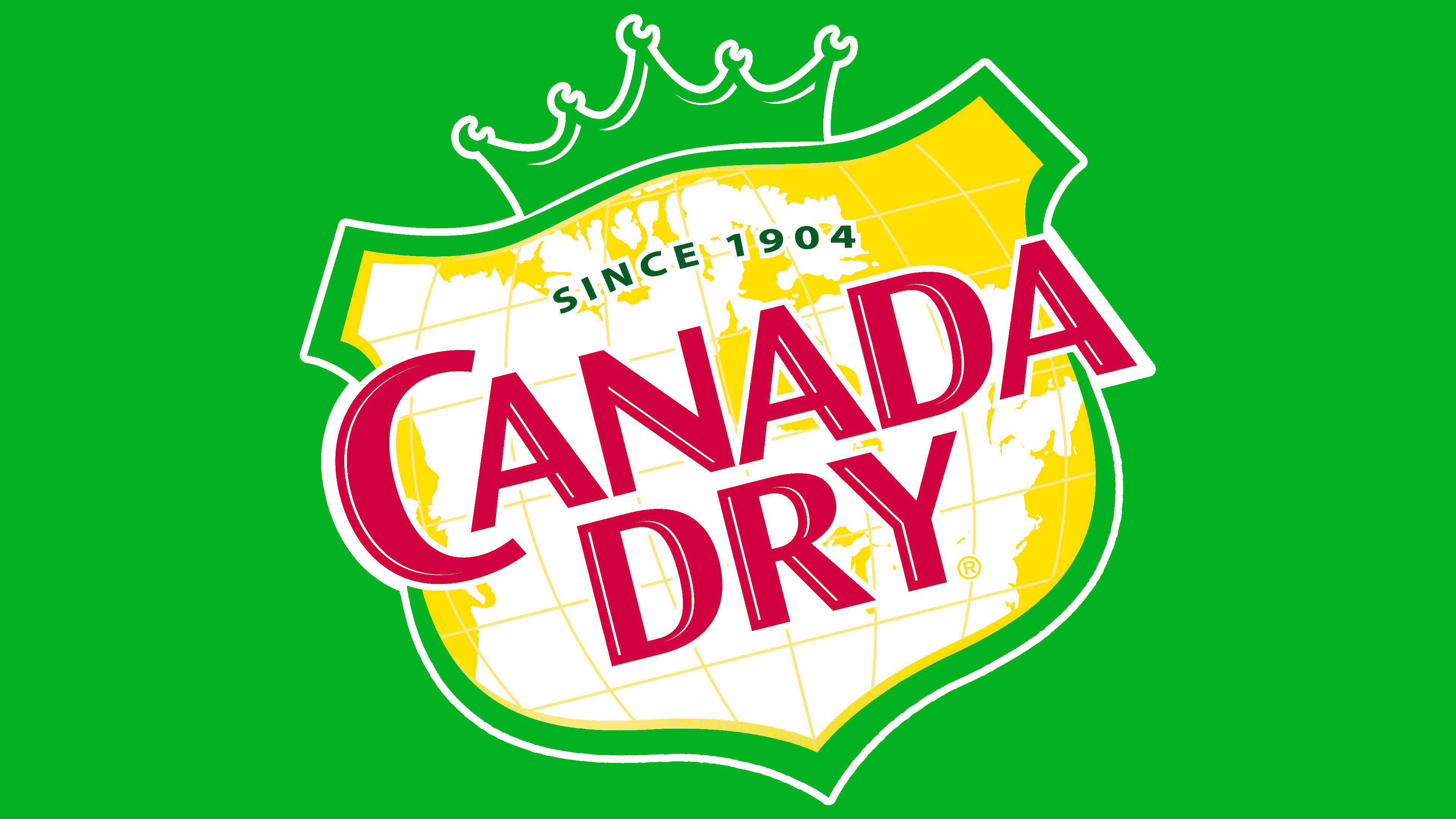
2022 – today (Canada)
![]()
In 2022, soft drink maker Canada Dry unveiled a new logo to be used only in its home country, Canada. The heraldic shield has retained its original shape, with two projections at the top, but now it no longer inclines to the right and is aligned as it was a hundred years ago.
The shield still symbolizes a map drawn by parallels and meridians. However, now there is no image of Canada on it; empty white space serves as the background. The logo’s inner lines and wide frame are in a light golden hue, while the thin outer outline is dark green, like the crown at the top. The latter, by the way, has also been changed. Now, it is decorated with five fat dots. The inscription “SINCE 1904” and the brand name are painted burgundy. At the same time, for the phrase “CANADA DRY,” an individually designed font with unusually smooth curves and sharp serifs sticking out in all directions is used.
Font and Colors
All logo variations are dominated by yellow, green, white, and red colors.
- Yellow signifies premium quality, light, joy, and good mood.
- Green the greens of Canada, the Irish roots of the drink’s creator, the naturalness of this brand of ale, and care for the environment’s safety.
- White is the color of the beginning, base, and white sheet. Canada Dry drinks are the basis for various cocktails. The white image of Canada’s territory indicates that the stamp originates here.
- Red – energy, movement, love. People in many countries love drinks.
The logo font is related to Microsoft JhengHei and Malgun Gothic Semilight.