The demonstrative aggression that fills the Cannibal Corpse logo perfectly fits the style of this band. After all, death metal involves such feelings as intensity, irrepressibility, and destructiveness. Designers considered the genre-specific features of the music and developed an emblem to match.
Cannibal Corpse: Brand overview
| Founded: | 1988 – resent |
| Founder: | Alex Webster, Jack Owen, Paul Mazurkiewicz, Chris Barnes, Bob Rusay, Barnes |
| Headquarters: | Buffalo, New York, U.S. |
| Website: | cannibalcorpse.net |
Meaning and History
Expressive symbolism that has survived the years. The Cannibal Corpse logo conveys an atmosphere of negation of negativity, as it is imbued with a spirit of mysticism. It concentrates peak emotion that absorbs the black energy of protest against the world’s injustice.
Immediately after its debut, the band acquired a logo with the inscription “Cannibal Corpse.” Bassist Alex Webster coined the name, and the other musicians unanimously supported it.
What is Cannibal Corpse?
It is an American band, with drummer Paul Mazurkiewicz and bassist Alex Webster as its constant members. It appeared in 1988 and, from the very beginning, played death metal.
1988 – 1995
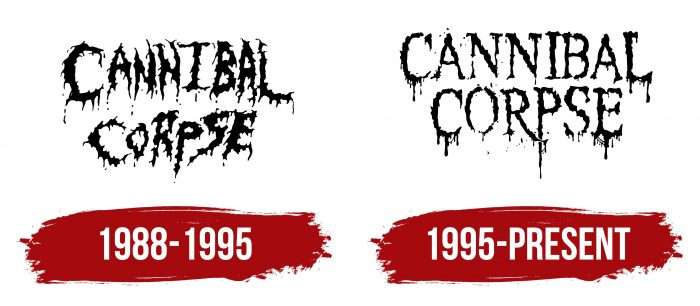
The first version of the logo appeared on the cover of the album “Eaten Back to Life,” released in 1990. It looked terrifying: it seemed that the words were written in blood. That was intentional, as designers chose red as the main color. Numerous splatters, droplets, and blurred lines intensified the impression. Moreover, the letters themselves were uneven and disproportionate.
1995 – today
In 1995, the drawing style changed somewhat. On the cover of the studio album “Vile,” fans first saw a more strict and neat logo. The inscription “Cannibal Corpse” was now done in a serif font. The letters no longer jumped as before; they were aligned horizontally and vertically. Traces of droplets were directed downwards, not smeared in all directions.
Due to its provocative design, the band’s logo has been subject to criticism more than once. On the other hand, the red color can be interpreted as the color of blood and the color of passion – apparently, passion for music.
Cannibal Corpse: Interesting Facts
Cannibal Corpse is a band from the United States that plays a type of music called death metal. They started in 1988 and are known for their intense music and stories in songs not for the faint of heart.
- How They Began: Some people in other bands started the band in Buffalo, New York. They got together and decided to make new music, Cannibal Corpse.
- Getting Popular: Their first album came out in 1990, and many people who liked Death Metal thought it was good. Their music is loud and fast and tells stories like horror movies.
- Big Debates: Some countries didn’t let the band sell its music or perform because they thought the stories in the songs were too scary or violent.
- New Singer: In 1995, they hired a new singer, George “Corpsegrinder” Fisher, who became a big part of the band.
- Many Fans: Although some people didn’t like their music because of the stories they told, many others did, and the band sold millions of albums worldwide.
- In a Movie: They were in a comedy movie with Jim Carrey in 1994 because he liked their music. This made even more people find out about them.
- Staying Together: The band hasn’t changed its members too much over the years, which helped them keep making music that sounds like them.
- Influencing Others: Many other death metal bands were inspired by Cannibal Corpse because they are very skilled at their instruments and making songs.
- Their Album Covers: Vincent Locke is the artist who makes the pictures on their albums, which are very detailed and show scary scenes.
- What Their Songs Are About: The band’s songs are inspired by horror stories and movies and discuss zombies and other spooky things. They say it’s just for fun and not to be taken too seriously.
Cannibal Corpse has played a big role in death metal music, with its energetic music and strong presence on stage. They’ve stirred up some controversy but also have a lot of fans who love what they do.
Font and Colors
Although the red logo of Cannibal Corpse is considered classic, it has several palette variants. A version with a black inscription is widely spread. In addition, it was once white (on the cover of Butchered at Birth, 1991), light gray (Gore Obsessed, 2002), and dark yellow (A Skeletal Domain, 2014).
Cannibal Corpse color codes
| Black | Hex color: | #000000 |
|---|---|---|
| RGB: | 0 0 0 | |
| CMYK: | 0 0 0 100 | |
| Pantone: | PMS Process Black C |
FAQ
When did Cannibal Corpse change its logo?
The current logo of Cannibal Corpse was designed in 1995. Since then, only the color of the inscription on the covers of new albums has changed.
What kind of metal does Cannibal Corpse perform?
Cannibal Corpse’s music belongs to the death metal genre. This is a subgenre of heavy metal characterized by sharp changes in tempo, the absence of keyboards, aggressive percussion, growling vocals, and special guitar techniques.
On which label is Cannibal Corpse released?
Since 1990, Cannibal Corpse has collaborated with the label Metal Blade Records, which specializes in heavy metal music.
How much is Cannibal Corpse worth?
The exact value of Cannibal Corpse is unknown. Preliminary information (as of 2021) suggests the band’s estimated revenue could range from 2800 to 3700 thousand dollars.
