The brand is quite recognizable, thanks to its bright and fresh logo. It consists of a graphic symbol (a stylized first letter of the name) and the inscription Cannondale. The logo evokes only positive associations and conveys the friendly spirit of the brand. The bright green color also symbolizes the trust of hundreds of customers who have had time to evaluate the quality of products.
Cannondale: Brand overview
| Founded: | 1971 |
| Founder: | Pon Holdings |
| Headquarters: | Wilton, Connecticut, United States |
| Website: | cannondale.com |
Meaning and History
Cannondale is a unique company that has changed its focus several times. But, the changes only benefited. Today, under the specified name (Cannondale Bicycle Corporation) operates a successful brand that produces high-quality products. They are recognized in most countries and know what excellent performance they differ.
Bicycles are easy to find among models from other manufacturers. The brand logo immediately captures the attention of buyers with its expressiveness and brightness. This goal was achieved by designers working on visual identity. They took the first letter as a basis and turned it into a stylish icon that immediately caught the eye.
Beneath it, the company’s very name was revealed – confirmation that a reliable brand made the model with an excellent reputation. Each element in this concept has a special meaning and harmonizes with other logo parts. A massive three-dimensional letter is balanced by neat, identical smaller letters.
What is Cannondale?
Cannondale is a successful division of one of the largest Canadian conglomerates. The company has been operating under the control of Dorel Industries for many years and, during this time, has been able to create a whole line of perfect bicycle models. The production process used CAAD technology and a special material (carbon). Cyclists around the world have already appreciated models.
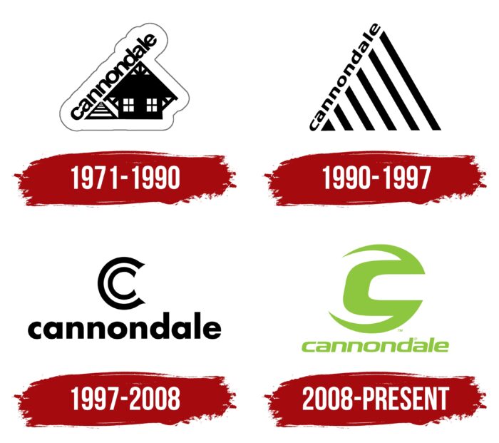
1971 – 1990
The idea of creating a company appeared in 1971. Three entrepreneurs (Ron Davis, Jim Catrambone, and Joseph Montgomery) decided to create a company that specialized in the production of precast concrete structures. Later, the direction was completely changed. The brand launched clothing and backpacks for cyclists. The creators did not stop there and soon began to develop trailers for bicycles intended for tourism.
Since 1983, a full-fledged production of two-wheeled vehicles has already been launched. During this period, the brand’s visual identity was based on the original logo, which consisted of several elements at once. The picture showed a house, a striped triangle, and the name of a company slanted.
The colors were not varied. Only black and white colors can be seen on the emblem. The choice of such shades was due to the company’s characteristics. It was a reliable and self-confident brand that sought to strengthen its position. The black and white color scheme favorably emphasized the solidity and elitism of the company.
1990 – 1997
In 1990, the company expanded its lineup with functional lines of motorcycles (motocross) and ATVs. But, such a decision led to a worsening of the situation and the search for solutions to reach the previous level. All this became one of the prerequisites for changing the corporate identity. The new emblem has become more simple and concise. This testified to the company’s desire for renewal and development.
An isosceles triangle divided into stripes was placed in the center of the image. On one side was the name of the company, written in neat miniature letters of the same size. The updated logo solved the “hanging” problem present in the previous version. The inscription did not fit on one side of the triangle, which created an effect of disproportion. Now the inscription was completely a stylish continuation that did not cause dissonance.
1997 – 2008
In 1997, Cannondale introduced a new bike model, the CAAD3. It was a new, more advanced type of two-wheeled vehicle from the 2.8 categories. The release of a new successful model prompted management to rebrand. The result was a new emblem vaguely similar to the modern version.
The double letter C became the central element. It created a special emphasis on the brand name and confirmed the strengthening of its position in the market. The company quickly went to success and developed new, improved models. Additional confirmation of the position improvement was a clearer and more expressive font.
The letters are thicker, rounder, and softer. This design evokes associations with comfort and reliability, which the brand wanted to convey to customers. The colors of the logo remain the same. Achromatic colors emphasized the prestige and solid status of the company.
2008 – today
A change in visual identity also took place in 2008 when Cannondale introduced the world to the world with improved bikes from a new line (SystemSix). During this period, a version of the logo was created, which is used to this day. It was a stylish concept that was radically different from all previous emblems.
Changed the design as a whole, the font, and colors. The basis of the updated badge is a massive letter C, which is made with thick lines. At the back, the ends of the lines do not connect, which adds originality and freshness. The font has become more refined and stretched, and the basic colors have changed to bright ones. These changes demonstrated the company’s progressive approach, as well as the desire for improvement.
Font and Colors
The modern corporate identity of the brand is based on a bright and expressive logo. The designers chose a bright green color for the main elements and white color for the background for decoration. The last shade is universal and symbolizes purity. In combination with a green tint, it creates the effect of freshness, energy, and lightness.
The updated palette perfectly underlined the company’s commitment to introducing progressive technologies that can make cycling even more comfortable and easier. A stylish font complements the overall concept. The name of the company is executed in straight thin, sans-serif lines, evoking a sense of confidence and professionalism.
They are also a stylish continuation of the top symbol. The inscription looks very harmonious and enthusiastic in combination with the massive letter C. But, the main message of the logo is professionalism, which is manifested at every stage of the production of functional bikes. It is visible in all the elements of the original emblem – a confident typeface, expressive colors, and a massive graphic symbol in the center.
Cannondale color codes
| Yellow Green | Hex color: | #8dc73f |
|---|---|---|
| RGB: | 141 199 63 | |
| CMYK: | 29 0 68 22 | |
| Pantone: | PMS 74887 C |


