The striking Capcom logo is particularly appealing to video game fans because it represents the company that produces them. The unconventional visual identity proves that it has a rich imagination and a high creative potential that can lay the foundation for many fascinating digital products. The emblem demonstrates the brand’s limitless possibilities to increase its range.
Capcom: Brand overview
| Founded: | 30 May 1979 |
| Founder: | Kenzo Tsujimoto |
| Headquarters: | Chūō-ku, Osaka, Japan |
| Website: | capcom.com |
Meaning and History
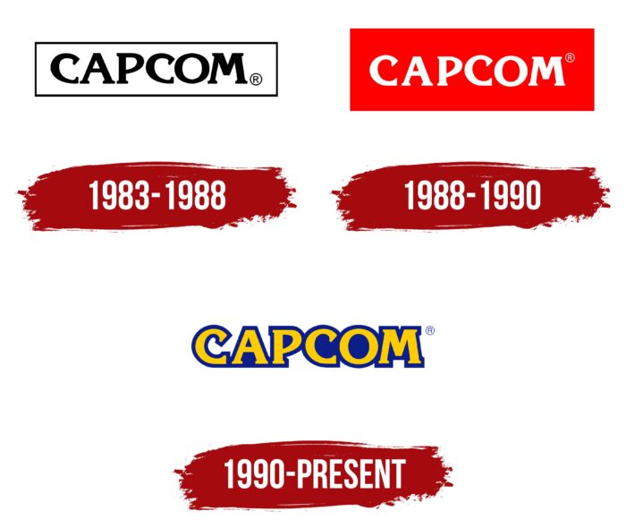
Visual brand recognition is at a high level due to the popularity of the projects released by Capcom. Three versions of the logo have been introduced over time. With each new redesign, the emblem became more spectacular and eye-catching, clearly associated with the company’s activities by potential customers.
What is Capcom?
It is one of the most famous video game developers globally—millions of gamers run Capcom-developed software every day to have fun.
1983 – 1988
The original version of the logo was designed in a terse and minimalist style. It was black verbal lettering on a white background with a black outline. The Capcom brand name itself was done with a modern bold serif font. All letters in the word were capitalized and had thick lines with an unusual form of roundings. Because of the chosen font, customers were increasingly paying attention to Capcom products, which stood out from the competition.
1988 – 1990
In 1988 the first redesign of the logo occurred. It was almost the same as the original version, but the lines in the letters became thinner and more elegant. Also, this logo was used in a different color palette. Apart from the classic black and white version, you could also see white letters on a red background.
1990 – today
The last redesign to date took place in 1990. This was a global redesign of the logo. Despite the retro style and the unusual color palette, it became brighter and more recognizable to the target audience.
If we talk about the style of spelling of the brand name Capcom, it again remains unchanged. However, now each yellow letter has a big blue shadow, making the logo three-dimensional. The lettering itself was presented on a white background, which added an elegant, eye-catching image.
With the logo, the company tried to show its customers its unique style in game development.
Font and Colors
At all stages of the company’s development, the font for the lettering remained unchanged. That is why fans of their games will have no problem finding the organization’s products among the analogs. The lettering is closest to the modern Korinna style, which actively uses serifs. Most clearly, they catch the eye in both the letter “C.” It is the serifs that make these letters look bold and attractive.
If the company made the main emphasis on the black and white color palette in the first two logo variations, then it has changed over time. Now bright yellow and blue are used, which in contrast give the effect of retro games. Globally speaking, the chosen color scheme reflects the energy and potential of the company and its prospects for further development in the direction of game development.
Capcom color codes
| Tangerine Yellow | Hex color: | #ffcc00 |
|---|---|---|
| RGB: | 255 204 0 | |
| CMYK: | 0 20 100 0 | |
| Pantone: | PMS 7549 C |
| Resolution Blue | Hex color: | #0c1e8a |
|---|---|---|
| RGB: | 12 30 138 | |
| CMYK: | 91 78 0 46 | |
| Pantone: | PMS Reflex Blue C |


