Nothing says this company specializes in Internet consulting and IT services because the Capgemini logo is soft, sweet, and playful. It intrigues potential customers and draws attention to the service. But behind the simple shapes and smooth lines, there is a powerful energy, and there is hope for high demand behind the pleasant color.
Capgemini: Brand overview
| Founded: | 1 October 1967 |
| Founder: | Serge Kampf |
| Headquarters: | Paris, France |
| Website: | capgemini.com |
Meaning and History
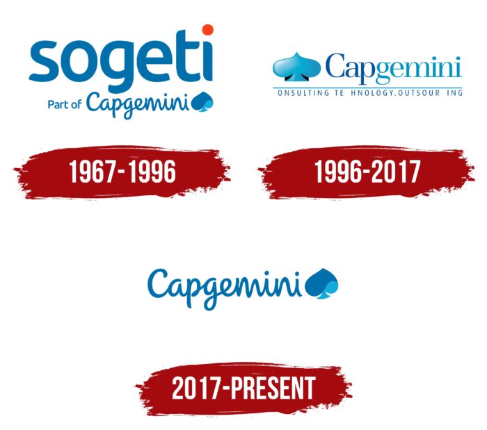
The brand’s visual recognition is high, thanks to the traditional color palette and the presence of a constant emblem, namely the card suit “spade.” In turn, the name Capgemini was not mainstream immediately, and therefore it is not surprising that all updates were displayed after the logo redesign. All in all, three logos were presented to the target audience throughout the project. Each of them complimented the previous one, making it more modern and progressive.
What is Capgemini?
It is a well-known French IT company providing consulting services in the computer field with over 50 years of experience. The company is headquartered in Paris, but despite that, out of 250 thousand employees, about half of them are in India.
1967 – 1996
The first version of the logo was introduced in 1967, right after the project launch. Conventionally, the logo was divided into four parts, where the first three had two letters of the name “Sogeti.” In turn, the fourth is directly dedicated to the Ace of Spades, which was used as the company’s emblem. According to the information, it was designed directly by the company’s creator. Among the other options were a bee, as a symbol of productive work, and a pinion, which indicated the technical specialization of the company. However, the card was chosen as a symbol of luck.
This choice was also because Kampf often played bridge, where the ace of spades was the strongest card. Interestingly, a gradient of blue was used for this element, which was the main one in the color palette of Capgemini. If we talk about the choice of colors, it is related to the fact that the company’s founder previously read an article about the French corporation ELF, which paid over 50 million francs for the design. Later, he joked several times that the company had saved that amount thanks to him.
A classic bold typeface with rounded corners without serifs was used for the lettering. All characters in the brand name were lowercase, which should evoke friendly emotions in readers.
1996 – 2017
The logo redesign came almost 30 years after the company was founded. It was directly related to the anchoring of the Capgemini name. The logo consists of three parts: the verbal lettering, the emblems on the left, and the company slogan at the bottom. Moreover, the word inscription is made using two shades of blue for the “cap” and “gemini” parts. The first part is darker and represents IT technology, while the closer shade of blue references consulting. The lettering is in classic bold, sans serif type.
The peak, represented on the left, is made with a gradient of blue. The slogan is in a classic font with thin lines. It reads as “Consulting. Technology. Outsourcing.”
2017 – today
The last current logo redesign took place in 2017. It significantly changed the style, making the image more vibrant and dynamic. The peak was again done in a wavy shape using different shades of blue.
Visually, the font remained identical to the previous version, but italics made it look more unique and independent. All the symbols are painted in dark blue. However, despite this, the logo does not look gloomy and depressing but rather attracts the target audience’s attention.
According to the staff of Capgemini, the dark blue hue is a reference to the experience and skills of the organization, while the light blue indicates potential and ambition.
Font and Colors
Throughout Capgemini’s development, different classic sans bold serif font variations has been used. For example, with the latest redesign and use of italics, the logo has become more unique and unusual, standing out from the main competitors in the market.
In turn, the basis of the color palette is blue and blue. The exception is the original version, where there was also red. In general, pleasant and bright shades evoke positive emotions and indicate the ambitions and prospects of the company and its experience in the market of computer technologies.
Capgemini color codes
| Bright Cerulean | Hex color: | #12abdb |
|---|---|---|
| RGB: | 18 171 219 | |
| CMYK: | 92 22 0 14 | |
| Pantone: | PMS 312 C |
| Bice Blue | Hex color: | #0070ad |
|---|---|---|
| RGB: | 0 112 173 | |
| CMYK: | 100 35 0 32 | |
| Pantone: | PMS 7461 C |
