Elegance, subtlety, and lightness are the main motives of the emblem. The Carefree logo is full of femininity. Shows that the brand was created specifically for the beautiful half, considering their needs and requirements. Therefore, brand products will always come in handy in a handbag.
Carefree: Brand overview
| Founded: | 1976 |
| Founder: | Edgewell Personal Care |
| Headquarters: | United States |
| Website: | carefreeliners.com |
Meaning and History
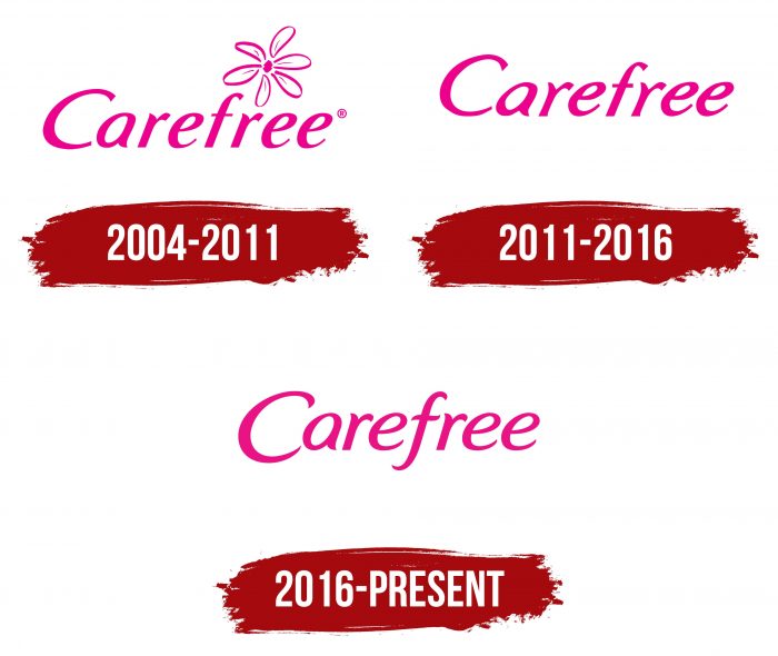
From the moment of its appearance to the present day, the company has changed five versions of the logo and now uses the sixth. On all variants, the main element was the inscription – the brand name. The word “Carefree” had a different look, but it was almost always light and slanted. The graphic designation appeared later. The main countdown in the history of logos dates back to 2004 when the brand was firmly established in the international market. There were no noticeable changes in its structure.
What is Carefree?
Carefree is a line of feminine hygiene pads previously owned by the American company Johnson & Johnson. The brand is now part of Edgewell Personal Care. The first batch of products was introduced in 1976, at which time the trademark was registered.
2004 – 2011
This time, the emblem consists of an italic inscription and an image of a flower with six petals. They are shaped like classic pads without wings.
2011 – 2016
Now the company uses a logo without a flower: the designers removed it in 2011. Then they changed the palette, making it pastel.
2016 – today
Designers have chosen a more saturated fuchsia shade for the modern logo. Therefore, now the inscription is made in neon pink with a slight touch of lilac. The basic font type remains the same, but some changes have been made. For example, “r” (the top stroke is made a little thinner) and “f” (the bottom half of it is finished and bent in the opposite direction) have been corrected.
Carefree: Interesting Facts
Carefree is a well-known name in women’s hygiene, offering products like panty liners that help women stay comfortable and confident.
- Background: Carefree is made by Johnson & Johnson, a big company known for healthcare products. They focus on making various health items for women’s hygiene.
- Innovations: The brand is praised for creating panty liners that aim to give women comfort, protection, and privacy. It keeps updating its products to match what women need and want.
- Comfort and Confidence: Carefree designs products to help women feel at ease and confident during their periods. They make thin, absorbent, breathable liners that are great for daily use.
- Variety of Products: Carefree has broadened its range to include many panty liners and hygiene products. There are scented and unscented versions, different shapes for various underwear styles, and options for those with active lifestyles.
- Education: Carefree educates people about menstrual health to help women and girls make smart choices about hygiene and health.
- Eco-friendly Efforts: The brand is working on being more environmentally friendly by improving packaging and exploring sustainable product options.
- Worldwide Availability: Carefree products are sold worldwide, showing their global appeal and the widespread need for dependable feminine hygiene products.
- Adapting to Trends: The brand keeps up with market changes, such as the growing demand for organic and natural products, using more natural materials and ingredients.
- Supporting Women: Beyond products, Carefree helps with women’s health and education. They partner with organizations that focus on health education and provide hygiene products to needy people.
- Ongoing Improvement: Carefree always seeks to improve its products through research and development. They listen to customer feedback and use the latest science to meet women’s changing needs.
In summary, Carefree’s focus on innovation, education, and sustainability has made it a leading brand in feminine hygiene, dedicated to improving women’s health and comfort worldwide.
Font and Colors
The main detail of the Carefree personal badge is the name. The graphic element was present only in the 2004 version. It was a chamomile flower whose petals resembled sanitary pads.
The brand uses italic lettering. Calligraphic letters: “c,” “a” and “e” seem to be written by hand. The emblem is made in pink: at first, it was bright, but now it has become subdued.
In the new logo, the developers have kept the old typeface, slightly correcting it. The original palette has been shifted to a bright-nude spectrum, as in the 2004 version, so the logo now uses a rich fuchsia color.
Carefree color codes
| Barbie Pink | Hex color: | #e81385 |
|---|---|---|
| RGB: | 232 19 133 | |
| CMYK: | 0 92 43 9 | |
| Pantone: | PMS 213 C |

