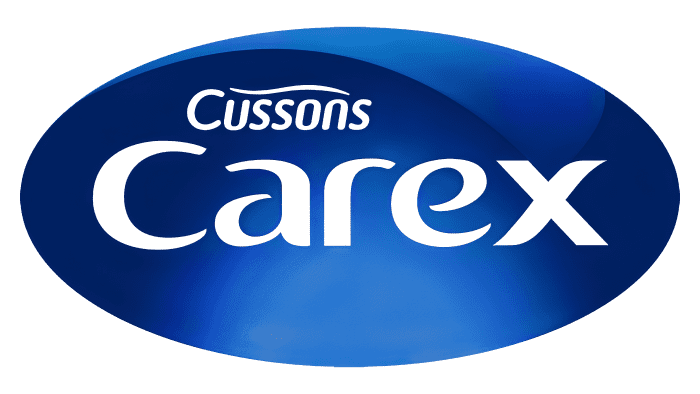
The Carex logo is like a voluminous soap bubble that promises safety and the destruction of dangerous microbes. The emblem represents the tool as reliable protection. Hands will shine with cleanliness thanks to an effective recipe.
Carex: Brand overview
| Founded: | 1994 |
| Founder: | Cussons |
| Headquarters: | Manchester, U.K. |
| Website: | cussonscarex.com |
Meaning and History
The brand emblem contains its name in a dark blue ellipse. The evening sky inspires its rich color. In general, over the entire period of its existence, it had two logos: the debut one and the actual one, which appeared after the transition to a British company structure.
The oval is the first thing that catches the eye when looking at the branding of this brand. The geometric shape has a regular shape and a light gray border around the edges. Moreover, the silver color is more like a metallic shade since there are light reflections on it. In the center, against a blue velvet background, is the large word “Carex.” “Cussons” is written above it in small letters, which denotes brand ownership. Even higher is a thin winding strip.
What is Carex?
Carex is a personal care brand for supporting the normal life and health of elderly people. It includes personal hygiene products and various accessories. The trademark was founded by the British company Cussons in 1994.
1994
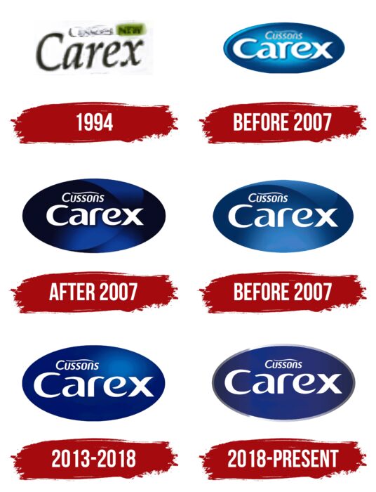
The logo consisted of inscriptions arranged in two rows. The brand name was in the second. It was in black italics. The letters were curved and lowercase, except for the first, which remained capitalized.
before 2007
During this period, the logo received a completely different concept. So, he got a blue oval with an internal gradient. It served as a background for the white lettering, the letters of which were vertical, bold, and smooth, with miniature curves at the ends. Above the company name was “Cussons,” written in italics. This word was written in thin right-handed glyphs. At the top was a wavy line.
after 2007
The logo of that time received a large ellipse of dark blue. He had several light zones. In the center was the word “Carex.” It was done in the same style as before but with a truncated stroke at the “r” (upper left). The designers moved the first line a little, placing it above the first three letters of the brand name.
before 2013
Compared to the previous logo, the proportions of the text and the background oval were significantly changed in this logo. The fact is that to increase the text’s readability, the designers increased the inscriptions, so they occupied most of the space. The developers replaced the dark blue color with a light one and added a bright highlight at the bottom.
2013 – 2018
In the logo, which appeared in 2013, the designers moved the white highlight to the upper right corner and removed the lines that divided the blue background into light and dark parts. They also removed the gloss from the surface of the emblem and added a matte finish to it. Everything else was kept as in the previous version.
2018 – today
The current logo is an improved version of the previous symbolism. The ellipse has a thin silver frame with bright reflections. But the light highlight at the top has disappeared, due to which the background has a slight blur. The developers aligned the word “Cussons” in the center, leaving it above the company name.
Carex: Interesting Facts
Carex is a well-known brand that makes hand wash and hygiene products. It was started by a British company called Cussons in 1994. It’s focused on keeping things clean and safe, especially when washing hands.
- Beginning and Growth: Carex started in 1994 and quickly became a top choice in the UK for keeping hands clean. It grew by making good, reliable products and spreading to other countries.
- Lots of Choices: At first, Carex sold liquid hand soap. But now, they also sell hand sanitizers, gels, and creams, offering many ways to keep hands clean.
- Leading in Clean: Carex is always coming up with new stuff, like being one of the first to sell alcohol-based hand sanitizers to everyone, helping stop germs from spreading.
- Helping the Community: Carex works with schools and other groups to teach kids and adults how important it is to wash hands to stay healthy.
- Help During COVID-19: When the COVID-19 pandemic happened, Carex made more hand sanitizers and soap to help meet the huge need, playing a big part in keeping people safe.
- Fun Learning: Carex likes to get involved in the community with fun campaigns that teach everyone about staying clean and healthy in enjoyable ways.
- Smart Packaging: They’ve made their bottles easy to use and refill, reducing plastic waste, and designed them to look fun for kids and adults.
- Top Brand: Because Carex is focused on making high-quality and innovative products, it’s become a leading brand in many places, trusted by families and health experts.
- Always Improving: Carex keeps changing its products to match what people need and like, including different scents, formulas for sensitive skin, and small sizes for cleaning hands anywhere.
With its dedication to making new, eco-friendly, and helpful products, Carex has played a big part in improving how people around the world keep their hands clean, making it a key player in personal hygiene.
Font and Colors
The emblem uses two types of tepefaces. The central inscription is made in an individual rounded font, which combines printed and handwritten characters. The upper word has an oblique spelling and is made with chopped letters, where “n” and “u” without legs repeat each other upside down. The color palette consists of blue, gray, and white.
Carex color codes
| Granite Gray | Hex color: | #62626d |
|---|---|---|
| RGB: | 98 98 109 | |
| CMYK: | 10 10 0 57 | |
| Pantone: | PMS Cool Gray 10 C |
| Space Cadet | Hex color: | #242950 |
|---|---|---|
| RGB: | 36 41 80 | |
| CMYK: | 55 49 0 69 | |
| Pantone: | PMS 2768 C |
| Air Force Blue | Hex color: | #15307f |
|---|---|---|
| RGB: | 21 48 127 | |
| CMYK: | 83 62 0 50 | |
| Pantone: | PMS 287 C |
| Ghost White | Hex color: | #e6e7ee |
|---|---|---|
| RGB: | 230 231 238 | |
| CMYK: | 3 3 0 7 | |
| Pantone: | PMS 656 C |
