Agriculture is a priority for this company. The Cargill logo, in the corresponding colors, proves it. A stylish sign stands for active growth, development, and improvement process. The simple symbolism is highly dynamic, focused on the vegetation of plants.
Cargill: Brand overview
| Founded: | 1865 |
| Founder: | William Wallace Cargill |
| Headquarters: | Minnetonka, Minnesota, U.S. |
| Website: | cargill.com |
Cargill is America’s largest agricultural corporation. The specialization includes several areas: the pharmaceutical and healthcare segment and agricultural management and services. The form of ownership is private property. Cargill is developing rapidly, which is confirmed by world-class ratings. According to one of them, it was included in the list of 15 best companies in the United States.
The visual brand identity is the perfect reflection of the brand’s essence. The corporate identity is based on a balanced picture consisting of an eye-catching graphic element and a contrasting bold inscription. The elements favorably complement each other, and the special execution style evokes feelings of trust and high professionalism.
Meaning and History
Cargill is not just a company but a diversified corporation with a long history. Throughout its entire existence, the brand has sought to develop and strengthen its position. He expanded the scope of activities, reorganized, and created new branches. As a result of the efforts, the company has become one of the best in the American market, occupying the first position in many ratings.
The current status and achievements are also reflected in the visual concept. The brand has a unique, stylish logo that emphasizes the best sides. This is a terse strict picture, including the company’s name with a bright accent in the form of a leaf shape. The graphic element has a special meaning – it reflects the field of activity (agriculture).
What is Cargill?
Cargill is one of the largest American food corporations, privately owned by two families (McMillan and Cargill). The brand is a manufacturer of agricultural products and also sells various products.
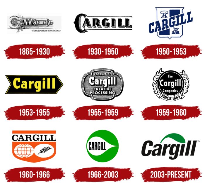
1865 – 1930
Cargill was founded in 1865. The brand’s founder (William Wallace Cargill) initially created a small company specializing in the grain trade. Later the company was reorganized, and in 1909 it was taken over by John Hugh MacMillan. In subsequent years, offices were opened in Argentina and New York.
In those days, the brand had a complex logo consisting of several original elements. Cargill & Bro was in the center, preceded by two Ws and a stylized graphic. The latter included the first two letters of the words from the name, superimposed on each other. This symbolized the unity of all employees and processes within the company. The badge was supplemented with a spikelet, demonstrating belonging to the economic sector.
1930 – 1950
This period was significant for the brand. The 1930s were marked by creating their shipyard for the construction of barges intended to transport grain. That same year, the company changed its name to Cargill, Incorporated. The changes also affected the visual identity. The old version of the logo was no longer relevant. The new emblem was radically different from its predecessor.
It has become simpler and more concise, and the graphic symbols have been completely removed. The badge consisted of only one company name. But, the designers used an unusual presentation. The word Cargill was made in original massive letters with a three-dimensional effect. This was achieved through the play of shadows in colors. The picture was complemented by two thin black lines located in the upper and lower parts of the inscription.
1950 – 1953
In the 50s, the brand again decided to change its corporate identity. The company received a stylish logo associated with reliability and high quality this time. The classic coat of arms was taken as a basis, divided into several parts, and crossed with Cargill’s inscription. It depicted a bundle of hay and a mill, which were symbols of the company’s activities.
The space was supplemented with two blue zones diluting the overall picture. The company’s name was located in the center of the coat of arms. The colors have also changed. The black color has replaced the soft blue hue associated with a sense of trust. The original performance looked fresher and brighter and emphasized the desire for improvement.
1953 – 1955
Cargill continued to develop and already, in 1953, created a new branch. Gradually, he became the largest grain trader in the world. In the same year, the brand decided to change its corporate design. A more minimalistic and modern logo has replaced the previous version.
It consisted of a wide elongated arrow located in the horizontal direction and the company’s name. The inscription was located inside the arrow on a black background. The letters were painted bright yellow, and their shape corresponded to the title case. This design reflected the unspoken motto of the company: “Only forward!”, And the contrasting colors made the logo stand out.
1955 – 1959
In 1955, Cargill began to use the new badge. It was an original figure, with prominent roundness, inside which there were several words: Product of Cargill Creative Processing. The letters were painted white and had black outlines. Due to this, the effect of volume was achieved. The same effect was used for the figure, but with shades of gray. The logo had a discreet, strict look and was associated with reliability.
1959 – 1960
At the end of the 50s, the Cargill brand worked with a more powerful and expressive logo. The symbol was a solid black circle. Inside, there was an inscription at three levels. The wordmark was painted in neutral white, which created a noticeable contrast. On the sides of the circle were graphic elements resembling spikelets (a reference to the brand’s field of activity). The lower part consisted of a ribbon, which was the year of foundation.
1960 – 1966
Since the 1960s, Cargill has expanded its sales market to the territory of the USSR and Hungary. Another success was also reflected in the visual identity. The designers have developed a completely new concept for the company, based on a bright design and the creation of direct associations. White, black, and orange were chosen as the colors, symbolizing energy, strength, and confidence. The logo itself included the company’s name, a globe icon, and a spikelet (invariably symbolizing the brand’s affiliation with agriculture).
1966 – 2003
During these years, Cargill expanded its specialization, also reflected in the logo. The new symbol was missing the spikelet, but there were new graphics simultaneously. The emblem was a circle divided into two parts. One part was painted green, and the other was white. On a neutral background, the company’s expressive name was made in thin elongated type. The updated logo was fresher and more modern.
2003 – today
The company was doing so well that in 2003, Cargill was a large corporation operating in several areas. Realizing the rapid development in those days, the management decided to change the corporate identity again. The updated badge is still used by the brand today. In this version, the old coloring remains, but the presentation and font have changed.
Font and Colors
The Cargill brand uses a modern, stylish logo that reflects its core business. The basis is a clear company name in bold italics. The letters do not have serifs, making the inscription smooth and soft. This design evokes associations with comfort and reliability.
Clear lines of letters and black coloring also emphasize the solid status of the company. The emblem is refreshed by a neat miniature sheet above four letters in the center. This bright accent dilutes the strict picture and evokes a sense of trust.
Cargill color codes
| Office Green | Hex color: | #00812e |
|---|---|---|
| RGB: | 0 129 46 | |
| CMYK: | 100 64 49 | |
| Pantone: | PMS 355 C |
| Smoky Black | Hex color: | #161413 |
|---|---|---|
| RGB: | 22 20 19 | |
| CMYK: | 0 9 14 91 | |
| Pantone: | PMS Black 6 C |

