


 Carlsberg Logo PNG
The emblem reflects the natural ingredients used to brew beer. The Carlsberg logo foams like a drink in a glass. The sign suggests serving the brand chilled, when its unique bouquet and invigorating taste are revealed.
Jacob Christian Jacobsen was born on September 2, 1811, in Copenhagen, to a brewer. His father, Christen Jacobsen, ran a small brewery, and after his father died in 1835, Jacob inherited the business. He soon concluded that the scale and conditions limited quality.
In 1845, Jacobsen visited the Spaten Brewery, where he studied bottom fermentation. He transported yeast back to Denmark in a cooled hat box. On November 10, 1847, the first batch was brewed at a new site in Valby. He named the brewery Carlsberg after his son Carl and the word “berg”.
Exports began in 1868 with a shipment to Edinburgh. In 1875, Jacobsen founded the Carlsberg Laboratory, followed by the Carlsberg Foundation in 1876, which later became the main shareholder after he died in 1887.
In 1883, scientist Emil Christian Hansen isolated a pure yeast culture, Saccharomyces carlsbergensis. Jacobsen shared it with breweries worldwide, setting a new standard for lager production.
A family split led Carl Jacobsen to establish Ny Carlsberg in 1882, forcing the original brewery to be renamed Gamle Carlsberg. The companies merged in 1906 under the foundation.
In 1970, Carlsberg merged with Tuborg. It then expanded internationally, including Malaysia in 1972 and the UK in 1974. In 1973, KMP launched the slogan “Probably the best lager in the world”.
In 1992, Carlsberg merged with Tetley. In 2008, it acquired Scottish & Newcastle with Heineken. The deal gave it control of assets, including Baltika Breweries. In 2011, the long-running slogan was replaced with “That calls for a Carlsberg”.
Meaning and History
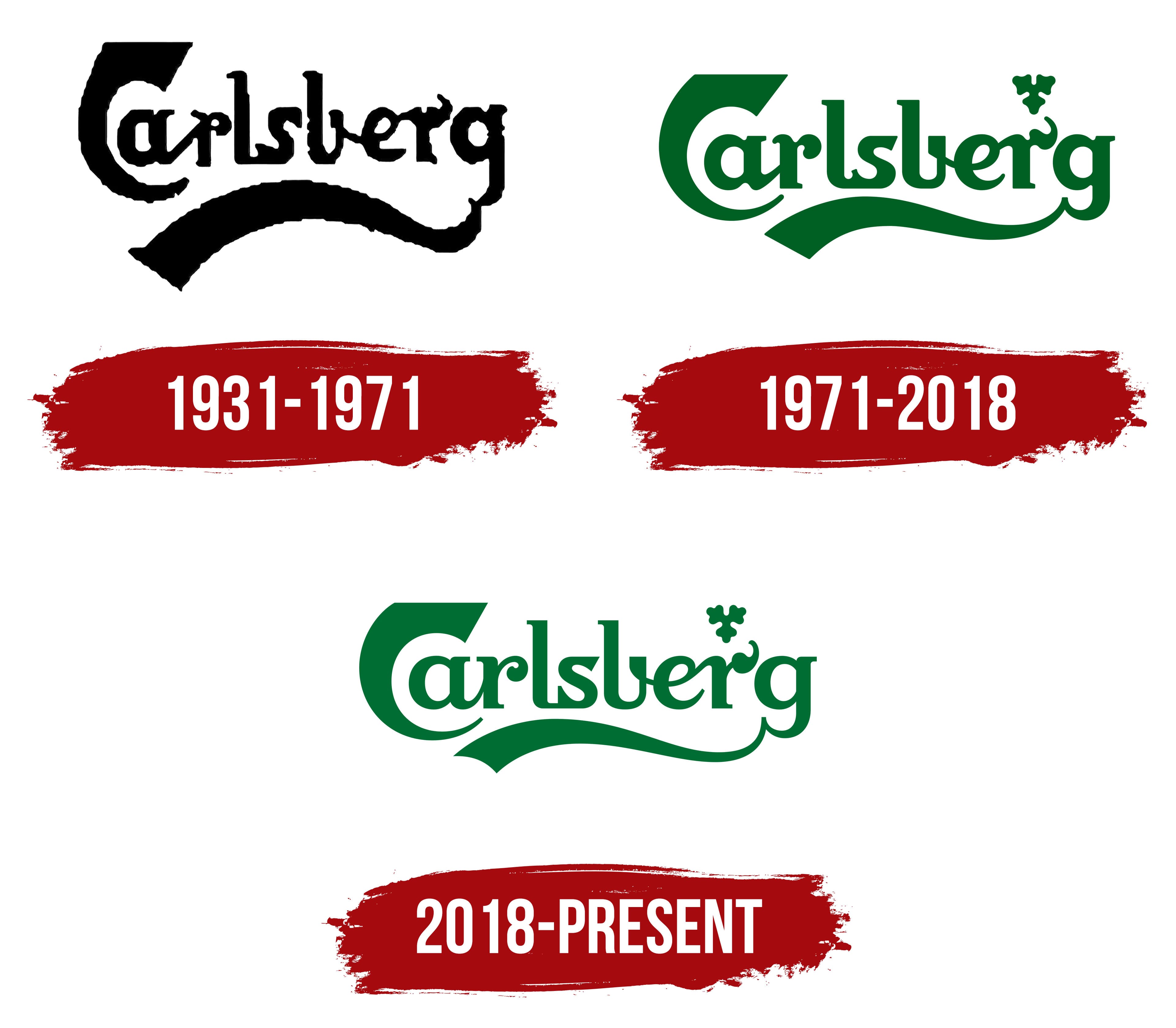
The iconic Carlsberg logo has not changed since the brand’s launch. The original emblem, which Danish national ornamental artist Thorvald Bindesbøll helped design, first appeared in 1904, when brewer Carl Christian Hillman Jacobsen brewed Carlsberg Pilsner. The new brand launched with an updated visual identity. Bindesboll stepped in and designed a graphic Art Nouveau sign. Over time, the elegant inscription has become a symbol of the entire Carlsberg Group, not just its flagship brand.
What is Carlsberg?
This famous Danish brewing giant, known for its green bottles and emblem, is one of the world’s largest beer producers. Using carefully selected barley, hops, and a unique strain of brewing yeast preserved in laboratories, the company, which started in Copenhagen, has grown from a small brewery into a global beer sensation. With the same commitment to quality that earned its fame, the company produces a premium pilsner. It boasts a rich portfolio of many well-known brands, including its flagship product. Its phrase, “Probably the best beer in the world,” has become part of beer culture, reflecting Danish humor and the brand’s confidence in brewing expertise.
1931 – 1971
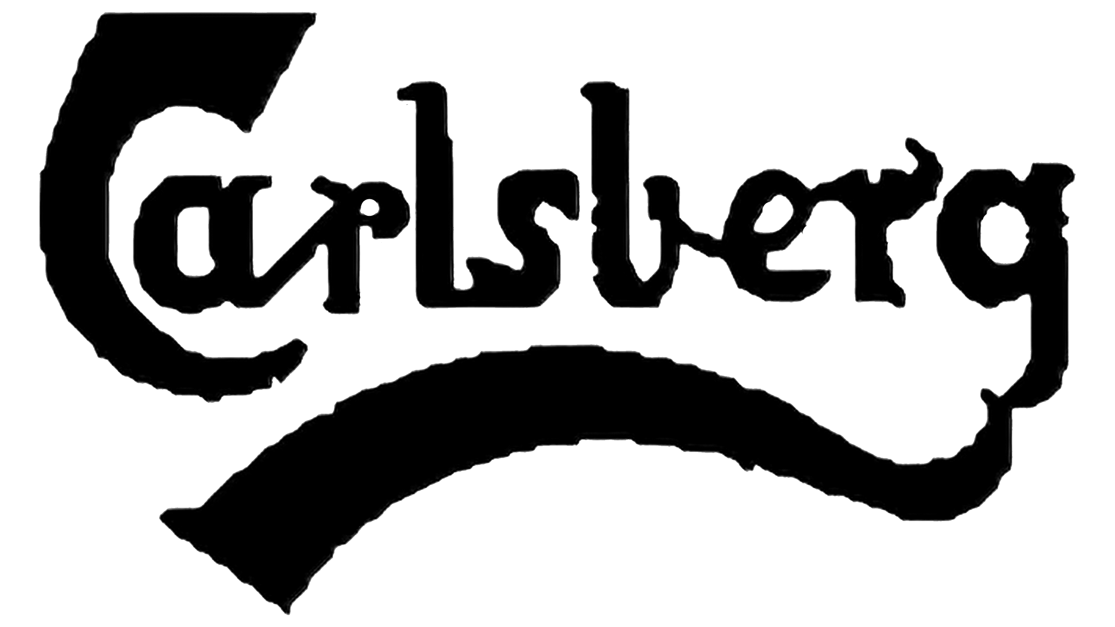
In 1931, the Carlsberg brand, which had existed since 1904, adopted the nickname Hof, but the logo did not reflect this; it still bore the beer’s official name. The inscription was set in an individual Art Nouveau font. Its creator, Thorvald Bindesbøll, depicted the “C” as a sickle and complemented the “g” with a long, flowing ribbon pointing left. The word was black against a light background.
1971 – 2018
In 1971, the letters became clearer and more even, but the font’s overall concept remained the same. Above the “r” was an icon shaped like a stylized hop leaf, divided into three identical segments, like a shamrock. Black was replaced with Carlsberg’s signature dark green.
2018 – today
The 2018 redesign brought minor changes to the Carlsberg logo. First, it changed the color scheme, as the inscription took on a turquoise hue. In addition, the shape of some glyphs has been redesigned. Now the letter gaps are widened, the bend at the end of the first “r” looks like a spiral, the connection between adjacent “e” and “r” runs exactly along the bottom of the “e” loop, and the “s” has become thinner and more elegant.
Font and Colors
The inscription on the iconic logo is non-standard: some letters are connected, while others stand separately. “C” looks like a large sickle. A wide line extends from the “g” to the left, like a waving ribbon.
The hop leaf is hand-drawn with thin lines. The branding symbol draws on the brand’s heritage and old beer-bottle labels. After the redesign, it was moved closer to the middle of the “r,” making the logo more symmetrical.
The trademark is presented in two basic colors: white and green. There are also seven secondary shades. These include pink, red-brown, light blue, blue, yellow, light green, and khaki. They are used depending on the background.
FAQ
What does the Carlsberg symbol mean?
The brand, founded in 1847 by J.C. Jacobsen, used a 19th-century logo featuring a Swastika symbol. At that time, the Swastika was a popular symbol representing good luck, prosperity, and well-being. Carlsberg included it in its logo for these positive meanings.
The Swastika was common across various cultures and did not carry political or negative connotations at the time. It was a symbol of positivity used by many brands.
The brand has since updated its logo, removing the Swastika and focusing on other elements. Today, the logo is known for its green color, elegant script, and iconic crown symbol, reflecting the brand’s commitment to quality and excellence in brewing.
What font is the Carlsberg logo?
The logo uses a custom font called Carlsberg Slab. The Danish brewer developed this two-weight slab serif typeface specifically for the brand. The company wanted a unique and distinctive font to represent its brand, known for making “probably the best beer in the world.”
Kontrapunkt, a design agency in Copenhagen, designed Carlsberg Slab. The slab serif style adds tradition and strength, fitting the brand’s identity.
This custom font gives the brand strong visual uniqueness. It keeps the logo easily recognizable and helps it stand out in the competitive beer market.
Who designed the Carlsberg logo?
Danish architect Thorvald Bindesbøll designed the logo, introduced in 1904, in two primary colors: Carlsberg green and white. These colors strengthen the brand’s visual uniqueness and make the logo easy to recognize. Green represents freshness and quality, while white adds clarity and simplicity.
Thorvald Bindesbøll’s design has left a lasting impact, giving the brand a distinctive and timeless look. The logo’s elegance and simplicity continue to represent the brand’s values and reputation for excellence in brewing.
What is the Carlsberg slogan?
The company slogan, adopted in 1973, has long been “Probably the best beer in the world.” This iconic phrase highlighted the brand’s confidence in its beer and created a memorable tagline.
In 2019, the brand launched a self-deprecating ad campaign and changed the slogan to “Probably not the best beer in the world.” This campaign acknowledged customer feedback and showed the brand’s commitment to improving its product. The new slogan demonstrated humor and transparency, aiming to rebuild consumer trust.
What is the Carlsberg logo?
The logo features elegant green lettering that spells out “Carlsberg.” Each letter is uniquely designed. A long, wavy line extends from the letter ‘g’ to the left, adding movement.
Above the letter ‘r’ is an abstract symbol resembling a snowflake or a tree leaf. This symbol reflects nature and craftsmanship, aligning with the brand’s heritage.
The green color represents freshness and quality. The unique design elements highlight the brand’s commitment to tradition and excellence in brewing.
Who owns Carlsberg Group?
The Carlsberg Group is partly owned by the Carlsberg Foundation, which holds a significant shareholding and plays a key role in its governance and direction. Individual shareholders own the remaining assets.
J.C. Jacobsen, Carlsberg’s founder, established the Carlsberg Foundation. It supports scientific research, art, culture, and social development. The Foundation ensures that the company’s profits contribute to these causes, aligning with Jacobsen’s vision of combining business success with social responsibility. Individual shareholders hold the remaining shares and invest in the company’s financial performance.
Who owns Carlsberg UK?
In 2020, Carlsberg UK merged with Marston’s to form the Carlsberg Marston’s Brewing Company. Marston’s owns 40% of the assets, while the Carlsberg Group owns 60%.
This merger combined the brand’s global reach and brewing expertise with Marston’s strong UK presence and extensive pub network. As the majority shareholder, the Carlsberg Group provides direction and resources. Marston’s contributes local knowledge and established distribution channels.