


![]() Carnival Cruise Logo PNG
Carnival Cruise Logo PNG
The Carnival Cruise logo is like a flying airplane, ready to take the viewer on an exciting journey. The emblem connects the company to its country of origin and emphasizes the owners’ patriotism.
In 1972, Ted Arison, an Israeli entrepreneur, founded Carnival Cruise Line, marking the start of its journey with just one ship, the Mardi Gras, which set sail from Miami. This modest beginning laid the foundation for what would become a titan in the cruise industry.
During the 1980s, Carnival carved out a niche by introducing short, budget-friendly cruises to exotic destinations such as Mexico and the Caribbean, quickly rising to prominence as a leading choice for vacationers seeking fun and festivity at sea. By the dawn of the 1990s, the company had scaled its operations, boasting a fleet that served over a million passengers each year.
Carnival’s growth trajectory continued upward as it began to incorporate other cruise lines into its portfolio and commissioned the construction of groundbreaking mega-ships, cementing its status as the premier cruise line operator worldwide. Entering the 2000s, the company was transporting over 3 million guests annually, with its influence extending across several brands, including Princess and Holland America.
Carnival Corporation oversees ten distinct cruise brands, operating a combined fleet of more than 200 vessels. Despite facing recent hurdles, Carnival Cruise Line, the original brand, remains at the forefront of the company’s offerings, embodying the ethos of affordable, high-spirited vacations at sea. With nearly 6 million guests served each year, it continues to play a pivotal role in shaping the cruise industry.
Celebrating half a century since its inception, Carnival has revolutionized the vacation industry, transforming cruising into a universally cherished mode of travel with its emphasis on leisure, adventure, and competitive pricing.
Meaning and History
![]()
The idea of creating the company came to Ted Arison in the early ’70s, when he already owned Norwegian Cruise Line. Things were not going very well with his partner, so in 1971, Ted decided to start his own business. The idea for the logo came to him when one of the famous ships of the time was decided to be leased and then sold. Arison associated the image of the famous liner with his new firm. The visual symbol reflected the company’s activity, the global nature of its possibilities, and its stability.
What is Carnival Cruise?
A British-American cruise conglomerate comprising 12 companies, it is the world’s largest owner of cruise liners. The staff includes about 38,000 employees, ¾ of whom work on board 25 ships. The company offers cruises ranging from 2 days to a month from U.S. ports in various directions around the world, including Alaska, Hawaii, and New Zealand.
1972 – 2008
![]()
Initially, Carnival Cruise opened as a subsidiary of American International Travel Service. As an emblem, the new company took the design of the ship Empress of Canada, launched in 1960 by Canadian Pacific Steamships. This liner was considered one of the largest passenger vessels traveling to Canada.
Ted Arison bought the vessel in 1972. Changed its name to Mardi Gras and slightly updated it. This ship became the first and, for a long time, the only liner in the company’s fleet. In 1968, the previous owners, trying to save the business, which was being displaced by airlines, updated the ship’s funnel design. Taking this as a basis, Arison slightly rounded the edges of the image, added red, and used this drawing as an emblem.
The design was recognizable to passengers and, at the same time, acquired individual features. The rectangular shape indicated the ship’s funnel. The blue semicircle with a white stripe resembled a sail filled with wind. The image demonstrated forward motion and spoke of travel. The blue also hinted at the expanse of the sea.
The red part of the emblem captures the vivid impressions travelers experience on a cruise. The curve of the sail seems to moor to the red shore in the bay. Arison developed a plethora of entertainment, both on board and at the destination. That’s why his cruises were popular with travelers.
The combination of red, white, and blue echoed the American flag, emphasizing:
- Affiliation with the American parent company.
- The ship’s route for several years was between Europe and America.
The logo evoked a sense of freedom, movement, lightness, and joy. The owner was adept at turning even failures into adventures. For example, on its very first voyage out of Miami, the ship ran aground. It took time and the evacuation of passengers before the cruise could continue. This event could have spelled the end for the young enterprise. However, Arison began serving the cocktail “Mardi Gras on the Rocks” on the ships. He turned the nickname, with which competitors tried to offend Carnival Cruise, into a fun and thrilling past event.
The company’s name was placed to the right of the image. The name was chosen to convey the entertaining nature of the enterprise, Fun Ships. Initially, Ted Arison was involved in marketing, so he combined the logo, name, and slogan to create a feeling of a perpetual, bright celebration.
2008 – 2018
![]()
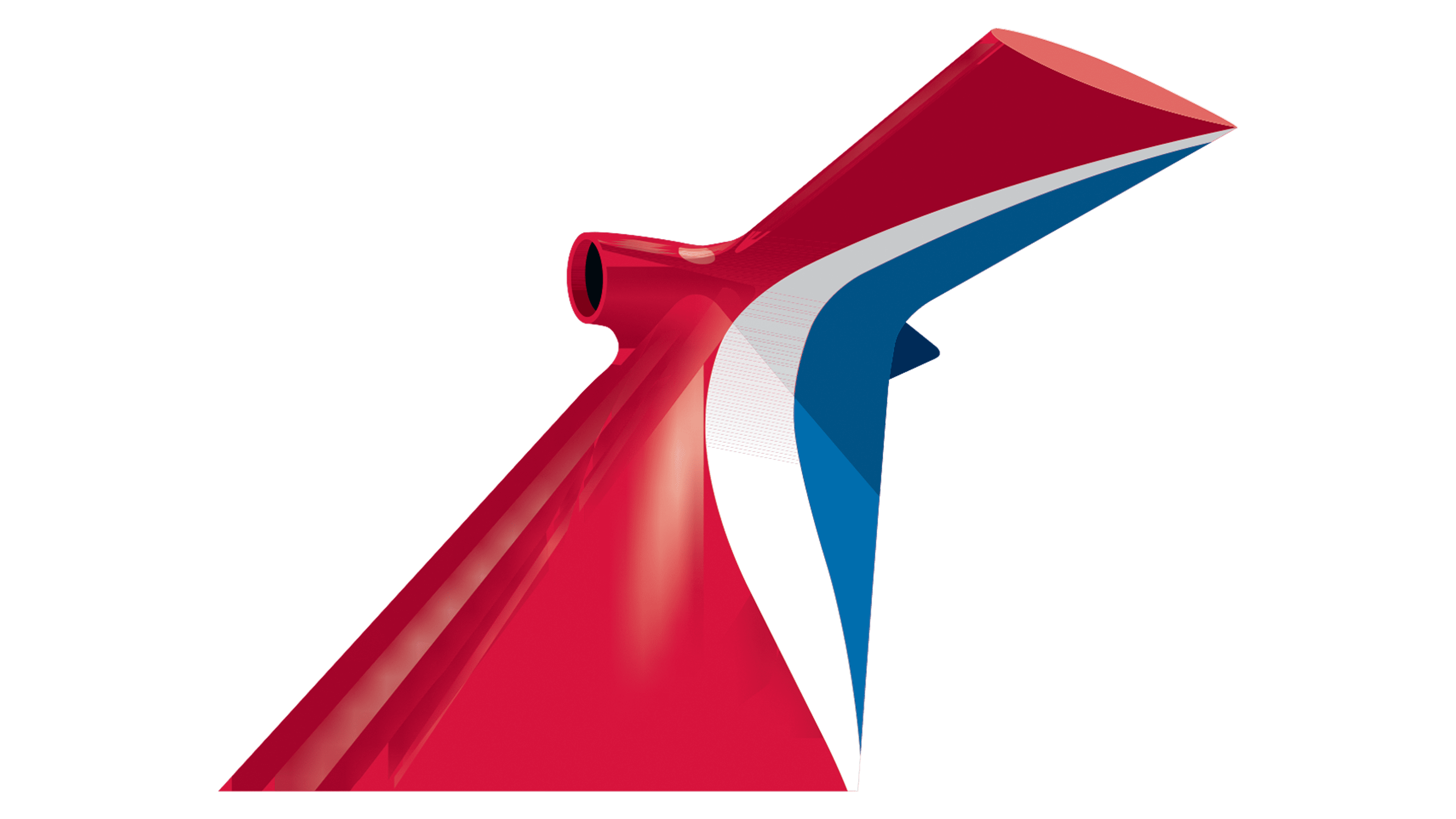
In 2008, a new route to Northern Europe opened, complementing the corporation’s nearly ubiquitous voyages. In honor of this and the introduction of Carnival Dream, the largest ship in the company’s fleet, the emblem was updated.
The new symbol adopted was the “whale tail,” the new funnel of the ships, painted in the company’s signature colors. The extravagant shape of the former steamship funnel is considered a feature of modern Carnival Cruise ships. It’s a perfect fit for large liners. The device:
- Reduces rolling.
- Decreases fuel consumption.
- Directs diesel exhaust away from the deck and passengers.
The fin also resembles an airplane tail, creating a sense of speed.
In the logo, the tail is depicted from a southwest perspective. The viewer appears to be on the pier, looking up at the cruising giant passing by. This technique indicated the ships’ multi-story nature.
2018 – today
![]()
In 2018, the emblem was slightly updated, removing dark shadows and overly bright sun glares. Among the operator’s routes are not only warm islands but also the cold shores of Alaska. Therefore, not all trips involve scorching rays. The font of the inscription remained unchanged.
Font and Colors
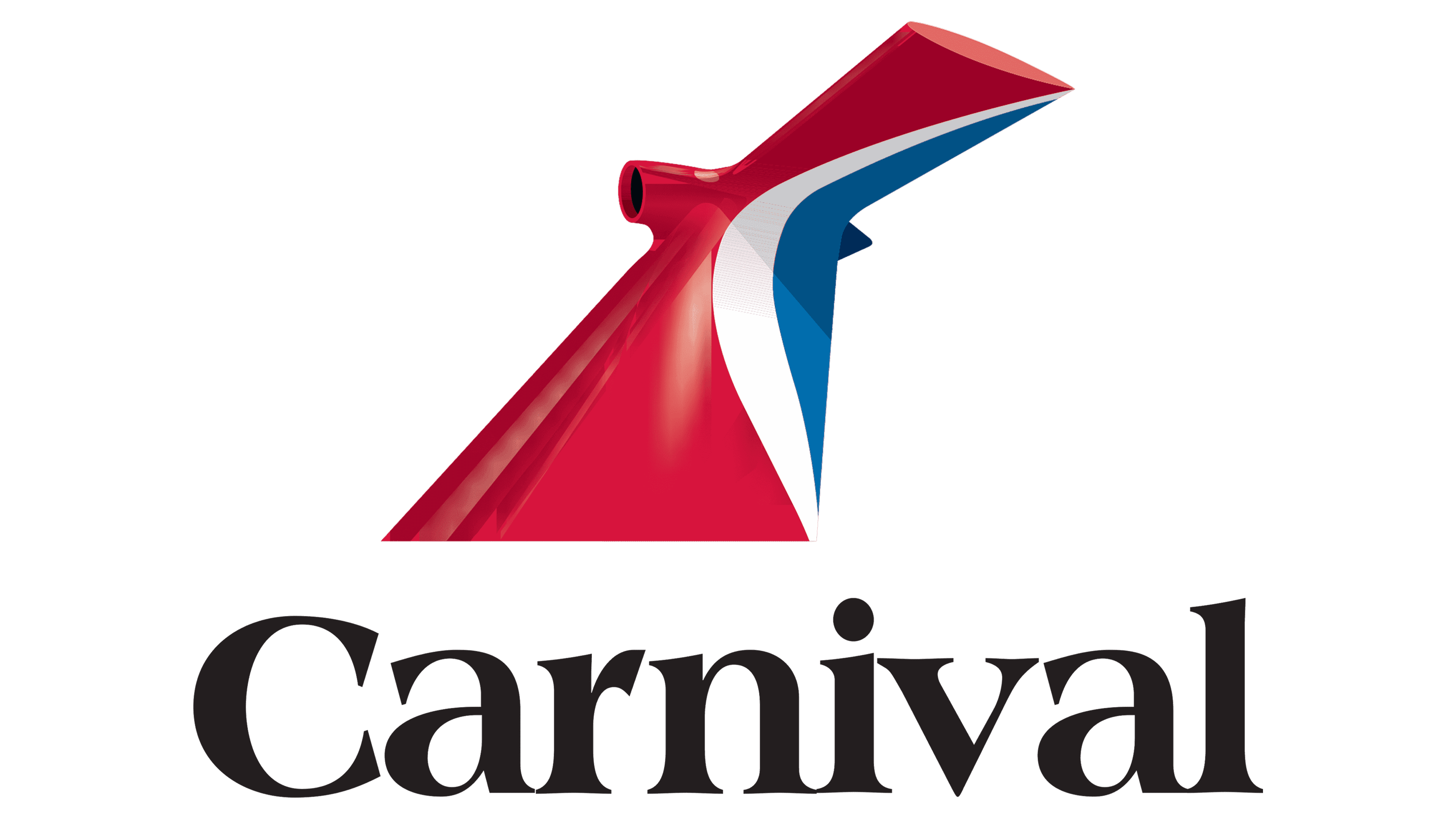
Red is the primary color of the image. The shade emphasizes the entertaining and amusing notes of the journeys. The color encapsulates adventure, excitement, and a sea of diverse, pleasant pleasures.
Blue symbolizes the theme of water and oceans, where the liners sail. White is associated with relaxation, light entertainment, and the breezes that blow on passengers at sea.
The combination of three colors links the emblem with the American flag. In this country, Ted Arison found business opportunities and moved his family from Israel to New York. The company’s first steamship operated out of Miami, where the immigrants eventually settled. Now, ships sail from various U.S. ports.
The font of the logo was chosen to match the color scheme, also American Americana Std Extra Bold.