


 Carolina Herrera Logo PNG
The Carolina Herrera logo embodies simplicity, elegance, and refined style. It carries a unique charm that perfectly reflects the brand’s entire product range. Thanks to the mystical beauty embedded in each letter’s element, it can be called flawless. The identity is free of excess but has a vibrant individuality. There are no complex or overloaded informative details; the brand’s aesthetic lies precisely in the simplicity that makes it so appealing.
The classic black-and-white color palette remains timeless and stylish. These two shades form the foundation of the logo’s color scheme. A glance at the elegantly and precisely crafted two words instantly brings to mind Carolina Herrera’s best models and accessories. The emblem, created in these shades, symbolizes the brand’s impeccable style, elegance, and longevity, leaving a lasting impression.
Carolina Herrera, born María Carolina Josefina Pacanins y Niño in Caracas in 1939, entered fashion after becoming known in international society for her personal style. Diana Vreeland, then an editor at Vogue, encouraged her to create a label. Herrera launched her clothing line in 1980 and presented her debut collection at New York’s Metropolitan Club in 1981. Later that year, she opened a fashion house in New York and began dressing socialites and celebrities.
The company expanded into bridalwear in 1986 and released its first fragrance in 1988, entering perfume and cosmetics. During the 1990s, boutiques opened in major cities worldwide. In 2000, Spanish group Puig acquired the business, providing new resources for international expansion, while Herrera remained creative director and continued supervising the collections.
A lower-priced New York line of clothing and accessories appeared in 2004. The Madison Avenue flagship opened in 2008. In 2015, the brand marked its 35th anniversary with a dedicated collection, and in 2016 Herrera received the CFDA Woman of the Year award for her work in fashion.
Wes Gordon, a longtime protégé of the founder, became creative director in 2018. During 2020 and 2021, the company expanded online sales and used virtual fashion shows. New stores and collections followed in 2022. By 2023, the business covered ready-to-wear clothing, bridalwear, accessories, cosmetics, and fragrance across international markets and major fashion capitals.
Meaning and History
What is Carolina Herrera?
This is a high-end fashion brand that embodies classic sophistication and refined elegance. Created by a Venezuelan-American designer, the brand has become a symbol of feminine elegance, winning over a global audience of fashion enthusiasts. It is known for its form-fitting everyday outfits, stunning evening gowns, and signature white shirts. The designs often feature bold prints, rich colors, and high craftsmanship. In addition to clothing, the brand offers accessories, bridal gowns, and a popular fragrance line. The brand creates a distinctive style seen on red carpets, political events, and social gatherings, combining elements of classic American sportswear with European sensuality.
Old

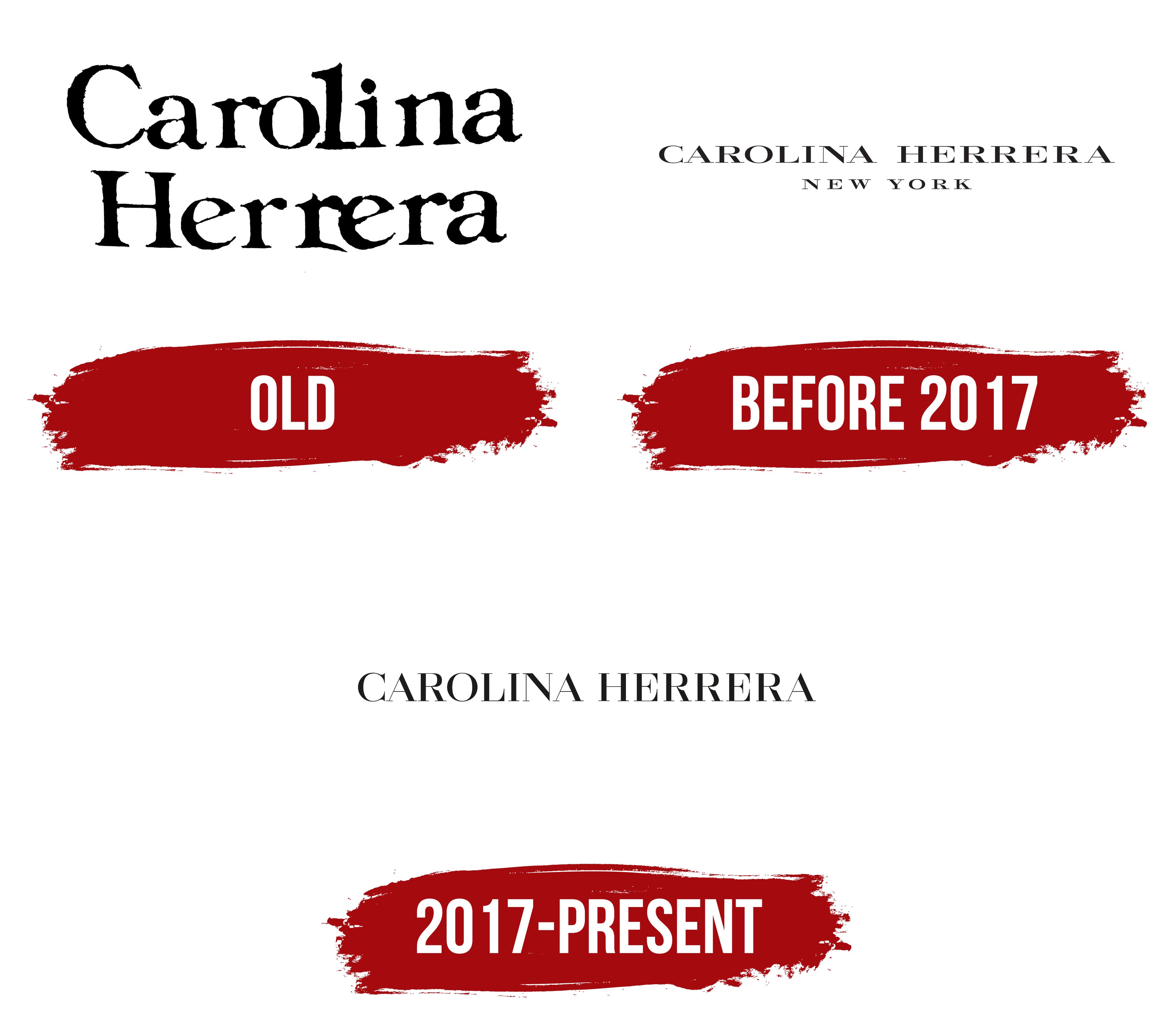
Since its founding, the “Carolina Herrera” brand has adhered to a strict minimalist identity. No excess or unnecessary details, only the first and last name of the founder, which became a kind of symbol for the brand. The company moved toward its goal smoothly and consistently without deviating from the chosen direction. Over different periods, the logo changed, but its essence remained the same. Only the two keywords’ fonts, sizes, and shapes changed. Sometimes, they experimented with text placement, either horizontally on one line or vertically stacked.
The first logo carried the main message: a new brand had entered the fashion market, offering high-quality luxury clothing and accessories now available to a wide audience. The two words, “Carolina Herrera,” were placed one below the other, symbolizing the drive for growth and success. The font was large, with all capital letters, creating a sense of movement as if the characters were in constant motion.
Rounded contours and expressive dots, adding sophistication to the letters, gave the logo a unique look. The edges of some characters resembled commas, further enhancing the logo’s distinctiveness. Each letter was designed to emphasize the originality of the brand’s products. The font highlighted refinement and style, perfectly conveying the charm and elegance of all the goods presented under the Carolina Herrera brand.
Before 2017

The “Carolina Herrera” brand’s products became increasingly refined and sophisticated each year. The dresses and accessories garnered admiration, immersing one in a world of aesthetic pleasure. It was natural that the logo would reflect all this magnificence, symbolizing the brand’s uniqueness. It embodied elegance and luxury, like every detail of the products, creating an atmosphere of perfection.
Loyalty to traditions remained unchanged in the new identity. The white background served as an excellent backdrop, highlighting each brand letter. The logo consists of two textual elements: the brand name and the city, which create a sense of completeness and harmony. Both texts are rendered in black, adding a sense of strictness and refinement.
The phrase “Carolina Herrera” is displayed in an elegant, refined font, with each letter capitalized and thin serifs that enhance a sense of grandeur. This part of the logo occupies a central position, and the letters are spaced apart, giving the emblem a sense of lightness and openness. Below the main inscription, the phrase “New York” is carefully placed in uppercase letters with straight lines, adding further aesthetic completeness to the logo and emphasizing its connection to the world of high fashion.
2017 – today

At this point, the Carolina Herrera brand has reached such a level of popularity that even a simple logo, at first glance, doesn’t need flashy details. Each collection generates tremendous interest among fashion enthusiasts spanning all age groups. The brand has earned trust and captured the hearts of fashion lovers worldwide. And this is not just a beautiful statement. Her creations give people a sense of elegance, like you’re always at your best.
The modern logo perfectly highlights this brand philosophy. The simple combination of black text on a white background looks so stylish that it feels like every element is in its place. It has symbolized the brand’s aesthetic beauty and mysterious allure since its inception.
The font in the emblem is strict, with serifs that emphasize the brand’s classic style and impeccable reputation. It doesn’t seek to stand out through complexity or creativity; it radiates confidence in its simplicity. Each letter appears as a perfectly measured element: nothing excessive, yet it’s immediately clear that this is more than just a brand name. It’s a symbol of class, luxury, and refinement.
The white background helps this contrast truly shine. Like the brand’s clothing, which always emphasizes individuality, this visual mark does the same; it helps you stand out without overshadowing the content. It’s a form of minimalism brought to perfection. Like the brand’s products, the emblem looks expensive and refined but not overly so.
The elegant, slightly elongated letters, particularly noticeable in combining the “C” and “H,” create a sense of regal grace. The logo subtly reminds you that, with “Carolina Herrera,” no matter where you are, you are always at the center of attention, at the height of style and taste. It is the kind of classic that never ages and will always remain relevant.