


![]() Vogue Logo PNG
Vogue Logo PNG
Elegance is read in every symbol of the emblem. The Vogue logo is an example of impeccable style, the ability to place accents and highlight the main thing. The sign represents the leading trendsetter in fashion and beauty. The publication guides everyone who wants to be on top.
Vogue began on December 17, 1892, when New York publisher Arthur Baldwin Turnure released a weekly magazine priced at 10 cents. It covered fashion, etiquette, theater, music, sport, and the habits of the city’s social elite, but its finances remained weak and depended on patrons.
In 1909, Condé Montrose Nast bought Vogue and rebuilt it around advertising. He shifted the magazine toward women’s fashion, beauty, and lifestyle, then expanded it abroad with British Vogue in 1916 and French Vogue in 1920. Under Nast, photographers and illustrators such as Edward Steichen, Cecil Beaton, and Baron de Meyer helped define its visual authority. In 1932, Vogue printed one of the first color photo covers in magazine history.
Edna Woolman Chase led the magazine from 1914 to 1952. During the Depression, circulation grew, and during World War II, the pages mixed practical clothing with Hollywood glamour. Chase gave American designers serious space beside Paris fashion houses. Diana Vreeland, editor from 1963 to 1971, brought in younger photographers, street style, subcultures, and the sharper look of the 1960s.
After Grace Mirabella’s more practical era, Vogue lost ground to Elle. Anna Wintour became editor in 1988 and changed the formula, partnering with Michaela Bercu on Christian Lacroix and jeans. She mixed luxury with everyday clothing and put celebrities such as Madonna and Oprah Winfrey on covers. The 1992 centennial issue became Vogue’s best seller, and the September 2004 issue reached 832 pages. In 2025, Wintour passed US editing duties to Chloe Malle while staying Condé Nast’s global editorial chief.
Meaning and History
![]()
The famous Vogue logo, which contains the magazine’s black name, has evolved. First, the cover lettering was hand-drawn. In each new issue, the designer created a new version to resonate with the articles’ thematic content. In 1909, the weekly changed its target audience. He decided to move to a higher level, so he hired professional artists who portrayed his name in the style of the jazz era or imitated the art deco direction.
1932 saw the first edition of Vogue hit the shelves with a logo in delicate white letters. Designers could still experiment and change fonts as they liked, from various sans serifs to serifs. In 1955, the publication began to use a typeface from the Didot family permanently.
The modern version of the word mark dates only to 1892, when the magazine was created. It was inspired by the inscription made on the cover in the mid-1950s. Over time, the developers have slightly changed the design to adapt it to fashion trends.
Capital letters, long serifs, and a strong contrast between thin and thick lines characterize the Vogue logo. All this makes it noticeable on any background, no matter what photo designers use for decoration.
The Vogue brand name consists entirely of lettering. It shows impeccable taste and matches any background, above all, with images from the world of haute couture. The logos that preceded it were inconsistent: the weekly experimented with shapes and styles, allowing for hand-drawn elements. Everything changed in 1955 when the magazine’s editor-in-chief decided to make the design utilitarian and consistent. The new word symbol underlined Vogue’s high status as a guide to world fashion.
1892 – 1907
![]()
On the cover of the fashion edition, a curved inscription containing its name is flaunted. The letters are thin and graceful, like the background they sit on. This is a wide and curly ribbon with twisted ends. To her right and left sit elegant ladies in chic outfits. One looks in the mirror, and the other flips through the pages of a magazine. These characters play a very important role in marketing. They emphasize the readership the print edition is aimed at, report on its subject (beauty and everything related to it), and also focus on the magazine’s accessibility to everyone. In the background, columns in the ancient Greek style and branches of a flowering tree are depicted.
1907 – 1910
![]()
After the multi-structured picture, the magazine got a minimalistic version of the logo. She moved from room to room, remaining constant. This is the original title. Sharp serifs and long curls with a dot at the end complement fanciful letters. “O” and “G” are connected like rings, forming a monogram within the word “Vogue.”
1908 – 1910
![]()
The designers bolded the letters, making the logo businesslike, significant, and large. The upper corner of the “G” has become long and sharp.
1910 – 1920
![]()
The inscription lost its decorative elements and gained more airiness. To do this, the developers removed dots and long serifs and widened the letters. As a result, the inter-character space has increased.
1909 – 1914
![]()
1920 – 1923
![]()
1923 – 1924
![]()
1924 – 1940
![]()
1940 – today
![]()
This vogue cover lettering style has become legendary. The timeless font is refined and business-like, helped by the harmonious combination of narrow and wide stripes in each letter. This combination makes the emblem catchy and sophisticated. The glyphs are so close to each other that the serifs of the “U” and “E” look like a single element.
Font and Colors
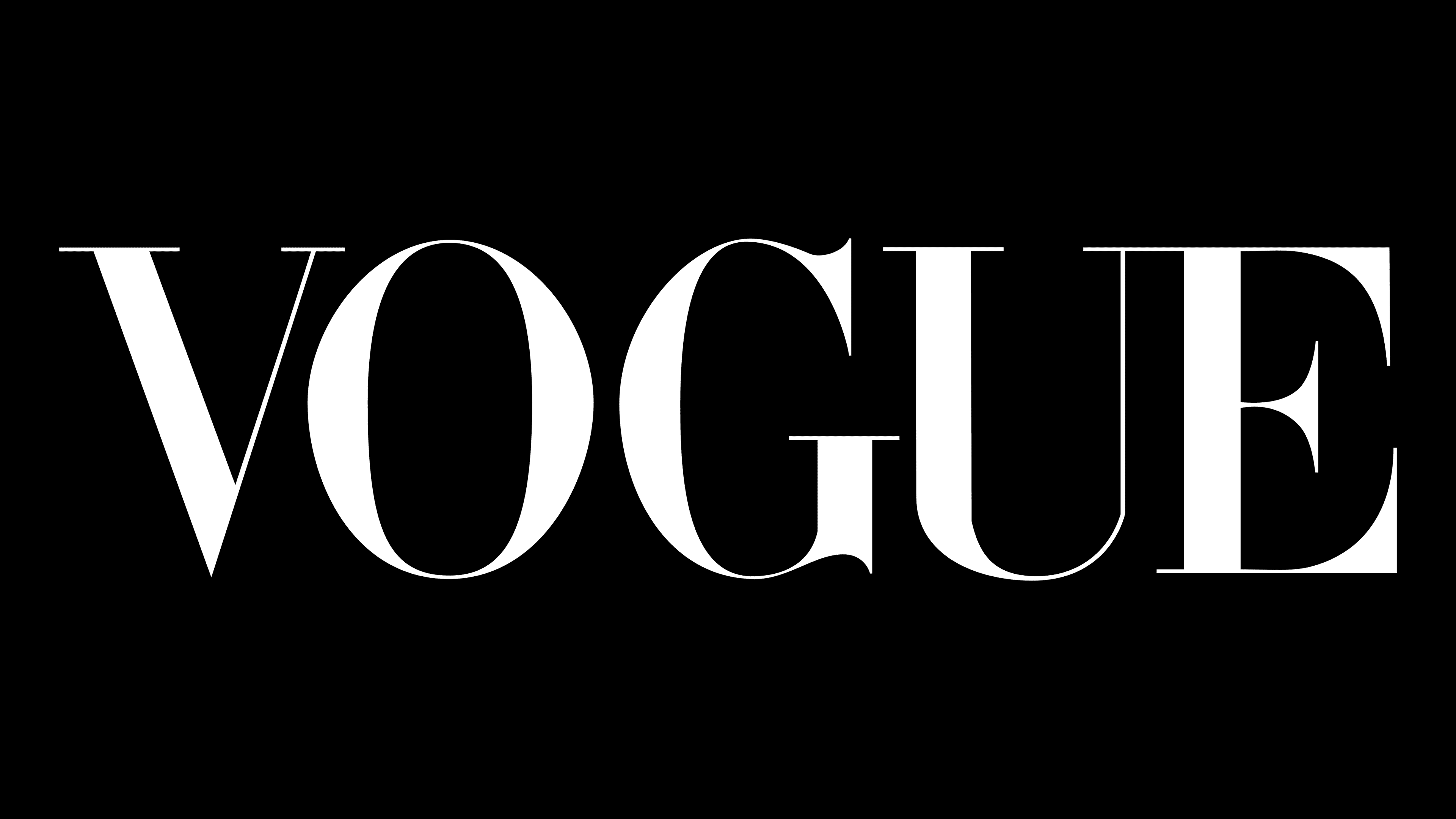
Since the logo has taken on a unified design, the typography hasn’t changed much. This was unnecessary because the Didot typeface was perfect for any cover, regardless of its content. It sometimes alternated with the Bodoni family of typefaces designed by the Italian designer Giambattista Bodoni. Both font types are united by a very high contrast between strokes of different thicknesses. Of course, Vogue designers have changed some of the nuances over time. They modified the Didot while retaining the old-fashioned sophistication. In addition, the magazine’s name can be written in the signature Vogue AG grotesque, created based on Avant Garde Gothic and Futura. Its developer is Terminal Design Studio.
The logo’s main color is black because it is classic and tasteful. But the fashion edition is not limited to the traditional palette. Editors boldly experiment with a color scheme so that the lettering blends harmoniously with other cover elements, especially the background photo.