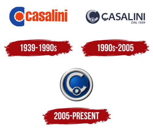
Like the manufacturer’s small cars, the Casalini logo is compact and harmonious. The vehicles are perfect for the narrow streets of Italy like an arrow hitting its mark. The emblem reflects the technical perfection and attractive design of these small cars.
Casalini: Brand overview
Founded in 1939 by Giovanni Casalini in Piacenza, Italy, Casalini began manufacturing mopeds and small motorcycles. It was not until 1956 that the company entered the microcar arena by introducing the Casalini Sulky model. This small and maneuverable car was ideal for the narrow streets of many Italian cities.
In the 50s and 60s, the Casalini company expanded its range of microcars, adding such models as Junior and Casalino. These cars gained popularity in Italy and Europe, and their sales grew. Casalini occupied a niche market for children’s microcars, with models such as the Casalini F10 being particularly popular, which in some countries could be legally driven by children under 14.
By the 70-80th years, the Casalini company produced more than 2500 microcars per year. However, this period saw a decline in sales due to increasing competition in the market. In response, the company introduced updated designs and models in the 1990s, adapting to new regulations and changing consumer preferences.
Today, Casalini is one of the few remaining microliter car manufacturers, producing about 500 vehicles annually. With models such as the M10 and Kerry, the company continues the tradition of creating unique Italian microcars.
Casalini’s influence on the automotive world is profound, especially in post-war Europe. The company’s iconic models, such as the Sulky, were instrumental in popularizing microcars across the continent. More than 80 years after its founding, Casalini continues to handcraft these unique vehicles in Italy, preserving an automotive history synonymous with urban convenience and Italian design talent.
Meaning and History
What is Casalini?
It is an Italian car manufacturer specializing in producing microcars and lightweight quadricycles. Based in Piacenza, the company specializes in creating compact, efficient, eco-friendly vehicles designed for urban environments. The vehicles are known for their small size, making them ideal for navigating narrow city streets and tight parking spaces. In some European countries, these cars can be driven without a full driving license, making them accessible to a wider range of drivers.
1939 – 1990s
The Casalini brand emblem immediately catches the eye with its capital “C” stylized as a wheel. This symbol originally adorned mopeds and motorcycles, later appearing on the brand’s cars. The central orange gear highlights the auto manufacturer’s focus, while the blue tire around the gear symbolizes every detail’s technological perfection and thoughtful design.
Next to the image is the brand name, displayed in orange. The name comes from the founder, Giovanni Casalini, adding historical significance and a personal touch to the brand.
The emblem’s color palette consists of red-orange and blue shades. These colors echo the coat of arms of Piacenza, where production began. This color choice is visually appealing and emphasizes the brand’s connection to its hometown and history.
1990s – 2005
In the 1990s, Casalini introduced a new logo that became their long-standing symbol. The emblem features a capital “C” on wheels, representing mini-cars that are compact and convenient for one or two people. This symbol conveys the brand’s philosophy of creating small, functional vehicles suitable for urban environments.
The logo is set in a circle, symbolizing movement and harmony, two key aspects in the design and production of Casalini cars. The company name uses a modified “C,” creating visual cohesion and uniqueness for the brand.
The dark blue color of the emblem highlights the company’s expertise and professionalism. The founding year, 1939, adds historical depth and respect for tradition. Casalini takes pride in its long and successful history and continues to innovate in its vehicles.
2005 – today
The Casalini logo, for the Italian car brand named after its founder, features the letter “C” and is styled to look like a steering wheel. This design ties directly to the brand’s automotive nature.
The letter “C” has shadows that give it a three-dimensional effect, adding depth. Below this is a smaller round element that mirrors the main design, highlighting Casalini’s focus on microcars. This repetition creates a cohesive design.
The silver-chrome “C” stands against a dark blue background, resembling the night sky. This makes the silver letter shine, much like the moon at night. A thick metal ring around the letter adds a robust frame, emphasizing the brand’s reliability.
The smaller round element at the bottom echoes the main emblem, subtly indicating the company’s specialization in mini cars. This detail ties the design together, keeping it clean and sophisticated.
The dark blue background contrasts with the shiny silver-chrome letter, enhancing the logo’s visual appeal and conveying professionalism and trustworthiness. The metal ring adds a touch of modernity and strength, symbolizing the durability and quality of Casalini vehicles.


