Casio: Brand overview
Founded in 1946 by Tadao Kashio in Tokyo’s Mitaka district, the company, originally known as Kashio Seisakusho, began its journey as a manufacturer of smoking accessories such as lighters and pipes. In 1957, the company underwent a dramatic change, changing its name to Casio Computer Co. Ltd., which was marked by the release of the groundbreaking Casio 14-A calculator, the world’s first compact all-electric calculator.
In the 1960s, Casio expanded worldwide, opening sales offices in Europe and the Americas. This period was marked by the introduction of such revolutionary products as the Casio Mini compact calculator and the Casio fx-10, the world’s first calculator designed for individual use. In 1974, Casio expanded its lineup with the Casiotron digital watch, which became part of the watch industry. This move contributed greatly to the worldwide shift from mechanical watches to quartz watches in the 1970s and 1980s.
In the following decade, Casio attracted attention with its electronic music keyboards and economical digital wristwatches. Among the company’s innovations were calculator watches that combined timekeeping and basic arithmetic functions. Today, the company remains a significant player in the manufacture of a variety of electronic products, from calculators and watches to keyboards. With a global network of factories and sales offices, Casio continues to occupy a prominent place in the electronics industry.
Meaning and History
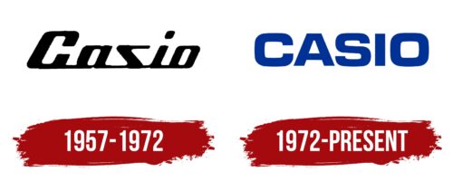
1957 – 1972
1972 – today
A simple Casio logo creates an atmosphere of business style: it is textual, minimalistic, and informative. Over the years, the company has gained worldwide popularity, so it is well-known to consumers and does not need bright symbols and conceptual images. The main element of the emblem is the brand name. It is made in bold letters. The font is sans-serif flat, with an optimal combination of rounded and angular sides. The text is colored in dark blue, symbolizing reliability, growth, and forward movement.
The deep blue color of the text is reminiscent of a calm sea that you can trust. The bold but not garish font is reminiscent of a firm handshake: it speaks to the cause but doesn’t flaunt it. Even without any fancy symbols, this logo whispers: “We know what we’re doing, and we do it well.”
Casio color codes
| Dark Powder Blue | Hex color: | #003296 |
|---|---|---|
| RGB: | 0 50 150 | |
| CMYK: | 100 67 0 41 | |
| Pantone: | PMS 661 C |


