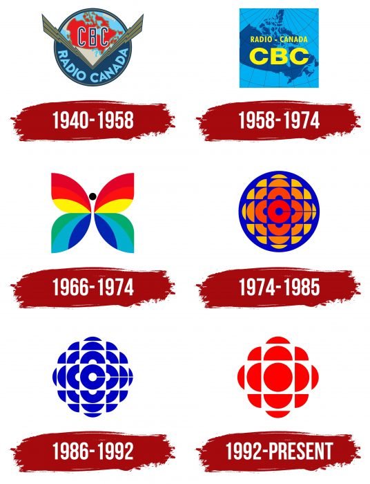
Resonance and spread are shown in the CBC logo. The emblem seems to echo everything said into the microphone. The company uses any available channels for broadcasting, and its listeners are aware of a large amount of fresh and hot news.
CBC: Brand overview
| Founded: | November 2, 1936 |
| Headquarters: | Ottawa, Ontario, Canada |
| Website: | cbc.radio-canada.ca |
Meaning and History
It is the oldest broadcasting organization that still retains its identity and functionality. It operates four ground stations and offers programs in eight domestic dialects (radio service) and five foreign languages (international webcasting).
The history of its development is a continuous evolution towards expansion. Consequently, the CBC has a variety of logos to mark the most important milestones in her career. In total, there are nine of them.
What is CBC?
CBC is the acronym for Canadian Broadcasting Corporation, a Canadian broadcasting corporation based in Ottawa. It has existed since 1936.
1940 – 1958
It all started with a circle and a map of Canada. This variation of the logo was suggested by Hortense Binette, a student at the École des Beaux-Arts. The Dominion of Newfoundland later joined them. As a result, the debut emblem looked like a globe divided into two parts. At the top was the North American continent with the red fragment of Canada and the abbreviation CBC. In the middle were two diagonal lightning bolts – a symbol of relevance and high information transfer speed. Below there was a blue segment with the name of the radio station – Radio Canada.
1958 – 1974
The author of this version is the artist Jean-Paul Boileau. During the redesign process, he suggested drawing a map of Canada against a hemisphere’s background with a grid of parallels and meridians, with which the station’s management agreed. On top of them, inscriptions also appeared, located at two dates: “Radio-Canada” and “CBC.” They were executed in yellow, which made them catchy and accent.
1966 – 1974
The creator of this logo is Hubert Tison. Moreover, his sign was used simultaneously with the previous one and was associated with the transition of television to color format. But he was present only on those channels that broadcast in colors. The logo was named Butterfly for its peculiar style.
The designer was tasked with making a peacock’s tail semblance, with a lot of rainbow shades. He chose butterfly wings, from the center of which stylized waves radiate in different directions. The upper part of the emblem is of the warm spectrum and consists of burgundy, red, yellow; the lower one is cold and includes green, blue, blue. Both sides are identical in size and structure. Also, there is a small black dot between them.
1974 – 1985
In 1974, a large-scale transition to a new symbolism took place, which received the unspoken names The Gem and Exploding Pizza due to its shape and structure. The original logo was created by graphic artist Burton Kramer. His work turned out to be so extraordinary that it is the most memorable and most significant in the corporation’s history. After all, all other official emblems were later created on its basis.
The basic concept of the logo has become kaleidoscopic. It looked very impressive on-screen because the circle was animated. It diverged from the center and fell apart into several small pieces under the signature melody. The choice of music was country-specific and was a mandatory part of the branding. The circle consisted of many geometric shapes with a red-orange-yellow letter “C.”
1986 – 1992
At the end of 1985 – at the beginning of 1986, the corporation approved another logo, shaped like a cut gem. Hubert Tison and Robert Innes suggested this version. It was monochrome and consisted of blue on white or white on blue, which was the same.
1992 – today
The current emblem is a thematic continuation of the previous version. The developers only changed the color, suggesting red instead of cobalt. Gottschalk + Ash also removed the cross-stripe, replacing the wide blue “C” with a solid red disc. They have also reduced the number of geometric shapes, using only 13 instead of 25, as was the case in previous versions.
CBC Television
The TV channel logo coincided with the base one. But in some cases, he had individual interpretations. From 1952 to 1966, the round icon was in use, first with lightning and a map, and then with a red Canada against the background of a geographic grid of the globe. The television service had two logos: the generally accepted one – colored with a butterfly and a special one – monochrome, for advertising, with white lettering on a dark background.
Then CBC Television had innovative emblems – round and segmental, made up of 25 small pieces. The original version was very colorful – red, orange, yellow. The second consisted of the same number of squares and triangles, but it was deep blue, with a large “C,” also divided into several parts. Since 1992, the number of segments has been reduced to 13, and monochrome red-white-and black-and-white variations have appeared.
The current emblem appeared in 2017 and, in addition to a round icon with a crushed ball, contains an inscription. This is the abbreviation for the “CBC” channel located to the right of the graphic symbol.
CBC Radio One
The radio service existed before, but since 1997, it expanded its broadcasting and came out under a new logo. It included two parts: the general corporate emblem in the form of a segmentary ball with the name and the channel’s logo, which consisted of the phrase “Radio One.” They were done in a sleek serrated typeface.
In 2007, a variant appeared with regrouped elements that were present in the old version. On the left was the CBC icon and abbreviation, and on the right, behind the vertical bar, was the name of the radio service.
In 2018, the ratio of graphic and text parts changed, so inscriptions became predominant. Of the drawn elements, only the icon with a red circle remains. The designers changed the blue color to black. They also changed the font.
CBC: Interesting Facts
The Canadian Broadcasting Corporation (CBC), established in 1936, is Canada’s national public broadcaster with a rich radio, TV, and digital media history.
- Foundation: CBC started giving Canadians their radio broadcasting service, later expanding into TV and online platforms, making it one of the world’s oldest public broadcasting services.
- Bilingual Service: True to Canada’s bilingual nature, CBC operates in English and French, serving all linguistic communities in the country.
- TV Broadcasting Pioneer: CBC introduced television to Canadians in 1952, marking a new era with the broadcast of the opening of the Canadian National Exhibition.
- Nationwide Reach: With a vast network, CBC reaches even the most remote areas, making it one of the world’s largest broadcasters by local presence.
- Olympics Broadcaster: CBC has a tradition of bringing the Olympic Games to Canadian viewers, offering extensive coverage of both the Summer and Winter Olympics.
- Digital Shift: Embracing the digital era, CBC offers streaming services like CBC Gem and Radio-Canada’s Tou.TV, providing a mix of live and on-demand content.
- Cultural Advocate: Platforms like CBC Music and ICI Musique highlight CBC’s role in promoting Canadian music and culture across various genres.
- Journalistic Excellence: CBC News is renowned for its in-depth and award-winning journalism, contributing significantly to public service journalism in Canada.
- Promoter of Canadian Talent: CBC has supported numerous Canadian artists and creators, becoming a key platform for showcasing Canadian content and talent.
- Children’s Programming: With offerings like CBC Kids, the broadcaster provides educational and entertaining content for children, including shows like “The Nature of Things” and “Paw Patrol.”
CBC/Radio-Canada is a pillar of public broadcasting dedicated to promoting Canadian culture, providing quality journalism, and adapting to the changing media landscape. This reinforces its vital role in Canadian society.
Font and Colors
The evolution of the Canadian Broadcasting Service’s corporate logo has been interesting, as creative mandalas have dominated her career. They are all colorful, stylish, and unique. Each is based on a circle. First, it was supplemented by lightning, then by the earth’s hemisphere, then by a rainbow butterfly and kaleidoscopic balls. They were so creative that at one time, they received unspoken nicknames: Butterfly, The Gem, Exploding Pizza.
The text was only in the first emblems. The base font was Foundation Sans Bold Extended, which was used to write the abbreviation. But at the radio service, the inscriptions are still used. There are two types of typefaces: in the early logo – FreeSet Book, in the current one – Mirai Bold.
An abundance of colors distinguishes the palette of all emblems. The official colors include red, cobalt, black, blue. There was also a rainbow color, consisting of yellow, orange, scarlet, green, and blue.
FAQ
What is the CBC symbol?
The symbol is known as the “rainbow butterfly.” This logo was created to celebrate the arrival of color television for CBC/Radio-Canada. The rainbow butterfly became an iconic symbol of the network’s transition to color broadcasting.
The logo’s vibrant and colorful design symbolized a new era of television. The tagline “A CBC Colour Presentation” accompanied the logo, emphasizing innovation and progress. This combination became memorable to viewers during the historic shift to color TV.
The butterfly’s design was visually appealing and conveyed excitement and modernization. It marked a major milestone in television broadcasting, showing CBC’s commitment to new technology and improving the viewer experience.
What color is the CBC logo?
The CBC logo changed in 1986 to a single color, typically dark blue on white or white on dark blue. This simplified design created a consistent and recognizable brand image.
Even before 1986, print ads and most television promos had used a single-color version of the logo since 1974. The move to a monochromatic scheme ensured the logo’s versatility and clarity across different media.
The dark blue color conveys professionalism and reliability, aligning with the brand’s identity as a trusted public broadcaster. The simplified design makes the logo easily recognizable and effective in print, television, and online.
What is the CBC logo?
The logo features a wide-open ring with arches, semi-arches, and small fragments arranged around it. This design is a stylized abbreviation of the company name.
The central ring represents the letter “C,” while the surrounding elements form abstract representations of the letters “B” and “C.” This dynamic and modern logo conveys movement and connectivity, reflecting the brand’s role in broadcasting and communication.
The logo is visually appealing and meaningful. It is easily recognizable and symbolizes the brand’s commitment to providing quality programming and information.
Who invented the CBC logo?
Burton Kramer, a pioneering Canadian designer, designed the famous logo. This design, called the “exploding pizza,” has become a widely recognized symbol.
Kramer’s logo features a wide-open ring with arches, semi-arches, and smaller fragments. This design is a stylized abbreviation of the name, capturing the brand’s essence in a dynamic and modern way. The logo represents movement and connectivity, reflecting the brand’s role in broadcasting.
What did CBC stand for?
CBC stands for the Canadian Broadcasting Corporation. It is a major broadcasting company in Canada that provides a wide range of television, radio, and online services. The company aims to deliver high-quality news, entertainment, and educational content.
As a public broadcaster, he plays a key role in Canadian media, reflecting the country’s diversity and culture. It offers programs in Canada’s official languages, English and French, through CBC Television, CBC Radio, Radio-Canada, and Radio-Canada Télévision.
The company provides digital services like CBC.ca and Radio-Canada.ca, offering news, information, and streaming content. Its mission is to inform, enlighten, and entertain Canadians.
When was CBC created?
The Canadian Broadcasting Corporation was founded in 1936 and has been operating continuously. It provides various broadcasting services, including television, radio, and online content.
The creation was a significant milestone in Canadian broadcasting. It was established to deliver high-quality news, entertainment, and educational content to Canadians. As a public broadcaster, CBC’s mission is to serve the public interest, reflect Canada’s diversity, and promote Canadian culture and stories.

