The Celcom logo is based on the principle of graphic-textual balance. It concentrates the energy that gave birth to Malaysia’s first mobile operator. It symbolizes public support, wide mobile coverage, accessibility, and reliability. Thanks to its realistic style, it clearly shows the movement toward the subscribers.
Celcom: Brand overview
| Founded: | 1988 – December 2022 |
| Founder: | Axiata Group Berhad |
| Headquarters: | Petaling Jaya, Selangor, Malaysia |
| Website: | celcom.com.my |
Meaning and History
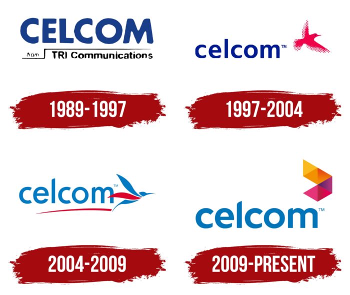
If we talk about the Malaysian market, then the brand’s visual recognition is at a high level. For more than 30 years of work, the company has presented four logo variants to the target audience. Despite significant changes, the logo’s basis remained indispensable, so it was not difficult for the client to identify their favorite mobile provider.
What is Celcom?
It is one of the largest mobile operators in Malaysia, with many years of experience and millions of satisfied customers across the country.
1989 – 1997
The first version of the logo was presented almost immediately after the company’s founding. In it, the main element was the name “CELCOM” in dark blue. The basis was a classic bold sans-serif typeface with subtle rounding. The thick lines in the symbols made the wording more confident and powerful in the eyes of potential customers. The inscription is most similar to the Helvetica font, with slight changes in the style of writing letters.
Under the main name, there were two horizontal lines that were at different levels. A vertical line connected them. The inscription “TRI Communications” was added here. It was written in black letters with thin lines.
1997 – 2004
The first major redesign made the logo more lively and dynamic. Even though the company used an identical font, the capital letters were changed to lowercase. Thus, Celcom had to evoke positive emotions in potential customers. Also, significant spacing between characters left “food for thought” for users. All lines under the wordmark have been removed, making the logo more readable.
A bird appeared in the upper right corner. Visually, it looks like a hummingbird. This bird was red, which directly references the transmission of information. The edges of the wings and the tail of the emblem are made with red dots, which makes the Celcom logo more mysterious.
2004 – 2009
Another redesign made minimal changes to the logo. The font of the verbal inscription and the character case remained identical. At the same time, the dark blue color was replaced with a brighter shade. A red horizontal line has appeared from below, which rises slightly in the right corner. The color of the bird changed from red to blue. The only exception is one red wing.
2009 – today
The latest redesign to date has made the logo more confident and modern. The writing style remained the same, but the lines in the letters became bolder. Also, the bird was removed. Perhaps this is because not all users found associations between hummingbirds and mobile communications. Probably, the company put speed into this symbol because the bird makes up to 80 flaps of its wings per second. In general, an abstract emblem appeared in its place, conventionally divided into five blocks of different colors.
Font and Colors
The basis of the logo was a classic sans-serif typeface. Apart from the first option, after all the redesigns, the basis was lowercase letters, which evoke positive emotions among potential customers. The Celcom brand name is easy to read and stands out from the competition.
The logo was based on a red and blue color palette. If, in the first stages, the company tried to use them in contrast, then the latest redesign led to the fact that blue became the dominant color, and it is what many people associate with the activities of a mobile operator.
Celcom color codes
| French Blue | Hex color: | #0075b9 |
|---|---|---|
| RGB: | 0 117 185 | |
| CMYK: | 100 37 0 27 | |
| Pantone: | PMS 7461 C |
| Selective Yellow | Hex color: | #fab91c |
|---|---|---|
| RGB: | 250 185 28 | |
| CMYK: | 0 26 89 2 | |
| Pantone: | PMS 7549 C |
| Carrot Orange | Hex color: | #f29200 |
|---|---|---|
| RGB: | 242 146 0 | |
| CMYK: | 0 40 100 5 | |
| Pantone: | PMS 151 C |
| Spanish Orange | Hex color: | #ec660a |
|---|---|---|
| RGB: | 236 102 10 | |
| CMYK: | 0 57 96 7 | |
| Pantone: | PMS Bright Orange C |
| Amaranth Deep Purple | Hex color: | #932e73 |
|---|---|---|
| RGB: | 147 46 115 | |
| CMYK: | 0 69 22 42 | |
| Pantone: | PMS 675 C |
| Spanish Carmine | Hex color: | #ca1348 |
|---|---|---|
| RGB: | 202 19 72 | |
| CMYK: | 0 91 64 21 | |
| Pantone: | PMS 192 C |
| Cerise Pink | Hex color: | #e73378 |
|---|---|---|
| RGB: | 231 51 120 | |
| CMYK: | 0 78 48 9 | |
| Pantone: | PMS 191 C |
