


![]() Century 21 (real estate) Logo PNG
Century 21 (real estate) Logo PNG
The Century 21 logo represents the pinnacle of practicality, complemented by a futuristic aesthetic. It’s no wonder that the company’s founders admitted they preferred the futuristic option when choosing the name, even though they had a simpler one in reserve. Now the graphic-text emblem attracts clients with its concept, color, and shape.
Century 21 was founded in 1971 in Orange County, California, by Art Bartlett and Marsh Fisher. Both had worked in real estate and wanted to build a franchise network in which independent agencies could operate under a single recognizable brand while retaining local ownership. The model gave small brokerages shared standards, agent training, advertising support, and a common visual identity.
The name referred to the coming 21st century, although the company began in the early 1970s. During its first years, Century 21 sold franchises across the United States. It became known for its gold-and-brown branding, including the agents’ signature blazers. By the late 1970s, thousands of offices were working under the brand.
In 1979, Century 21 was acquired by Trans World Corporation, the parent company of Trans World Airlines. In 1985, ownership passed to Metropolitan Life Insurance Company, or MetLife, which supported further expansion in North America and abroad. In 1995, Hospitality Franchise Systems acquired the brand. After HFS merged with CUC International in 1997, Century 21 became part of Cendant Corporation, alongside Coldwell Banker and ERA Real Estate.
In 2006, Cendant split its businesses, and the real estate brands moved into Realogy Corporation. Realogy later included Sotheby’s International Realty and Better Homes and Gardens Real Estate, then changed its name to Anywhere Real Estate in 2023. Century 21 continued to compete with RE/MAX, founded in 1973, and Keller Williams Realty, founded in 1983, while keeping the franchise model created in California.
Meaning and History
![]() The real estate franchising company was founded in 1971, when two entrepreneurs opened it in Madison, New Jersey. Art Bartlett and Marsh Fisher took their time choosing a name, eventually settling on what they considered a futuristic option. The main requirement was that it be perceived as if the company had existed for a long time, without being clichéd. Balancing between several options, they unanimously agreed on the current name.
The real estate franchising company was founded in 1971, when two entrepreneurs opened it in Madison, New Jersey. Art Bartlett and Marsh Fisher took their time choosing a name, eventually settling on what they considered a futuristic option. The main requirement was that it be perceived as if the company had existed for a long time, without being clichéd. Balancing between several options, they unanimously agreed on the current name.
The Century 21 logo adheres to an unusual, expressive concept. Of course, there is little futurism in it, but it cannot be said to be absent. Throughout the years, a striving for precise geometry has been evident. Straight lines and even circles are present in both the image and the inscription. The number “21” highlights the company’s relevance to the 21st century and its focus on the future.
What is Century 21?
Century 21 is a real estate franchising service founded in the United States in 1971. It brings together over 14,000 brokerage firms worldwide, providing a working platform for real estate agents. The company’s headquarters are located in Orange County, California.
1971 – 1991
![]()
In the text-graphic emblem, the focus is on the company’s field of activity. Beneath the large “Century” inscription, there is an image of an unusual building. It has a flat roof and three parts: a garage, a residential house, and an entrance area with tall arches. Each part has individual design elements, but they are drawn with a single continuous line. To harmoniously incorporate the number “2”, designers made the “y” leg diagonal.
1991 – 2018
![]()
After the Century 21 logo was modernized, the inscription retained its previous font but became bolder. As a result, the letters appear somewhat bulkier and larger. The drawing, however, underwent significant changes, as nothing remained of the old version. It was replaced by three geometric fragments: a long horizontal line, a short vertical column, and a triangle symbolizing a gabled roof. Additionally, the emblem now features yellow.
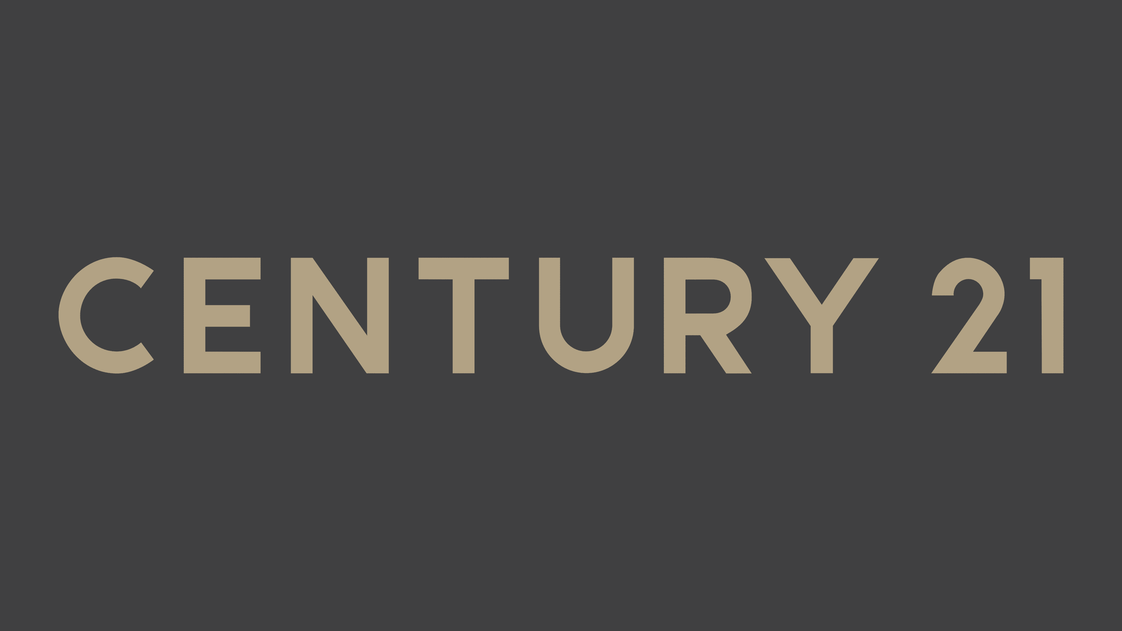
2018 – today
![]()
In 2018, designers introduced a radical transformation of the real estate platform’s identity. None of the familiar details were preserved in the logo: everything was subject to change. Developers removed the smooth font with diagonal curves, reduced the number of digits, and abandoned the real estate symbol. Now the logo displays the company’s name with wide intervals between the glyphs, and the number “21” is aligned with the word “Century.” The result is a combination of luxury and accessibility.
This is emphasized by the combination of dark gray and gold, which is much more appealing than the black-and-yellow pairing. Despite the absence of serifs, the logo acquired a sophisticated, chic look. In this way, the brand caters to the tastes of millennials, who have become the company’s main target audience as they now represent the primary financially capable population segment. The new design was developed by the MullenLowe agency.
Font and Colors
Avant Garde Gothic, a font with unconventional letterforms created in 1970 by Herb Lubalin and Tom Carnase, was chosen for the futuristic emblems. It consists of diagonal letters, demonstrating a departure from classic forms and a leaning towards modernity, as its foundation was the Bauhaus movement, which dominated Germany in the 1920s.
After the redesign, the logo features a spacious inscription set in a smooth typeface with clear, understandable glyphs. The approved font families include Arial, Barlow, Oakes, and Typold. They were approved by the Century 21 brand for the new identity. The modernized version works well on signs, website headers, brochures, flyers, business cards, branded bags, and other marketing materials. This is very important for the company, and it emphasizes this fact to subconsciously connect with millennials.

The corporate palette was also adapted to meet the demands of the new generation of consumers. The real estate franchising company first abandoned the classic monochrome and then introduced a noble gray-golden color scheme. Such colors balance on the edge of luxury without fully immersing themselves in it, maintaining an aura of modern sophistication.