Connecting subscribers to a single service center show the CenturyLink logo. Information flows through the arteries of the fiber optic network, helping users. The emblem represents growth, development, unity, and a full range of services.
CenturyLink: Brand overview
| Founded: | 1930 |
| Headquarters: | Monroe, Louisiana, U.S. |
| Website: | centurylink.com lumen.com |
Meaning and History
The renaming of CenturyLink into Lumen Technologies is not the only global change in the history of the giant operator. This company repositioned itself several times, changing the name, concept, and visual identity elements. Its earliest predecessor was the Oak Ridge Telephone Company, which pioneered telephony. It was bought by the Williams family in 1930 when subscribers had to water the land to improve the quality of the connection.
In 1946, Clarke Williams decided to automate the system and purchased everything he needed, but the banker who promised to issue the loan suddenly died. An acquaintance of Joe Sydney Carter provided the required amount. Inspired by his success, the entrepreneur began buying up other telephone companies in different states. When there were 15 of them, he united them into the Central Telephone and Electronics holding.
The telecommunications corporation has constantly been experimenting with names and logos. Moreover, in the latter case, she followed the path of simplification, abandoning complex graphic symbols. Lumen Technologies (formerly CenturyLink) has chosen a minimalist wordmark with a short blue dash as the only striking element.
What is CenturyLink?
CenturyLink is the former name of Lumen Technologies, used until 2020. However, the CenturyLink brand still exists, under which copper network telecommunication services are provided. The brand Quantum Fiber is responsible for fiber-optic communications. Their parent company, established in 1968 and based in the US, serves clients worldwide, providing mobile services, digital television, and internet access.
1968 – 1971
Central Telephone and Electronics was formed in 1968, three years after the death of George Lee, who was Clarke Williams’ father-in-law and helped him run his business. Having lost an irreplaceable manager, the owner of telephone networks decided to combine them into one structure to simplify control over all access lines. The headquarters has moved to the city of Monroe.
1971 – 1999
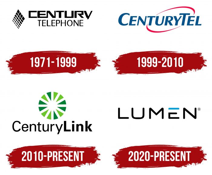
In 1971, the Central Telephone and Electronics holding became the Century Telephone Enterprises corporation. She immediately began buying up smaller independent companies and was one of the first to enter the cellular market in the US. Its logo was a reflection of high technology. The graphic element looked like a diamond and consisted of clusters of different sizes, which could be interpreted as a symbol of a connection or a transmitted signal.
On the right were the first two words of the company name, written one below the other. Different fonts were used for them: bold, contrasting line thickness, and narrow with letters extended upwards. They were united by black color, square shape, and lack of serifs.
1999 – 2010
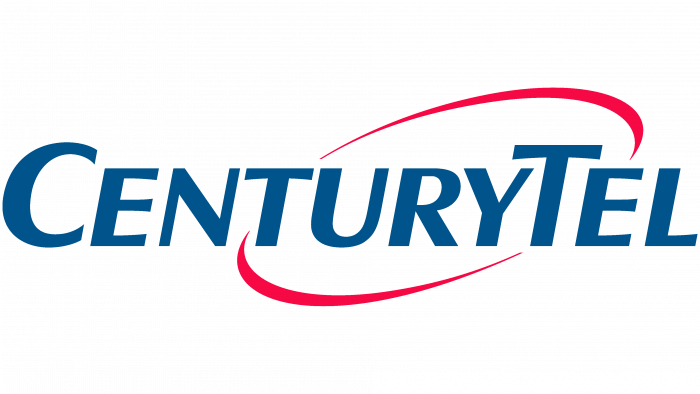
In 1998, the company began preparations for a rebranding to merge Century Cellunet, PTI Communications, Century Long Distance, and Century Telephone services under the name CenturyTel. The new brand was approved in 1999 and at the same time began to use the logo with a blue oblique lettering “CENTURYTEL” on the background of a red ring. Even though all the letters were capitalized, the first “C” and the eighth “T” stood out noticeably in height. The two red arcs above and below represent an abstract rotation orbit.
2010 – today
Following the merger with the telephone operator Embarq Corporation, the company was renamed CenturyLink. In 2010, the new name became official. As part of the restructuring, a green round emblem appeared. It consisted of twelve small green triangles arranged in a ring and pointed inward with sharp angles. The black lettering “CenturyLink” took place to the right. The designers visually divided it in half, highlighting the second part in bold. This version of the logo and the brand name is still used for some of the corporation’s services.
2020 – today
In 2020, the telecommunications company received a new name – Lumen Technologies. It is reflected in the modern word sign, which contains a short inscription “LUMEN.” The design follows the tradition of 1971-1999 when the logo featured a square typeface. Visually stands out only the capital letter “E,” divided into two parts. It consists of a blue stripe (top) and a black line curved at right angles (bottom).
CenturyLink: Interesting Facts
CenturyLink, now called Lumen Technologies since September 2020, is a big tech and communications company that’s been around since 1930. It started in Oak Ridge, Louisiana, as a small family business with 75 customers and grew into one of the top telecom companies in the U.S.
- Beginnings: William Clarke and Marie Williams started the company in a small Louisiana town, proving big things often have small starts.
- Growth: CenturyLink grew by buying other companies, including big names like Embarq, Qwest Communications, and Level 3 Communications. These moves helped it serve more customers and expand its services.
- Services: The company didn’t just stick to phone services; it moved into high-speed internet, digital TV, and home security, reaching millions in the U.S.
- Worldwide Presence: Buying Level 3 Communications made CenturyLink a global player, important for the internet worldwide, operating in over 60 countries.
- A New Era: The change to Lumen Technologies in 2020 showed a shift towards advanced tech like fiber optics, cloud, and cybersecurity, aiming to lead in the 4th Industrial Revolution.
- Tech Advances: CenturyLink has always been ahead with tech, investing in fiber-optic internet and cloud services to provide top-notch digital services.
- CenturyLink Field: Naming Seattle’s stadium after itself put CenturyLink in the spotlight, making it known beyond its customer base.
- Government Trust: The U.S. government has given CenturyLink important contracts for infrastructure and cybersecurity, showing trust in its services.
- Giving Back: The company isn’t all about profit; it’s also involved in community service and supports education and tech through its foundation.
- Business Solutions: Lumen also offers modern business services, such as cloud computing, managed services, and cybersecurity, to meet the needs of today’s companies.
In summary, CenturyLink’s transformation to Lumen Technologies highlights how the company has evolved from a traditional telecom provider to a forward-looking tech firm. This change reflects its commitment to adapting and leading in the fast-paced digital world.
Font and Colors
One of the typefaces on the Century Telephone Enterprises logo was similar to Salzburg Serial Regular, a modern geometric sans serif from SoftMaker. In 1999-2010, bold Gothic italic with extensions at the ends was used for the inscription. Then the typeface changed: the first part of the CenturyLink logo resembled the Urbano Regular, and the second – the Urbano Bold.
The last logo with the word “LUMEN” is the most unusual one. The designers chose a square font with rounded corners and sans serifs. In doing so, they made the letter “E” stylized by repainting the top stroke in a bright blue to contrast against the black lines.
Lumen Technologies color codes
| Black | Hex color: | #000000 |
|---|---|---|
| RGB: | 0 0 0 | |
| CMYK: | 0 0 0 100 | |
| Pantone: | PMS Process Black C |
| Spanish Sky Blue | Hex color: | #00a0dc |
|---|---|---|
| RGB: | 0 160 220 | |
| CMYK: | 100 27 0 14 | |
| Pantone: | PMS 801 C |


