Although the CertainTeed logo is austere, it inspires hope for the best. The shape and color of the glyphs directly say it. This palette – is a sign of confidence in high-quality building materials and the use of innovative techniques in their production. Business style is expressed in smooth lines, precise angles, and minimalistic structure, while reliability is expressed in strict visual elements.
CertainTeed: Brand overview
| Founded: | 1904 |
| Founder: | George M. Brown |
| Headquarters: | Paris, France |
Meaning and History
In more than a century of the company’s history, there has been only one major redesign. Thus, the visual recognition of the brand is at a high level. The basis of each logo is minimalism and conciseness in detail. The key element is the wording.
What is CertainTeed?
This is one of the largest companies in North America, whose products are purchased annually by tens of millions of citizens who want to get into construction.
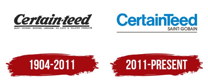
1904 – 2011
The first version of the logo was presented immediately after the company’s founding. It was used as one of the key elements of CertainTeed’s advertising campaign. It is important to note that its name was spelled somewhat differently in the early stages of the company’s development, namely “Certain-teed.” Therefore, it was also displayed with a hyphen on the logo. It should be noted that, in parallel, several fonts were used for the logo, depending on the background and tasks. As a rule, it was a classic serif typeface. All letters, except for the initial, were made in lower case. If we talk about the color palette, then it was a common logo for those times, made in black and white.
Some versions of the CertainTeed logo used an additional inscription that displayed the types of products that the company manufactures: “Paint, Varnish, Roofing, Linoleum, Oil Cloth, Related Products.” They were listed below the horizontal line that separated the two lines of inscriptions from each other.
2011 – today
Since 2011, the company’s name has been displayed on the logo in one solid word. However, the second letter “T” is also capitalized, allowing associations with the original version. The brand name was written in a strict bold sans-serif font. The blue color was taken as the basis, which looks harmonious and natural on a white background. Separately, it is necessary to note the minimum distances between the letters. Also, the company tried to make the style of some letters unique. This is evidenced by the absence of half of the vertical stripe in the letter “t.”
Under the main inscription, there is also the name of the parent company Saint-Gobain, made in a simple font using black letters. A horizontal line has also been added at the bottom.
Font and Colors
The company used a classic font in both versions of the logo. However, additional changes were made to the peculiarity of writing individual characters. Thus, the inscription looked more progressive and confident, highlighting CertainTeed from the competition.
The choice of the blue color was not accidental because many people associate it not only with the sky but also evokes positive emotions. Also, it can be seen as a symbol of trust and potential.
CertainTeed color codes
| Green Blue | Hex color: | #0081c9 |
|---|---|---|
| RGB: | 0 129 201 | |
| CMYK: | 100 36 0 21 | |
| Pantone: | PMS 3005 C |
| Dark Lava | Hex color: | #50483e |
|---|---|---|
| RGB: | 80 72 62 | |
| CMYK: | 0 10 22 59 | |
| Pantone: | PMS 7519 C |


